Dark Knight Headsculpt Set From Chris Howes

Collector Freaks Forum

Help Support Collector Freaks Forum:

This site may earn a commission from merchant affiliate links, including eBay, Amazon, and others.
Status
Not open for further replies.
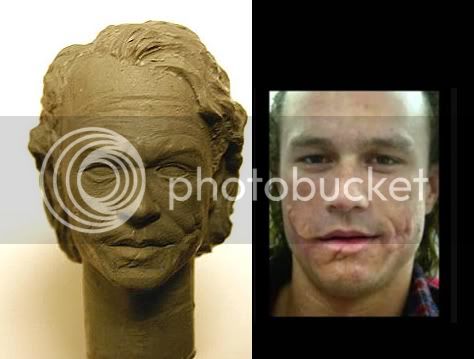
Looking good so far Chris! Looking forward to seeing the finished product. Keep it up!


I own the DC Direct head and the face and the jaw itself look spot on with Ledger. Isn't it an actual scan of Ledger? I'd still like to see what you can do with it.

Yes the DC's are scans.
 
Would you say "I believe in Chris Howes"?:D

Thank you for the vote of confidence, I'll do my best.

I've been trying to see beneath the makeup by looking at dozens of photos from many angles, and by looking at the HD Trailer. I think it's pretty close now.

Keep in mind, the hair as it is, is still in the earliest "placeholder" stage. I spent many hours on the likeness, and about 1/2 an hour on the hair.I'll be layering strands onto it, so it will look very dimensional, don't worry. Plus, strands in the face will come after the face is finished, otherwise I'd be working around the strands which is a pain in the arse! :horror

I believe in Chris Howes. :D

Know this has been posted before, but it is really your best reference pic I think:

joker3nv9.jpg
 
Last edited:
Looking very good!

My 2 cents -

The eyes are a little too big. I would say make them a little bit smaller/squintier and add some of the puffiness to the lower lid.

Also his nose it off slightly. The bottom of his nose is slightly pointier and it hangs a little further than his nostrils. Also the bridge between his eyes is slightly wider than you have it.
 
First off, a huge props to Chris for the outstanding work. I am one of those who are in the "wait and see" camp, but after seeing this, I am definitely getting one. Great job again, Chris!

Now I hope it's OK for a non-artist like me to post his observations :)

I just want to point out 2 minor issues:

1. I think the hair at the back should "flare" out just a little more:

comparison2uu1.jpg


2. The lower portion of his jaws also need to be slightly wider:

comparison3kr1.jpg


Other than these 2, I think the face sculpt is pretty spot-on. Like the rest, I am excited to see the final product.
 
Sorry to be a day late to the party. First off, I find the makeup complicates evaluation here, so I want to compare the sculpt to the photo that only shows the scar work:

jokercomp1.jpg


At first I thought the eyes are too large and too wide-set, but I tried superimposing one image over another and realized that if you match the eyes up, the face seems to be not quite long enough. In other words, the eyes are in a slightly different scale to the rest of the face, both in terms of size and distance between them. I don't know which is the better to try to adjust since I can't see the size of the sculpt.

It's really evolving into a handsome beast. Thanks for letting us watch the development, Chris. I hope this doesn't come too late to be helpful.
 
Looking good, but I'd just like to add to the above posters comments and say that what also makes that image a good to work from is that the corners of his mouth are slightly raised on one side, which does give the face more character rather then just a neutral expression. Something a Joker head desperately needs I feel.

It's a great sculpt though even at this early stage, and I feel that maybe overlapping the two images in Photoshop will help you see areas where things are not matching up scale wise.
 
Thanks for letting us into the process. It's brave of you but you're gonna have an amazing piece when this done.

Not so brave! Actually it's very helpful to hear unique perspectives. Everyone sees something different.

This way all of you can have a tangible connection to the end product and your a heck of a lot nicer than ornery product managers! :lol
 
very impressive so far! just think the hairline needs to come down a tiny bit, but overall its coming together nicely. :)


mike
 
First off, a huge props to Chris for the outstanding work. I am one of those who are in the "wait and see" camp, but after seeing this, I am definitely getting one. Great job again, Chris!

Now I hope it's OK for a non-artist like me to post his observations :)

I just want to point out 2 minor issues:

1. I think the hair at the back should "flare" out just a little more:

comparison2uu1.jpg


2. The lower portion of his jaws also need to be slightly wider:

comparison3kr1.jpg


Other than these 2, I think the face sculpt is pretty spot-on. Like the rest, I am excited to see the final product.

Just saw this post Chris...I agree with vader on this about the hair beings flared out more at the bottom and the jaw being a tad wider.

mike
 
Maybe a sculpt of him licking the corner of his mouth might look better. I'm guessing if you followed this reference, he would end up looking like he is just sticking his tounge out, which is what it looks like in that pic. I think more to the side would actually looking like "licking."
 
Here is a few more early practice shots guys, I'll have it down by the time i have the sculpts in hand for you guys.
Picture_13591.jpg

Picture_1357.jpg

Picture_1354.jpg
 

Excellent work Kuato! :rock
That left eye is perfect! Excellent life to it.

I might blend the hair more to that nasty green, almost yellow, at the tips, more than the gold you have used, but I know why you used it. His hair always looks like the green is washing out, so the tips have more, and the roots are more his normal hair color.

Not shabby! Try a touch more black in the eye outlines areas for "earlier" shots and a more pure cherry red on the lips, but he looks astonishing otherwise. Makes me happy I got a HT one coming now. You've sold me on it's likeness possibilities.

By the time you get to the heads by Chris, you'll get your practice alright! :banana Can't wait to see your work on these! GREAT start!
 
Status
Not open for further replies.
Back
Top