Premium Format Darth Vader [ROTJ]

Collector Freaks Forum

Help Support Collector Freaks Forum:

This site may earn a commission from merchant affiliate links, including eBay, Amazon, and others.
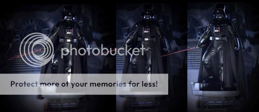
I think this looks just like Vader did in the films. Love starwars, might get some statues from the new trilogy.
 
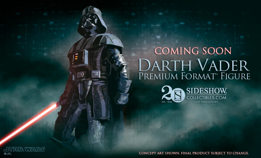
how did you guys think he was going to look? We knew the base & the pose was therefore a given

His arms didn't seem that separate from his body on the concept art we had seen.
attachment.php


a5e3y8e4.jpg


SW_SSC_PF_DarthVader2__Z_Meu_zps9pitnivd.jpg


SW_SSC_PF_DarthVader2__Z_Meu2_zpsoc2km4tb.jpg
 
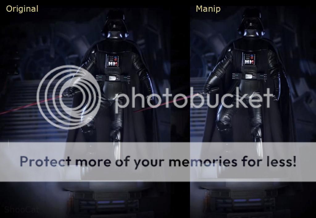
I like the non-manip better. Reminds me a bit of one of the old vintage poses of him:

darthvintage.jpg
 
His arms didn't seem that separate from his body on the concept art we had seen.

attachment.php


a5e3y8e4.jpg


SW_SSC_PF_DarthVader2__Z_Meu_zps9pitnivd.jpg


SW_SSC_PF_DarthVader2__Z_Meu2_zpsoc2km4tb.jpg

Something with his body language does not seem right, his upper body and his arms do not look right. The art work makes Vader look imposing, here he does not seem to transfer from the art work to the product we see on display

I wish they used the choke hold pose, which is something that could have been an interesting pose to have pulled off. Because this pose does not seem to look right. Shame they do not offer more exclusives with his arms
 
I have to say, I don't normally go for these "heroic" poses-- especially for Vader of all characters-- but this one actually kinda works for me. It might be a bit overly badass, but it's at least not one of those extreme action poses that people try to put Vader in sometimes. And it still feels enough like Vader to me.

I think the only change I would make is to have him looking down a bit more.

And even though it looks like yet another symmetrical mask, it at least looks much better proportioned than their 1/6 version. Which is nice to see. :)
 
Pose looks great to me. I can't wait to preorder this statue. With this statue, my Sith PF collection will be complete. Oh I forgot, I still need to find an Asajj Ventress.
 
Something with his body language does not seem right, his upper body and his arms do not look right. The art work makes Vader look imposing, here he does not seem to transfer from the art work to the product we see on display

I wish they used the choke hold pose, which is something that could have been an interesting pose to have pulled off. Because this pose does not seem to look right. Shame they do not offer more exclusives with his arms

Well if they did an iconic pose that would make too much sense. You can't do that to the fans and give them the cool pose. You gotta go for something more awkward... you know like this:

SS-05-10031-2.jpg

Ultimately that pose was the deal breaker for Jedi Luke. You get all these people around a table and somehow they all agree on some goofball pose.

I don't think this Vader one is nearly that bad, but I agree they definitely could have done a more imposing standing position.

I'm also not too crazy about the idea of spreading things out on the sides too much taking up more cabinet/shelf real estate. The saber being held out like that adds even more inches to the across measurements. They're making them taller and wider with these bases and poses.

The Wonder Woman PF spear was nuts making that have to fit in a 21" wide spot.
 
I can't tell if the leather suit arms and legs are mixed media or sculpted. Looks nice. I have a feeling HT will be releasing a 1/4 version after seeing 1/4 Boba so I'm debating whether to wait for that or not... THis one has light up features though?
 
He seems to be looking up too, why would he be looking up?? From what I can recall, the only time he did that in ROTJ was when he and Luke got separated in the duel and he was looking at Luke from the BASE of the stairs, in fact I think most of the time he was looking DOWN. Might be wrong though, it's been a while since I watched the movie. But damn...

I guess when people look forward to the HT release just hours (maybe less) after an official release by SSC, you know it can't mean anything good...
 
I also noticed in the video the black paint on the helmet seems a bit orange peeled. You can see it right at the end when the reflection gets on it.
 
I also noticed in the video the black paint on the helmet seems a bit orange peeled. You can see it right at the end when the reflection gets on it.

Thank you

I said this in a group on FB and was told it looks fine. Certainly is a lot of peel there tbh. Not good for such a highly anticipated figure preview :/
Let's hope they have diverted QC to the figures now rather than the videos :D
 
Well if they did an iconic pose that would make too much sense. You can't do that to the fans and give them the cool pose. You gotta go for something more awkward... you know like this:

View attachment 169225

Ultimately that pose was the deal breaker for Jedi Luke. You get all these people around a table and somehow they all agree on some goofball pose.

I don't think this Vader one is nearly that bad, but I agree they definitely could have done a more imposing standing position.

I'm also not too crazy about the idea of spreading things out on the sides too much taking up more cabinet/shelf real estate. The saber being held out like that adds even more inches to the across measurements. They're making them taller and wider with these bases and poses.

The Wonder Woman PF spear was nuts making that have to fit in a 21" wide spot.

You see Sauron's PF pose, his leg very similar, but you get the sense of dread with the dark lord in the way he is standing.


The Vader pose on the art work looks badass, bring it too life it looks different. Could be his upper body and the way he is standing, has taken a few back. But he is not standing how he should, that is the problem with the pose. I feel like he is about to lift that left leg up like he is doing some exercises

This is when I think of Vader


But oh well, SS cant please everyone. Maybe when we get more pics it will look much better
 
Back
Top