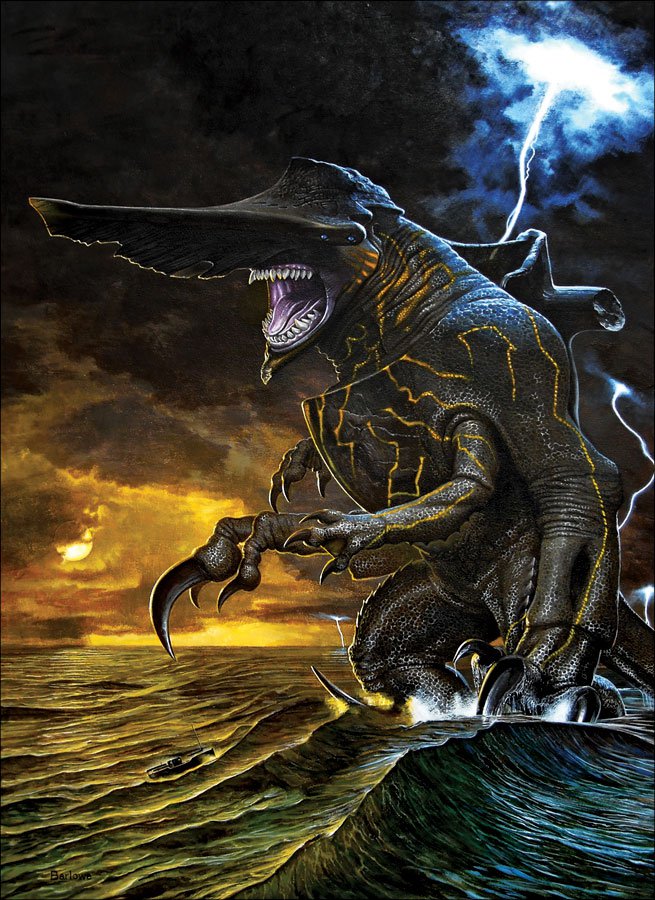
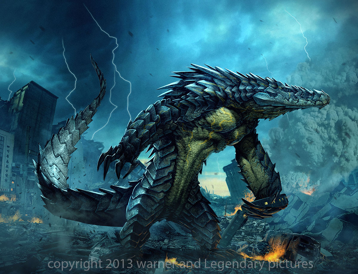
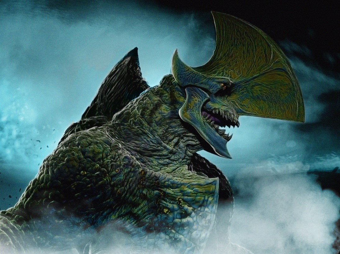
I look at the toys coming out of the monsters, I look at pictures of the monsters online,
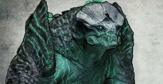
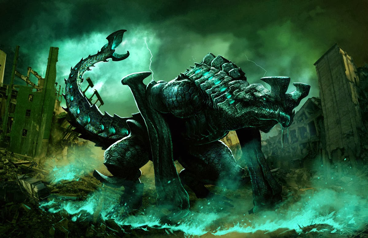
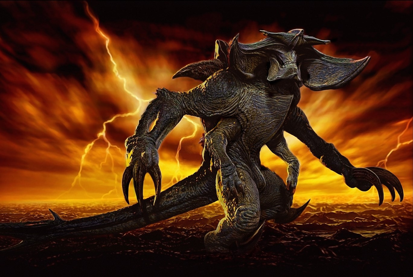
And I still wonder, why did they have to look so boring? Why couldn't they be colorful?
Why didn't they have better color on their skin? The designs are kind of cool but they all looked like this weird grey bug with blue lines on it.
I don't know, Guillermo has such a good eye for creature making and these monsters are pretty boring looking. I really don't understand why they didn't make them look different from each other as far as their skin and colors go.
I need to watch the movie again because they all looked the same, they all look like each other.
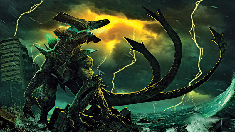
the final battle was a complete mess for me, I have no idea what monster was doing what, who was attacking who. It felt like the same monster was attacking the robots over and over.


 !
!