Hot Toys DX09 - BATMAN - Batman (Michael Keaton) - Specs & Pics

Collector Freaks Forum

Help Support Collector Freaks Forum:

This site may earn a commission from merchant affiliate links, including eBay, Amazon, and others.
The fact that they've already used purple for the Heath Joker, and the fact that they seem to be using gaudier, more vibrant colors (yellow box instead of black) makes me wonder if Jack's box won't be something different, like the orange from his shirt, or even the mint green from his tie, in terms of color.
 
The fact that they've already used purple for the Heath Joker, and the fact that they seem to be using gaudier, more vibrant colors (yellow box instead of black) makes me wonder if Jack's box won't be something different, like the orange from his shirt, or even the mint green from his tie, in terms of color.
See.. that would be perfectly in context though.

The box for BATMAN.. should've been a dark colour, with the symbol from his chest emblem on it - like Spidey's box.

Just bizarre.. :monkey1
 
No, coco was referring the logo on the stand and just clarifing for jayvee that the logo on the stand is accurrate to '89, not so much saying it isn't accurrate to Returns, but jayvee thought it was accurrate only to returns.
 
I was actually a strong supporter of DiFabio's "Vault box" idea (BTW where the hell is he anyway?) , but I'm fine with the box, and even the base, really. As far as the base goes, I find it extremely ironic that some of those complaining about the base and how they should change it back to black were those complaining that it was too bland before.
 
My only complaint about the base before was when they were recycling the TDK base, as that material had direct ties to TDK and nothing to do with '89. This is the first DX base to have a logo on it and it looks bad.
 
Hi-res shot :panic::panic::panic:

d3e37f21.jpg

6014e93d.jpg

sweeeeeeeeeeeeeeeeeeet........:rock
 
In all honesty I love the figure to the max.

But, I don't like the yellow logo on the base. The yellow bat is very Batgirl to me. And they could do better on the box art. Using the movie poster would be epic on the box art.

I totally agree with this..I think the box is a little weak, but the figure rocks.

Just got mine now as well.

Got mine yesterday as well, can't wait to get this.
 
This is going to be amazing, and likely my favorite Hot Toys figure yet. Not worried about the stand at all. If I don't like how the symbol looks when I get it I can easily cover it with something cool that will work fine. I don't get the fuss. :dunno:
 
This is going to be amazing, and likely my favorite Hot Toys figure yet. Not worried about the stand at all. If I don't like how the symbol looks when I get it I can easily cover it with something cool that will work fine. I don't get the fuss. :dunno:

I totally agree with your statement...I would have to think this and Nicholson will be the highlights of my collections. And as far as the box and stand go, while the box is weak it'll be put in my closet, the stand I'll get used to it it definitely not take away from the amazingness of the weapons and sculpt.
 
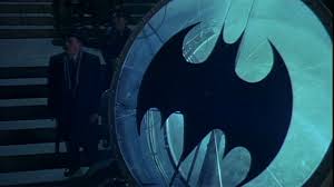
The Batsignal was too big...

images

Whatchoo talkin bout Willis?

No, coco was referring the logo on the stand and just clarifing for jayvee that the logo on the stand is accurrate to '89, not so much saying it isn't accurrate to Returns, but jayvee thought it was accurrate only to returns.

Yes, exactly, MF. :lecture

the returns insignia is the same one for the 89, just black and white, washed in snow.

the one on the base isn't even from the poster I don't think. it's this one.

I refer you to the above quote. :D

If the only thing people can complain about is the base and box it must be a pretty fantastic figure. :lol

:rock That hi-res shot looks amazing.
 
I hope that the figure shown at the con is a production piece, if so, then it looks like the cape came out as good in production as the prototype. I had concerns they wouldn't be able to make the production cape look as nice being leathery and not cloth.
 
Back
Top