Hot Toys DX09 - BATMAN - Batman (Michael Keaton) - Specs & Pics

Collector Freaks Forum

Help Support Collector Freaks Forum:

This site may earn a commission from merchant affiliate links, including eBay, Amazon, and others.
On my thread in the art section, on the second page I have posted some pics of this situation, including the tools I used to make the proper fit for the rods, hope it helps.

Thank you!

I just checked your way out... however, mine inside cape doesn't look at all like yours... i will post pics later... it's like both sides have small stitched in rectangles with no opening at all.

M.

 
IMG_4477.jpg
:horror:horror:horror
Hot damn man that's gorgeous.

I ____ you not

I just spent 1 1/2 hours futzing with his cape and I ended up with the same look from when I started. :lol

:rotfl:rotfl:rotfl:rotfl
That made my day.
 

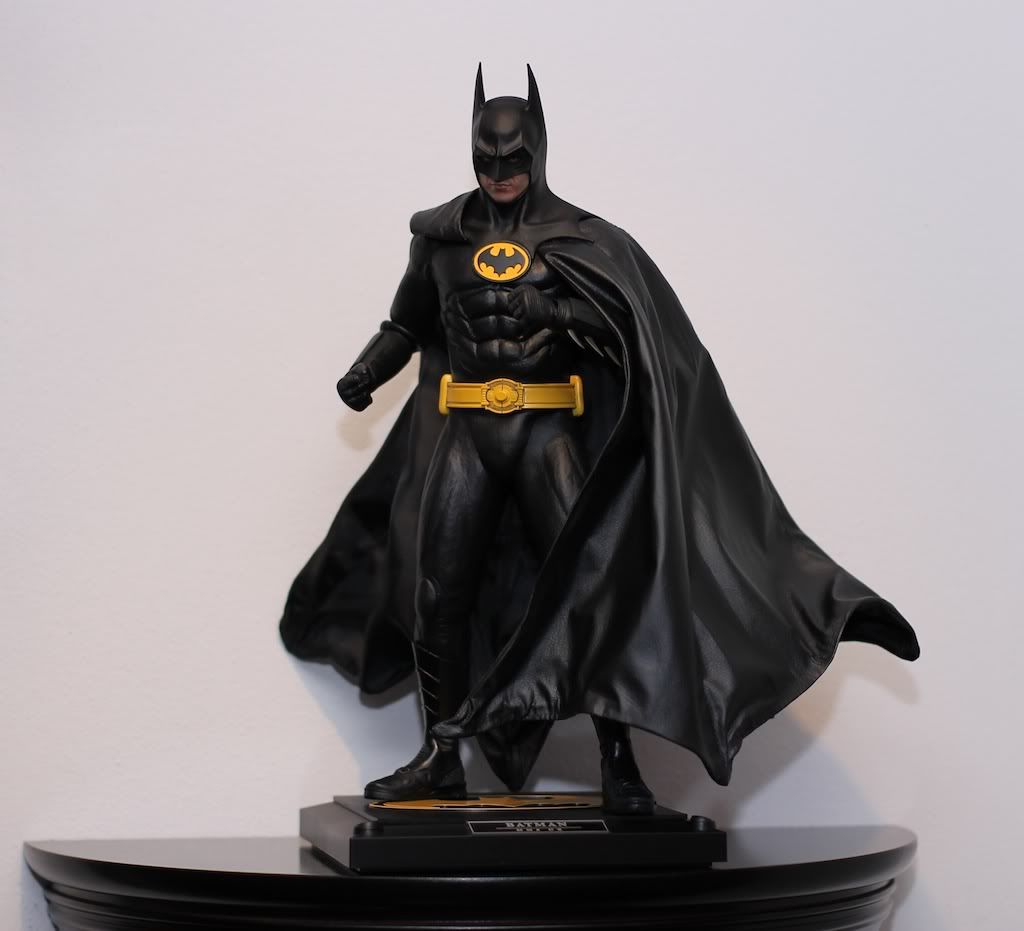
I'm not going to lie, even though the display base looks like it's more from Returns now, i think the subtle look instead of the bright yellow... honestly looks much more appealing... and i had no issue with the yellow until i saw it a different way.

Your cape futz looks great too!

Just need to line up the seam with the two front cowl scallops and it would look perfect! ;)

M.
 
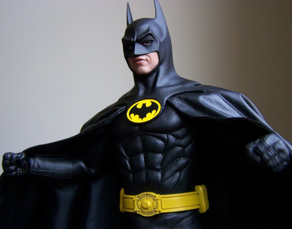
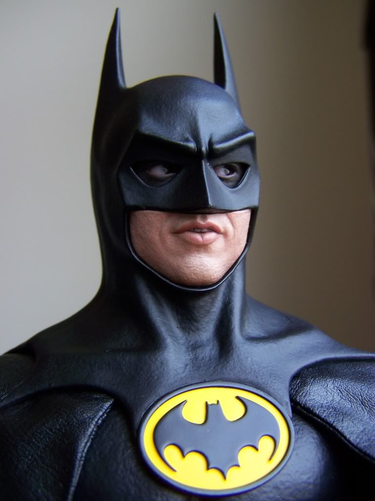
Since this thread was already flooded with pics i had no intention of posting any... but i kind of like these two:

100_9512.jpg


100_9515.jpg


M.
 
I'm not going to lie, even though the display base looks like it's more from Returns now, i think the subtle look instead of the bright yellow... honestly looks much more appealing... and i had no issue with the yellow until i saw it a different way.

Your cape futz looks great too!

Just need to line up the seam with the two front cowl scallops and it would look perfect! ;)

M.

It's hard to line the seams up and still have it coming down far enough in the front to be almost flush with the logo. Chose the lesser of two evils. :lol

As far as the logo goes, I was actually going for more of the granite/stone look from the opening titles than anything from Returns, but after I did it fully in gray, it didn't have the contrast I wanted, so I re-did the bat itself.

Yeah, you'd have thought that HT would have lined these up better... oh, who am i kidding, they didn't give the T-1000 a trigger finger left hand and the hands the did give him were the size of the ones people wear at sporting events. :p

As far as the base goes... either way... i like the outcome you got!

M.
 
Thanks, I appreciate it!

Truth be told I almost destroyed it. Did a first paintjob on it, but wasn't happy, so without thinking I stripped it with alcohol which basically turned the black plastic everywhere but the bat symbol itself white. Soooo yeah...had to do a complete overhaul on it.
 
the one thing I dont like, and maybe its just my figure, is this god awful left over plastic at the bottom of those capsules on his belt, wish those were not there...

I didn't have this either, but i do wish they would have made it so you could move the capsules closer to the buckle, or included a second belt with the capsules closer to the buckle.

All the TDK Bats had two belts for different purposes...

This one only came with the one and the capsules are too far apart.

M.
 
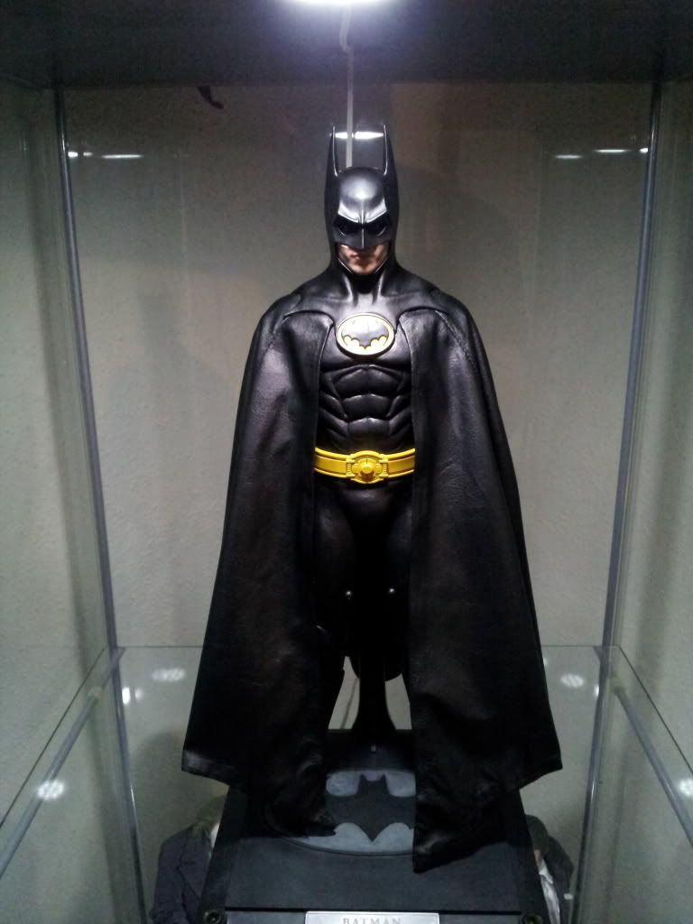
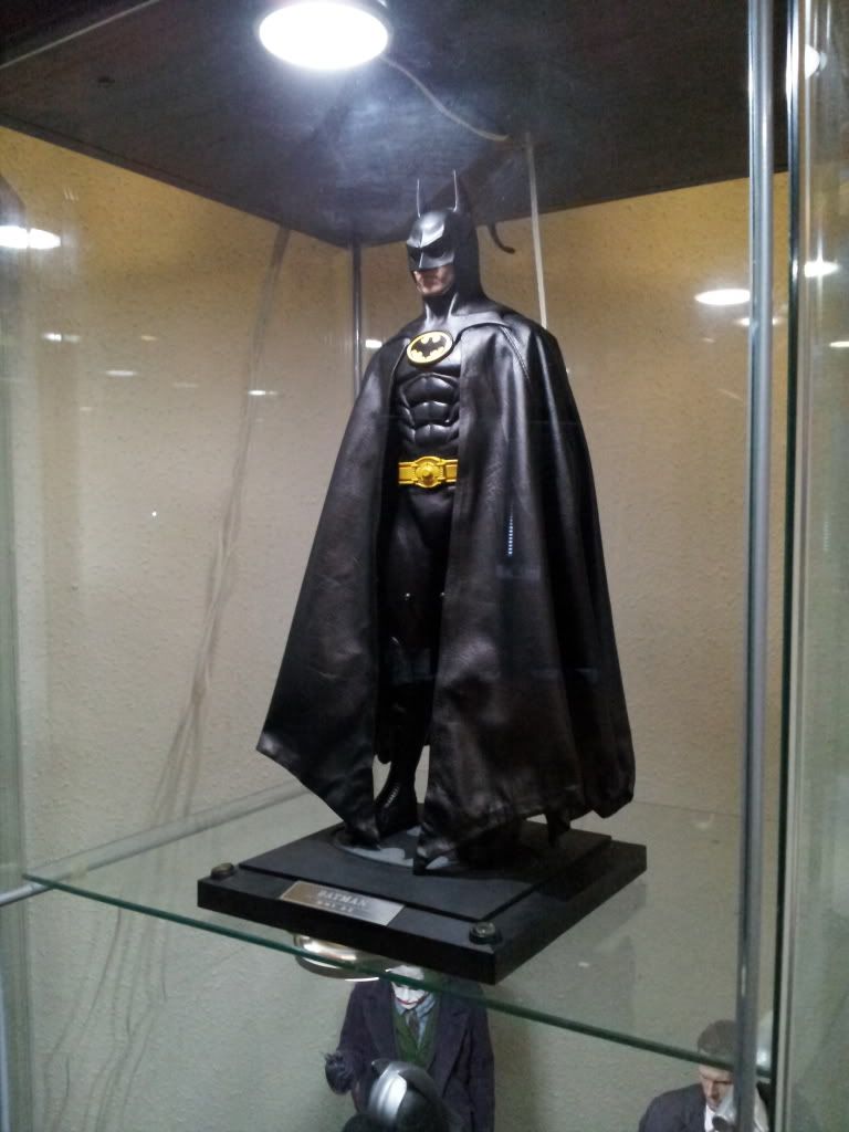
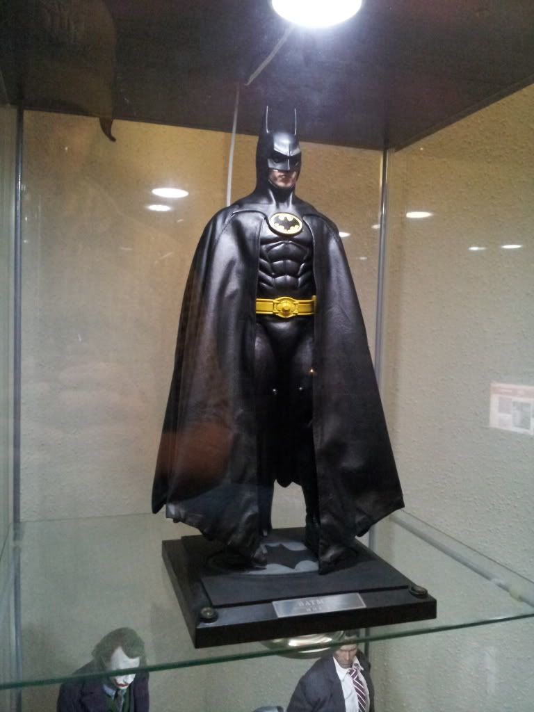
Couple of pictures from another angle, not just from straight on, showing the cape and how I have it displayed. Yes, I do need to clean my Detolf glass. This will give you a better idea of how it looks in person.

keatman1-1.jpg

keatman-1.jpg


I'm still not 100% happy with how far out it flares at certain points, but I don't think it's possible to have it lay any flatter and have it look natural overall rather than just the front. Plus it looks like actual wings, which I like.
 
Just noticed your base emblem, cr0w. I like it. That's how I thought HT would do it. Subtle and classy.

Cr0w did a really nice job, but it looks like it belongs with the Returns figure. Grey doesn't belong with this display imo.

I never thought I would say this, but I actually really like the base as-it. Am I the only one? :huh


can someone please explain to me what it means when someone says they "futz" a cape? what is futz?

To play around with it, rearrange, fiddle with, move until satisfied with.

Yeah, what he said.


Here's a few shots I took today with my Iphone.

B20D3FFC.jpg

52B397A3.jpg

Nice work there! Looks just like Cr0w's! :clap
 
Great pics. How'd you get get the cape to flow so well without looking like it's bunching up or having so many creases/wrinkles?

Couple of pictures from another angle, not just from straight on, showing the cape and how I have it displayed. Yes, I do need to clean my Detolf glass. This will give you a better idea of how it looks in person.

keatman1-1.jpg

keatman-1.jpg


I'm still not 100% happy with how far out it flares at certain points, but I don't think it's possible to have it lay any flatter and have it look natural overall rather than just the front. Plus it looks like actual wings, which I like.
 
You basically just have to pull it taut and fold it into itself, think of how you crease a pair of slacks. Just do multiple creases and fold the wire at the bottom to hold the creases in place.

Maglor: Honestly, I would rather have the original base back. But, me being me, I utterly destroyed it in the process of improving it, so I had to repaint it or else it would look like Batman was standing on melted plastic.
 
Maglor: Honestly, I would rather have the original base back. But, me being me, I utterly destroyed it in the process of improving it, so I had to repaint it or else it would look like Batman was standing on melted plastic.

Now that you have the Bat painted black, what about painting the grey part yellow? That would give you the un-inverted black and yellow symbol?

00779.jpg
 
I was thinking about it, or doing like a metallic bronze/gold to mimic the movie poster, but it's so hard to get paint to stick to this plastic, even with primer, that getting an even coat of either paint would be a nightmare. Yellow is watery as hell as a rule, and any metallic paint would have to go on too thick. It's similar to painting a Transformer, and I'm not sanding the whole thing down and priming it. I've spent too much time on it already.
 
Back
Top