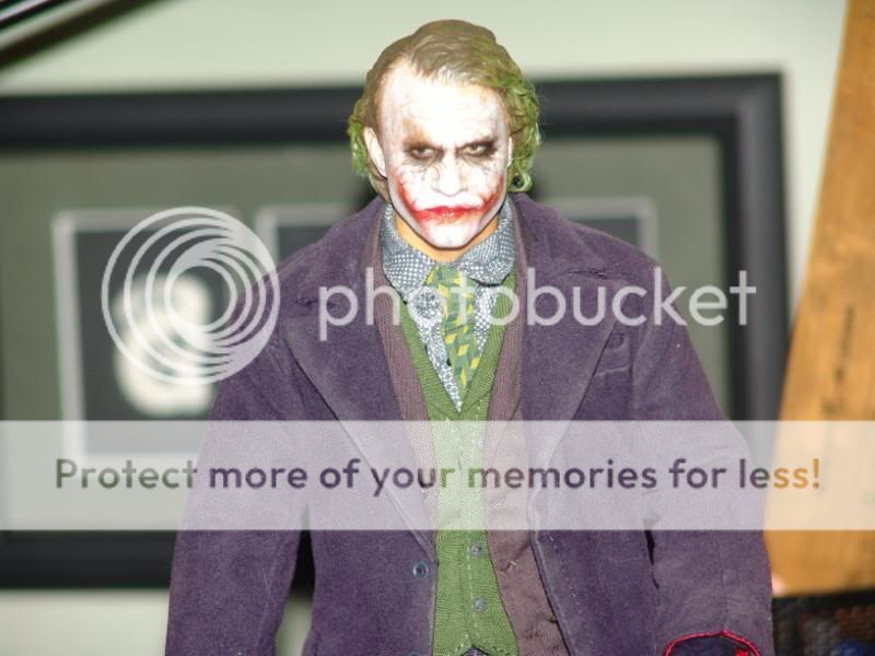
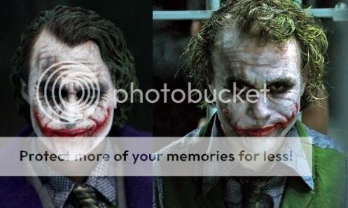
Hot Toys - MMS DX 11 - TDK: The Joker 2.0 Collectible Figure specs and pics

Collector Freaks Forum

Help Support Collector Freaks Forum:

This site may earn a commission from merchant affiliate links, including eBay, Amazon, and others.
The DX11 looks real, whether or not you think is accurate to Ledger is up to anyone and what they see. Who are you to tell them any different? :huh

I am just expressing my opinions and giving you reasons why people might think Enterbay's is better because it does look very realistic compared to this one IMO. Most of Yullis sculpts IMO are missing something that makes them look real, but that's just my opinion. The bank Robber Joker looks more realistic than the 2.0 normal one IMO.
 
I think that the best way to judge the Enterbay Joker is to cover the top of his head and eyes. You should be able to see Ledger's likeness without the eyes, yet it's almost nonexistent. I think that viewing a sculpt from the nose down actually allows you to judge it better. I actually see more of the jaw inaccuracies without the eyes than if I'm looking at it in it's entirety. It also allows you to truly see its potential. The likeness is there, it just needs refining.

Maybe your right but the only thing I can see that Enterbay got right was the shape of the jaw. TBH I hate the eyes on Enterbay's one, they look too small IMO.
 
Skin texturing doesn't mean the sculpt looks more real unlesss you look up close because you can not notice skin texturing on 1/6 figures unless you look up close. Your right though, Adam has even admitted he finds doing skin texturing hard to accomplish.

I don't know about cartoony but in the same ballpark, the normal 2.0 sculpt does not look realistic to me. The laughing one does though. Then again Ledger pulled cartoony expressions so that is maybe why I think that. :dunno

Skin texture does mean more realistic. I guarantee that if Adam sculpted the same 2 expressions but put the time into added skin texture to one and not the other, you will find that the one with skin texture looks more realistic. From what I gathered from your post, you were saying how Adams is more realistic b/c it looks like Ledger to you than the DX11. However, looking more like Ledger doesn't mean it's more realistic, it's means it's more accurate.

Also saying that the HT one looks cartoony is like saying it looks like this:
review_dk1_8.jpg


I am just expressing my opinions and giving you reasons why people might think Enterbay's is better because it does look very realistic compared to this one IMO. Most of Yullis sculpts IMO are missing something that makes them look real, but that's just my opinion. The bank Robber Joker looks more realistic than the 2.0 normal one IMO.
I get that you are expresing you're opinion which I by no means have an issue with. Where my issue lies is with your very last sentence of that post.

People get confused with realism and likeness, they think if something looks more real than they think it looks more like the person, even if it has severe flaws with it.

The way this is put makes it sound like you're saying that you are right and they are wrong for thinking that the EB sculpt is better. What ppl like and what they think is better is all up for grabs. No one is right and no one is wrong. Which is why I said "who are you to tell them different."


I'm not trying to attack you or anything but that just ground my gears. :peace
 
Last edited:
this joker is so much better than enterbays. its hard for me to even compare them.
enterbays just looks so bad. and has like no good accessories.
 
Void it it is also blue on you tube and remember they changed the purple Kato shirt to a blue shirt for this Joker.

Then again, the coat was purple in the teaser pics so I dont know what to think. :dunno

I saw it in person at SDCC. It's definitely purple.

Also saying that the HT one looks cartoony is like saying it looks like this:
review_dk1_8.jpg

Cool Beetlejuice figure, dude.

Oh, wait...
 
Skin texture does mean more realistic. I guarantee that if Adam sculpted the same 2 expressions but put the time into added skin texture to one and not the other, you will find that the one with skin texture looks more realistic. From what I gathered from your post, you were saying how Adams is more realistic b/c it looks like Ledger to you than the DX11. However, looking more like Ledger doesn't mean it's more realistic, it's means it's more accurate.

Also saying that the HT one looks cartoony is like saying it looks like this:
review_dk1_8.jpg


I get that you are expresing you're opinion which I by no means have an issue with. Where my issue lies is with your very last sentence of that post.


The way this is put makes it sound like you're saying that you are right and they are wrong for thinking that the EB sculpt is better. What ppl like and what they think is better is all up for grabs. No one is right and no one is wrong. Which is why I said "who are you to tell them different."


I'm not trying to attack you or anything but that just ground my gears. :peace

Maybe I am saying it in the wrong way then, but I believe because the EB sculpt looks more real than HTs one that is why people think it is better.This is because nearly every comment I see about it is how real it looks. It does not look better to me but that is my opinion.

You are right when you say skin texturing is more realistic but my point is you can not see it on 1/6 figures so there is no point in mentioning that unless you look up close.

Showing a picture of an abstract cartoony toy is insane, since their are levels of realism. A lot of people say PERS makes a figure look cartoony.

I don't know maybe more accurate then, all I know is that this looks realistic to me. Hot Toys one does not IMO.


DSC04294.jpg


:peace
 
Last edited:
People thought it was blueish purple and not the right color purple like Enterbays one is.
it never even looked at all blueish to me.
and i like the color of hot toys one better than the color of the enterbays one.
enterbays one is too dark.
 
It won't, because it's not an accurate example. The make-up + lighting in that pic is making his jaw look less wide than it actually was.

Here's what I mean:

56283846.jpg


10215781.jpg

Devil not you to.

It's not the width, its the shape, do you see how Hot Toys 2.0 is shaped like a heart. The jaw should be fatter yes, but only where the scars are.

Enterbays one has the right shape but it is too thin.

I have always said that the Joker 2.0 jaw is not chubby enough, despite that it is wide.
 
No offense, but weren't you the guy who got PO'd and said he wasn't coming back to this forum?

[ame]https://www.youtube.com/watch?v=_o8gxFGAh9w[/ame]
 
I have no doubt at all for this figure, plus is kato clothing... Im really glad po this one.. Now im just confused which hs should i put .. The normal or the laughing Since both are trully amazing... Any idea guys ??
 
Back
Top