Hot Toys MMS233 -Predator 2 - 1/6th scale Elder Predator 2.0 Collectible Figure

Collector Freaks Forum

Help Support Collector Freaks Forum:

This site may earn a commission from merchant affiliate links, including eBay, Amazon, and others.
Comparison of the updated proto/original proto (for visual reference):

o3m7.jpg
They both look awesome but the left one is way more movie accurate.
What's pictures? This pictures? :lol

b92724ae1928ee0c17fe51dc49f5c7ed_zps2945744a.jpg


4c70ec2f4c8feb41e37ea0a1e16df468_zps661c2ca3.jpg
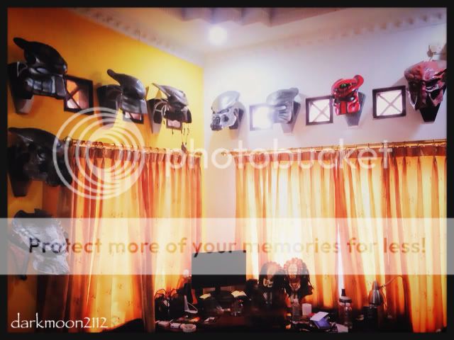
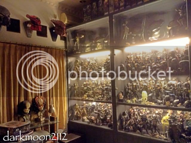
Showing off that sweet collection of yours :lol Always enjoyable to check out :clap
 
Yeah thats is super crazy.:clap

:lol

Hit u guys later, merry christmas
Its been real darkmoon

Thanks bro, marry christmas to u too :1-1:

They both look awesome but the left one is way more movie accurate.

Showing off that sweet collection of yours :lol Always enjoyable to check out :clap

Thanks a lot brother xeno, you're the man :1-1:
Can't wait to make the bone grill mask and develop the conversion kit for the ancient asia (mask, alien thropy and chest armor) :exactly:
 
Now i'm thinking to have the right one :monkey3

The right one could be a younger version of the left one. :lecture

I do not understand the price, It has no second set of mandibles, no extra arms, no weapons, no extras, no nothing, the only thing is that it one of the most loved predators. :dunno

Love the new version. If there are no delays, here in Spain I can get it if I am lucky in Xmass 2014. a year :impatient::monkey2
 
This is when all of you guys are going to complain about how the head sculpt (forehead wise) was smaller on the first one. Ummm, hello? Can you guys not see that the new head sculpt is smaller and a lot more accurAte when it comes to the forehead area? :slap

In reference to forehead, we refer to the entire crown not just the lighter part or shape of the open area...but everything above the eyes...especially vertically...

The older ht prototype head is also angled down more showing more top half, while the newer prototype head is angled up a tad, still showing the same amount of total real estate above the eyes vertically, because it seems slightly steeper in appearance.
In terms of being accuracy, according to film sculptor Steve wang, the newer (pred 2) preds' crowns were angled more steeply foreword, as an intentional aesthetic change from p1, ( which is why his cinemaquette predator sculpt looks to be more like a p2)
plus Stan Winston character artists decided that the individual predators had distinct markings on their heads to distinguish them.
 
Last edited:
I do not understand the price
-sword and sheath
- LOTS of accessories on the head
- ribcage shoulder bag (or facehugger fingers shoulder bag as a drug eater tsang made it)
- unique belts
with all of these he should be way more expensive than ****ty new P2 which had no new accessories except for a breather mask far worse than the one already made before.
 
Good old plastic sword from previous figures.

- LOTS of accessories on the head
Yet not all of them. And pretty sure those are just one-piece rubber from old release.

- ribcage shoulder bag
Again cheap rubber piece.

with all of these he should be way more expensive than ****ty new P2 which had no new accessories except for a breather mask far worse than the one already made before.
Aaaaand this is where continuity of logic fails completely...
 
you tore the idea apart (turning "sword and sheath" into just "sword" is the brightest example), collaged the parts into your own thoughts and ****ted on them. see the point? what you made of pieces was so stupid that you noticed that yourself :D
the idea was:
- he has no accessories
- no, he has lots of new and/or unique accessories, compared to other tsang versions of Winston predators


what if i divide your nickname, through away a part that i didn't get and say that it's stupid to call yourself DIСK? :D you did the same.
 
Last edited:
Comparison of the updated proto/original proto (for visual reference):

o3m7.jpg

I don't see any similarity between the new sculpt and Scar:

6bir.jpg


Other than the obvious (they're both Predators). And it has nothing to do with lighting or how the heads aren't in the exact same position.

Doesn't resemble Celtic or even the latest P2 City Hunter sculpts either. This newest version is actually one of the best Predator sculpts I've ever seen from HT. Wonder if another artist at HT stepped in and did it!? That would be funny if Tsang got the boot from ever working on Preds again. :lol

nice one. :yess:
the initial and latest pics do vary. they look GOOD. no complaints about that. but not life changing or anything.haha
one cant help but speculate the artist's rendering methods.:lol

the latest pic still hints scar to me. the forehead gives it away, i think. i must be nuts. tweaked eyebrow creases, paint scheme and mandibles down its looks like the base mold.
 
messing with my old version Grayback. he's nice but ugly and totally not movie-like in spite of all armor repainting, blade box replacing and so on.
at least one thing except for all better skin paint is fixed on the new one: the mouth line.
old one looks like new Joker - mouth cut with a knife ))
new figure will be better in every aspect except for armor color, which can be fixed.
 
You forgot head shape :lol
no, i meant what i said:
new figure will be better in every aspect except for armor color.
"every aspect" totally includes head shape, because that doplhin head with sad eyes, based on worst HT predator figures - old "avp" series - had only one good feature: mandibles shape and position.
that thing is good on the new one, and head shape is slightly better than it was before.

darkmoon is again obsessed with elongated items being too small (he mentioned that problem of his mind for lots of times already), but i don't think a person who calls a Thomas br. predator "elder", considers himself for a fan and doesn't even try to modify his numerous HT abominations,has anything sane to say at all about this figure.
 
Last edited:
Who cares? Wrong head shape is wrong regardless, so it's not better in EVERY aspect.

I like it anyway, just saying :lol
Wouldn't PO otherwise...
 
Who cares? Wrong head shape is wrong regardless, so it's not better in EVERY aspect.
better head shape is better.
that bulb of previous HT Grayback makes me sick. second variant, while obviously based on the old one, is still slightly better.
10 more attempts and it will be even more slightly better :D
still agree with some members that the first tsang variant of head's dome looked closer to the movie one.
and the answer to your question is "i care" :) i don't buy uber stupid ezios so have to stick to dull variants of excellent characters )
 
Back
Top