BrilliantJust brilliant

I love it

Awesome pic Sabrina!!!
Nice work sab4279

Thank you!!! You all rock.


BrilliantJust brilliant

I love it

Awesome pic Sabrina!!!
Nice work sab4279


Thank you!!! You all rock.
 :
:Must... Resist... Bat Armory...
This is still my favourite suit, but damn it looks crap in comparison to AOU version.
Would pick up a MOS body if i could as that seems to make a massive improvement

 O know we're talking Cap here but Supes looks amazing

Here's a comparision of a moded suit (original body) with MOS side by side. I doubt if you can fit the MOS body - the arm piece is very tight.
If you can make the original cap body drop the shoulders, he's got good proportions and looks similar to AOU cap. Though I had to partially damage the suit to get this (so I wouldn't recommend it to anyone), I am happy with the way he looks now.
View attachment 187721
Thanks for the info buddy, thats a wicked pic by the way.
Cap is looking awesome! was it literally just sorting the shoulders out?
That was achieved by the fat suit removal + dropping the shoulders + chest padding with a pair of plastic spoon heads and some cotton.
For lowering the shoulders, I had to cut the rubber like blue suit inside to get those to drop - but I don't recommend it. In certain poses like this and anything where the arm is raised, I can hide the damage. But if I drop the arm completely, the gap in the shoulder shows up.

They just padded the suit differently, pretty quick and easy fix.
...
Yeah but the suit on the proto was on a bigger body, whereas the suit on the AOU is on the same body but they padded it to make certain areas bugle out like the chest. The AOU version still lacks muscle definition around the shoulders and torso it is all padding that is making the torso have a V shape look.
...

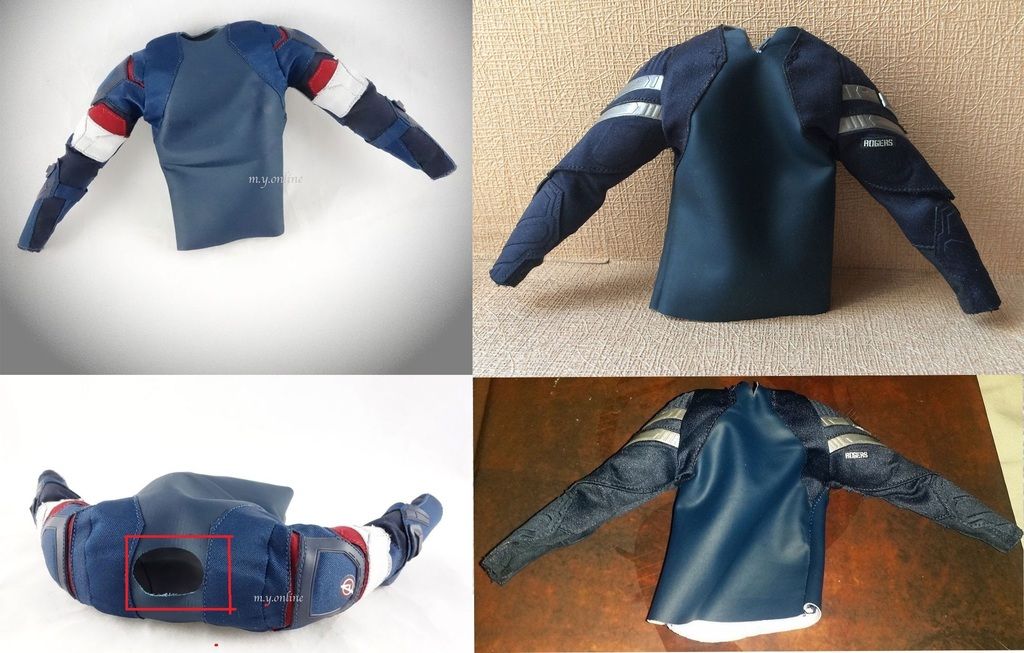
I did a bit of research on this some time back. Pics below are from ebay postings. It is the way they have stitched the arm piece to the blue rubbery shirt inside that makes a big difference. The one on AOU has enough space to allow the shoulder to be lowered. But the one on TWS one is like wearing a shirt that is too tight
I did a bit of research on this some time back. Pics below are from ebay postings. It is the way they have stitched the arm piece to the blue rubbery shirt inside that makes a big difference.


The one on AOU has enough space to allow the shoulder to be lowered. But the one on TWS one is like wearing a shirt that is too tight

It sucks that they'll probably never go back to this figure but I really can't help but keep getting reminded of HT dropping the ball on his costume, especially when I had him next to my AoU Cap. I had to move him somewhere else
Here's a comparision of a moded suit (original body) with MOS side by side. I doubt if you can fit the MOS body - the arm piece is very tight.
If you can make the original cap body drop the shoulders, he's got good proportions and looks similar to AOU cap. Though I had to partially damage the suit to get this (so I wouldn't recommend it to anyone), I am happy with the way he looks now.
View attachment 187721
You can def put this on the MOS body but its tough. HA but very worth it.
So even though the vest can't be zipped up, the belt and Harness prevent it from moving?
Yes sir. Or at least it has with mine.