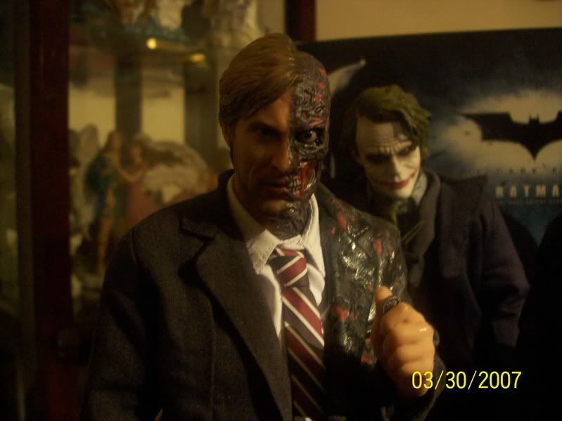
Hot Toys - TDK - TWO-FACE / Harvey Dent PHOTO Thread

Collector Freaks Forum

Help Support Collector Freaks Forum:

This site may earn a commission from merchant affiliate links, including eBay, Amazon, and others.
Yes you can use acryl to do that! FIrst you have to wet the collar and a part of a shirt and then add some collor dilued in water! I don't knwo if it's clear! My english is not that good!
Also i repainted mine and did a custom suit! I used burnt amber and then repainted it!
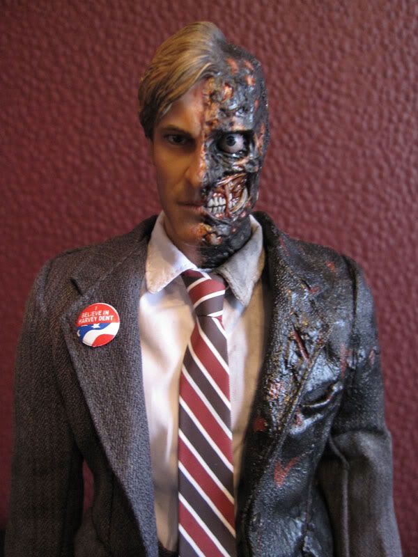
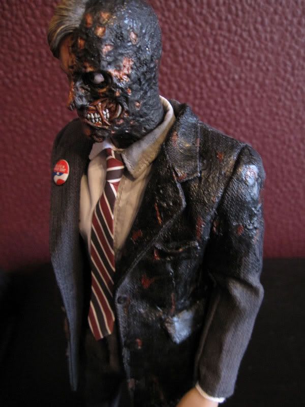
IMG_0373.jpg


IMG_0377.jpg

That's bloody fantastic. Good work.
 
Can't say I like the "skin technology". To me it looks cheap... but in my eyes the Two Face head is just flawless. Perfect likeness and detail. Theres no need whatsoever to alter this in any way, its just a good way to ruin a 200 dollar figure's head.

the Eckhart likeness on the fll Harvey face IMO is a little off. Its just weak. You can tell its him but its not as convincing as the half face. There's just something not right. Its one of the worst likenesses in the line.

An opinion which could not be more OPPOSITE to mine. How does the skin technology, detailed pores and stubble etc, look 'cheap'?!! How could it appear more cheap than figures of old whose skin was completely smooth, even shiny?

And to my eyes it is the all Eckhart likeness that is superior and also the best likeness in the line alongside BRJ.

Subjectivity is a funny thing.
 
I can't see any difference between Eckhart's likeness on the Two-Face head and the Harvey head. All I notice is that the Harvey head is a bit to angry and expression and maybe that throws off the likeness for some, that he's not the smiling, upbeat, pretty white knight of Gotham.

As for the "cheap" look of the new skin, I'll agree that under some lighting conditions, it looks less realistic than how the Wayne heads were done. Those catch light in a very realistic way pretty much in any condition but this new style can have a strong plastic look to the way light falls on it depending on the lighting conditions.
 
As for the "cheap" look of the new skin, I'll agree that under some lighting conditions, it looks less realistic than how the Wayne heads were done. Those catch light in a very realistic way pretty much in any condition but this new style can have a strong plastic look to the way light falls on it depending on the lighting conditions.

That's probably the "waxy" look I referred to several pages back. I have a feeling this will be a matter of seeing it in person before passing final judgment on the new skin technology.
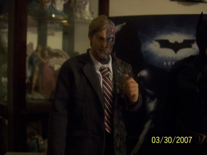
 
That's probably the "waxy" look I referred to several pages back. I have a feeling this will be a matter of seeing it in person before passing final judgment on the new skin technology.

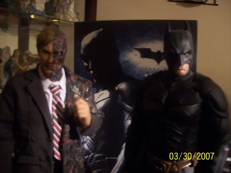
In the right lighting, it's great, I think it takes things even a step further, but in the wrong lighting, it's like a step backwards, so my overall opinion is, the manner we've gotten used to from Hot Toys over the past couple years is the more consistent look, and while Harvey's style takes things a bit further, I don't consider it so much better than how say Bruce heads were done as to be an issue to go back to that method for now. I favor HT continue to refine this new method, but in its early stages it's a little weaker than the previous technique.
 
100_0888.jpg

Two-Face: Even though I hate you Bats.. I gotta say, we're looking pretty good.
Batman: Yeah. I mean, well.. well you know.
Two-Face: Yeah I know half my face is gone..
Batman: Well.. yeah.. I um.. I didn't want to..
Two-Face: It's obvious. No need to keep bringing it up..
Batman: Well I didn't want to SAY it though.
Two-Face: It's cool..
Batman: But yeah, we're looking preeeeety good..


100_0889.jpg

V.1 Joker - HEY GUYS!!!


100_0890.jpg

Two-Face: ugh.. who invited HIM?


:monkey3
 
They may not be as polished as some other shots in this thread, but they do seem to have a very real quality to them. What I mean is that I get the sense that those pics really convey what the figure actually looks like in-hand, and that is extremely useful to those who are curious about it.
 
100_0890.jpg


This one really illustratest the versatility of the sculpt. While it's stern expression, camera angle and lighting can really change how it comes off, he looks ready to explode in anger on someone here, this is the most pissed off I've seen this figure look and it's fantastic.
 
This one really illustratest the versatility of the sculpt. While it's stern expression, camera angle and lighting can really change how it comes off, he looks ready to explode in anger on someone here, this is the most pissed off I've seen this figure look and it's fantastic.


Indeed it does.

Although, Sean, the lighting of the Two-Face picture in your avatar brings out a truly psychotic and crazed expression on the figure.
 
22.jpg


Indeed, this is the full image in my avatar, it does have a psychotic feel to it, but not the same burning intensity. The shadows in Zeelhar's image really convey a stressing of the sking on both sides of the face as if all the muscles are tensing with his restraint of his rage.

One thing I love in TDK is how the scarred side, even though mimicking the clean side's antomical movements, always looked a different emotion than the clean side, even just staring, the Harvey side would look pretty calm where the burnt side would have an almost burning anger to it, great work by the CGI team on Two-Face.


Y'know what it is...it's the cropping and darkening of the pic in your avatar because I don't get the same vibe from the full image.

I completely agree with your opinion of the cinematic Two-Face. That was some of the best integrated and photo-realistic CGI I've seen used in that capacity.
 
Indeed, ignoring the absurdity of the wounds themselves, the CGI was, dare I say, flawless. The motions looked synced properly, there wasn't anything animated looking about the motions of it, it always looked as though it was really there, if you walked on set Eckhart would look like that. I've always been critical of the realism of CGI on living beings, it's always seemed to carry a level of fake to it, but Two-Face is the first time I've had no grievances with the animation.

As for the photo, cropping can be key. That's one thing I love exploring with my photo work. Sometimes my best stuff is croppings of so-so images, you guys never see that. I think sometime, just for kicks, I may do a post showing off all the images I take and how many I would post here to see how much goes into just getting a handful of nice images to show off.

c i wish my pics turn out that good

Don't worry about it, there's nothing wrong with your images and the point is to have fun, you paid good money to have this figure, enjoy him however you like.
 
100_0888.jpg

Two-Face: Even though I hate you Bats.. I gotta say, we're looking pretty good.
Batman: Yeah. I mean, well.. well you know.
Two-Face: Yeah I know half my face is gone..
Batman: Well.. yeah.. I um.. I didn't want to..
Two-Face: It's obvious. No need to keep bringing it up..
Batman: Well I didn't want to SAY it though.
Two-Face: It's cool..
Batman: But yeah, we're looking preeeeety good..
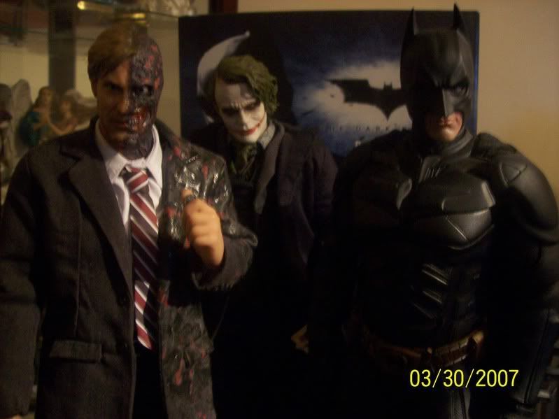


100_0889.jpg

V.1 Joker - HEY GUYS!!!


100_0890.jpg

Two-Face: ugh.. who invited HIM?


:monkey3

2007? :monkey5

Anyways nice!
 
Back
Top