Frostlord
Super Freak
'Almost exact' now
Haha ok well maybe not exact. But very very similar

'Almost exact' now
Still, it's a valid point. The main draw of this piece was the nice matt finish and the lighter pastel shades of red and blue. The red in particular seems more like a deep "Statue" red than the light comic book feel.
I'll wait for in hand pictures though before I get shot down by the people that just love everything and then get called a hater. As is the way. It's still a cool looking piece.
 to return this. Honestly, I could see myself keeping him and having a pro repaint him down the line I love the sculpt that much.
Well, as I've always said, I have no qualms about returning a piece if I'm not 100% satisfied. I really hope it delivers for me though in hand. I love this darn thing. It would make meto return this. Honestly, I could see myself keeping him and having a pro repaint him down the line I love the sculpt that much.
Not talking the paint. I'm talking the pose.
Still, it's a valid point. The main draw of this piece was the nice matt finish and the lighter pastel shades of red and blue. The red in particular seems more like a deep "Statue" red than the light comic book feel. This also had the benefit of making the sunken black pop out as opposed to now where the lines almost get lost into the sculpt.
I'll wait for in hand pictures though before I get shot down by the people that just love everything and then get called a hater. As is the way. It's still a cool looking piece.
Well, as I've always said, I have no qualms about returning a piece if I'm not 100% satisfied. I really hope it delivers for me though in hand. I love this darn thing. It would make meto return this. Honestly, I could see myself keeping him and having a pro repaint him down the line I love the sculpt that much.
I'm the same, although I feel let down that I have to pay again for something that Sideshow sold me the first time round. It just leaves a bitter taste in the mouth.
Again though, I'll have to see it for myself. All else fails I can go matt black myself over the whole statue.
It's be no means a bad statue, it looks brilliant, I just think the colour choice is questionable going from the proto. It was eye catching before, now looks just "solid".
Well, now the wait begins. I think I'll still be happy with him.


Hey wait ... You and I agree on something

As good as this looks that is what would be pissing me off if I had bought this piece. The flat paints made the proto look unique, and made it consistent with the ladies. Now this just looks like a mini version of the Original Com.
Apart from the fact that they're both on a wall it looks nothing like the original Comi.
Only thing I don't like the look of is the fingers.
'Almost exact' now
While I wouldn't say it looks exactly like the original, but it does look similar. Especially with the paint finish and lines being executed in such a similar way to the original. ATLEAST that is how it appears to me. The original flat paints were just better IMHO.

I love the sculpt and pose, but those are very fair criticisms of the paint. Like Jaws stated and the pics he threw up...I definitely preferred the matte shading and finish. I do feel like someone else said I was shown A and got B. However, it is still a great looking piece. It goes well with my koto and bowen spidey and soon to be PF grey hulk.
The sculpt on this was so awesome. That is why I ordered it. Only 1/5 I will have in collection. Glad the production pieces are looking great.
The planets do align sometimes
Spidey was referring to the paint apps being similar thus making the one thing that made this piece really stand out compared to the original a fail.
Hey Spidey does not think I was nit picking
I am very let down by the paint choice.... Hope I am happy with it in hand.... But I think the paint choice will have me frustrated.
Another pic.... The blue looks closer to the proto but the Red is still glossy and not what we were shown

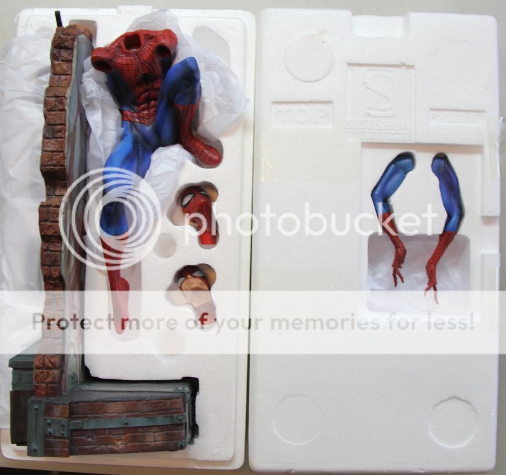
OK, Just got a chance to see the in hand pics that were posted. First the good stuff. He looks great. The pose and wall are well done. This hit JSC's art work dead on. If you like his art, this piece should make you very happy. Spidey looks very dynamic and the graffiti on the wall looks awesome. I believe Shu sculpted this. He did a fantastic job on it.
Now, things I'm not a fan of. Paint apps look to be a disappointment. As everyone is basically mentioning, the colors of the proto is what set this piece off. It's obvious that the production pieces aren't up to par with the proto paint apps. That's usually the case but the in hand pics certainly seem to show the same problems the original COM had. The webbing on his costume seem to particularly be hit or miss. It suffers from the same thick lines, no lines, blurred lines the original COM had. Besides the color change, the paint apps certainly don't appear to be as crisp and clean as the MJ or Gwen COMs were. After seeing the EX COH, I'm still not liking it. No biggie. It's just not my cup of tea. Lastly, not a fan of visible seams on a statue. Although, these seem to blend in pretty well.
Overall, it's a nice looking piece but I think SSC made enough changes to the paint apps to kind of shoot down what really set this COM apart. However, there's still a lot to like about it. It nailed JSC's art source. It is dynamic looking piece and it makes a fantastic addition to any collection. Congrats to all of you that are getting one. Hopefully those long fingers don't lead to a lot of broken pieces.

 I posted before I saw this in your response. we thinking of the same thing.
I posted before I saw this in your response. we thinking of the same thing.

Wow. Thanks man! New Spidey looks great. Old Spidey = supreme!