you can say what you want about everything else, but the head sculpt is on spot!


Last edited:


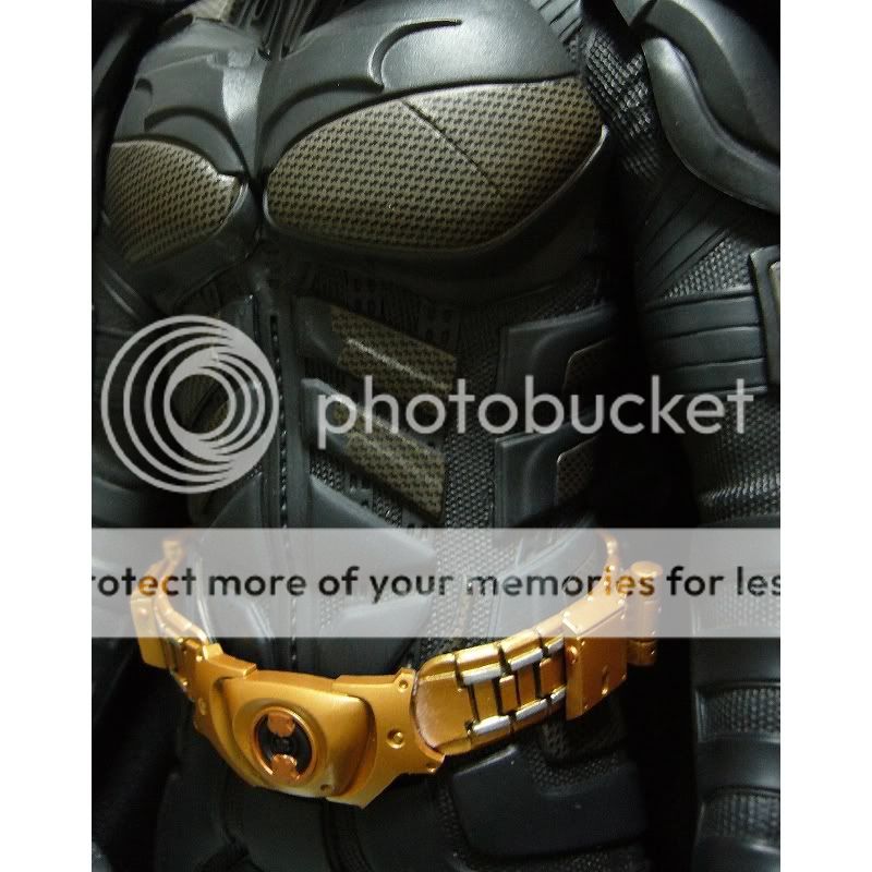
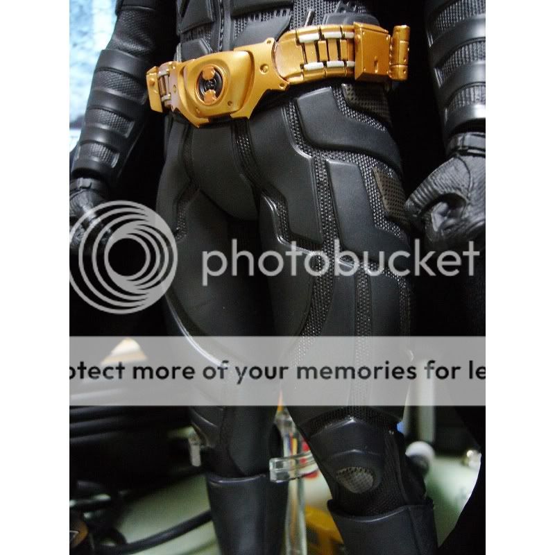
New pics from Toy-world. Credits goes to "lydiamomo".
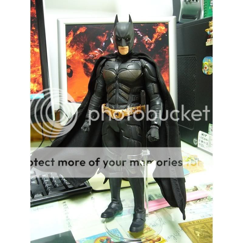
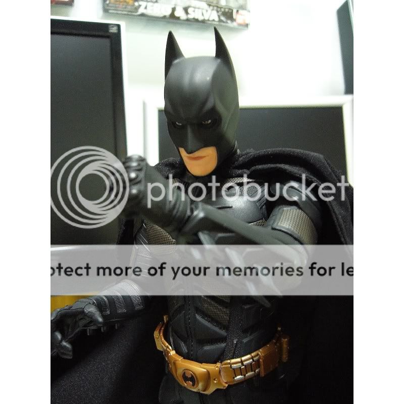
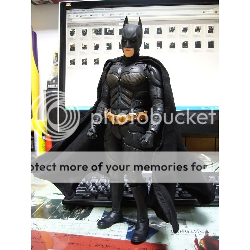
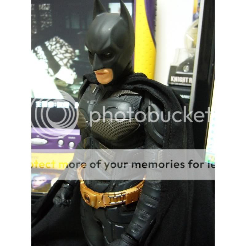
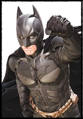
you can say what you want about everything else, but the head sculpt is on spot!
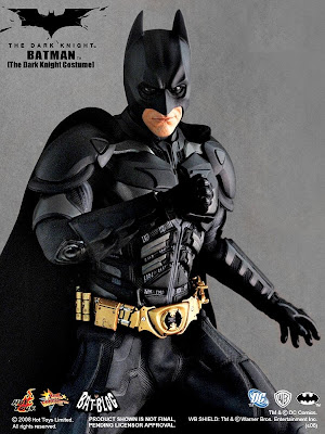


no seriously, just speaking about the headsculpt, it ain't off.

actually, the body sculpt is also quite goodbut okay, the way it looks, the choise of materials does look cheap.
But I for one, will buy this medicom TDK if Hot Toys will not come up with a DX version of their TDK.
And if the guy who took the pictures of his medicom would lower the belt as it should be, it woul make a much better impression + that cape of the medicom also makes a bad impression of the figure.


...then please buy a pair of glasses!


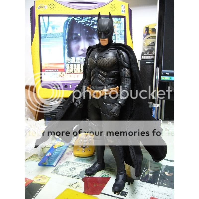
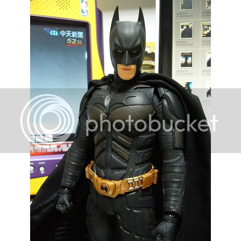
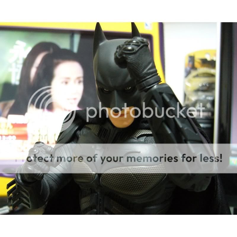
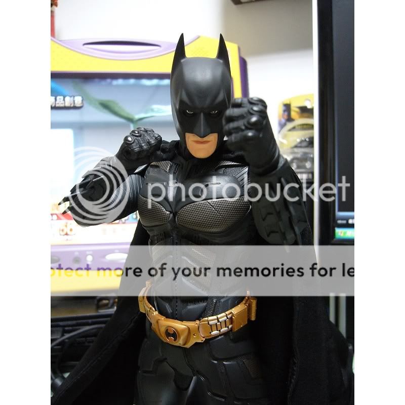
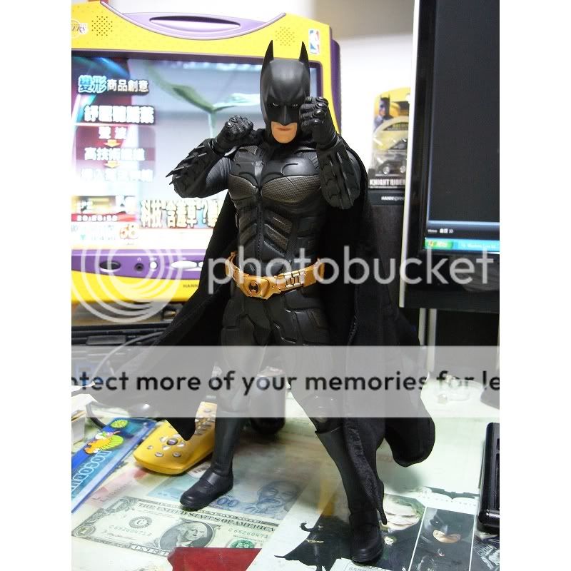
I agree the head sculpt is superior to the HT version. If it was cast in better suited material and painted better (so it doesn't look cartoonish) then it would really look exceptional.
However, I think HT will blow this out of the water with their forthcoming DX version. In fact, I don't think, I KNOW they will.
lol, THAT sculpt was the very first sculpt and it got rejected by everybody on this board, so bad example.
nono, I think some of you guys just don't wanna admit that the headsculpt is good!
and my eyes are perfect! I am very critical when it comes to detail that is why I haven't bought a TDK from hot toys yet. I prefer to wait until their DX version comes up and if not, I'd rather buy the medicom than the current Hot Toys batman.

again some new pics from "lydiamomo" over toy-world:


the upper-body looks ok, but his legs and headsculpt... I'm not liking it... not...a...bit!
ok...you buy it, and enjoy it. if you prefer it, then...buy it.
but for me, i cant stop but stare at my ht dk on my shelf, because it think it's spot on
good choice of a comparison photo, since you CAN'T see the mask...it's covered in SHADOWS!!!!

Imagine a custom slimline cape...a hot toys belt and some good posing and this figure would look really good. His shoulder pads seem to be floating in mid air and I really dont like the stitching seam that is running down the front of his body but apart from that I think this looks rather good!!
either way the proportions just don't seem right to me. And although it could be fixed, the paint on the mouth is way too flat and 1-dimensional.
Enter your email address to join: