Xeno Junkie
Super Freak
- Joined
- Oct 31, 2013
- Messages
- 1,694
- Reaction score
- 591
https://twitter.com/jaklynfior84/status/674315044969185280
Sent from my SAMSUNG-SGH-I337 using Tapatalk
Wow thanks!!! Looks outstanding!!!

https://twitter.com/jaklynfior84/status/674315044969185280
Sent from my SAMSUNG-SGH-I337 using Tapatalk


https://twitter.com/jaklynfior84/status/674315044969185280
Sent from my SAMSUNG-SGH-I337 using Tapatalk
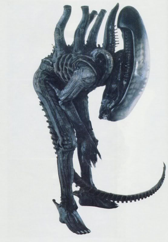
As for the lips, if I can snag one I'll definitely be darkening them up a bit. They just seem too white to me. And I'll probably darken the front of the dome as well. I always thought knowing the skull was under there was cool, but I don't like how every piece of merch has to blatantly put it on display when it was pretty much impossible to see on screen. Having it on full display kinda removes some of the mystery of a "faceless" creature.
I see a lot of people saying the ab-crunch is a bit weak. I'm not too concerned, because I was planning this pose since it has the relaxed lips.

I would assume that pose is possible. Anyone want to reassure me with a pic?
As for the lips, if I can snag one I'll definitely be darkening them up a bit. They just seem too white to me. And I'll probably darken the front of the dome as well. I always thought knowing the skull was under there was cool, but I don't like how every piece of merch has to blatantly put it on display when it was pretty much impossible to see on screen. Having it on full display kinda removes some of the mystery of a "faceless" creature.


Mich better angle pretty much identical
Sent from my SAMSUNG-SGH-I337 using Tapatalk
Nice vid from a fellow Tennessean.

I would assume that pose is possible. Anyone want to reassure me with a pic?
I very much doubt that pose is possible.
Much better angle pretty much identical
Sent from my SAMSUNG-SGH-I337 using Tapatalk

I like it, I figured it was the color that made it look so weird. I actually like both versions, the white looks kind of crazy looking. I think anyone that didn't like the original look should do that. Killer jobI always seem to custom a little on every figure. The smaller the custom the better the figure. The power loader got the metal grate top from the cloth. The dog alien got a repaint all over (sculpt was incredible ) but on the big chap the white tendons were bothering me. So gave them a grey brown tone. Small but world of difference before and after. View attachment 228190
I will probably get the alien 3 7" figures and some of those micro machine things lol. But really I want the other 1/4 alien so bad. The 3 side by side. I don't know what else I could want from this world