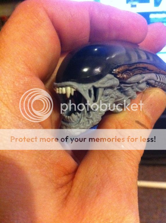
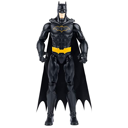
made some amateur photos of Isolation figures.
the alien itself looks nice, though not easy to pose into something close to his game walk. plus he is painted like A1 should have been painted (which is plain black with terribly white dome for some reason).
and due to his devil legs he is GIANT next to Ripley.
who is a beautiful figure herself.
Ripley had no quality issues (if only her palms don't break off).
Alien had terrible issues with his face - his tongue was stuck to the lower jaw, after unglueing it still hands badly. the jaw itself sits not properly, and the dome goes too low, covering the lip completely, though this way he looks like the game variant. may be it was intended.
the size of figures makes flaws easy to ignore and the figures themselves look more natural, which is why i love it when figures are small - and hate when they are 1/4 and still looking like toys.
i will bend down the creature's upper half more and remove the "head shelf" to fit the game pose when i get better stands (holders actually).
because it's seen from that shot that the alien should walk more like this.
head articulation is very bad on both A1 and A2 variants i have. it actually allows them only to turn left and right. all the rest is more breaking then turning.
i also notice on my photos now that the head shelf has some red dots. closer inspection of the actual thing shows that it is paint falling off. luckily i won't use that shelf (or will cut it to resemble the movie variant), but it is a reason to be super accurate with the figures: paint doesn't hold on them, and the color underneath is random. red plastic for an alien? wtf? if it at least was black, it would be unnoticeable.


