NEW PREDATOR 1 MAQUETTE by Sideshow

Collector Freaks Forum

Help Support Collector Freaks Forum:

This site may earn a commission from merchant affiliate links, including eBay, Amazon, and others.
Yea, seriously. I know it's probably heresy, but I have a few reasons:

1) The space that the Cinemaquette requires is gigantic. It's a huge footprint and I don't have the space for him.

2) The sculpt and pose are idealized and don't really do anything for me.

3!!) No biomask sculpt. This is the big one for me.

4) It's not in scale with the rest of my collection.

5) Price. If I had it I would sell it and put that money towards other collectibles I'd want to buy.

Not heresy at-all - perfectly reasonable and logical.

We all have our likes/dislikes.

Lots of people love the large-scale Wolf Sideshow did - I can't stand the thing, and would sell it immediately if I was given one.

Some people don't like Narin's work - I think he's the best sculptor out there - ever (plus he's an awesome dude - so humble and kind).

Totally get what you're saying.

.
 
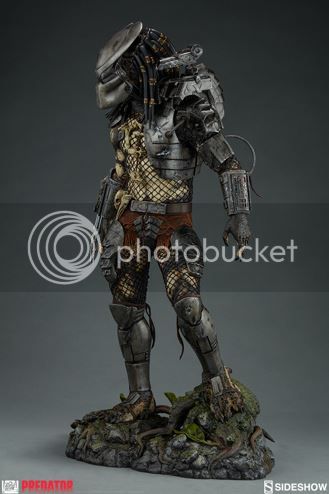
I'm amazed at how good this looks in angles other than head on. One could probably display this backwards and it'd look way good.

If this can actually get damn close to the detail of the prototype (or maquette) I may get this. Highly doubtful, though
 
I'm amazed at how good this looks in angles other than head on. One could probably display this backwards and it'd look way good.

If this can actually get damn close to the detail of the prototype (or maquette) I may get this. Highly doubtful, though

Some angles certainly work better than others (true for all sculpts I guess).

This shot is still my fave . . . (looks really cool like this)


Fave%20angleJPG_zps3zjrwq0a.jpg


.
 
Joking aside - as with so MANY of us that backed away - if they fixed that leg armour - I'd buy it.

But - they said it's where they want it to be - so that's that unfortunately.

.

yeah that leg armor is strange... Why SS won't fix it is strange also... Wonder if there is a peg or something there and the cost of moving it and resculpting is too much of a pain... Don't know... It seems like it would be an easy fix.

Turns out we were wrong on that "PREDATORS" pic.

Xenoburger on Statue forum has just pointed out this is from PREDATOR (the original) - it's the bone trophies that should have given it away I guess.

.


Whoa.... What!!! The pic is from Predator!! Well that settles it! The Maquette head sculpt is perfect ;)

There is something off.... It does need to be rounder like others have said.... But I still like it.
 
Yea, seriously. I know it's probably heresy, but I have a few reasons:

1) The space that the Cinemaquette requires is gigantic. It's a huge footprint and I don't have the space for him.

2) The sculpt and pose are idealized and don't really do anything for me.

3!!) No biomask sculpt. This is the big one for me.

4) It's not in scale with the rest of my collection.

5) Price. If I had it I would sell it and put that money towards other collectibles I'd want to buy.

Point taken. I can also relate to a few things you have mentioned as it's not easy to display with that huge base. I have had a few awkward moments with some of my pieces. Like the Wolf Predator is impossible with the spear as that is seriously long. A switch out head would have been applauded but it's just not cinemaquettes style to do so.
 
Some angles certainly work better than others (true for all sculpts I guess).

This shot is still my fave . . . (looks really cool like this)


Fave%20angleJPG_zps3zjrwq0a.jpg


.

When I display him, he will be angled like that since thats how he has to be displayed when you look at certain angles, damn is dutch and the jungle hunter going to look so badass displayed side by side
 
When I display him, he will be angled like that since thats how he has to be displayed when you look at certain angles,
damn is dutch and the jungle going to look so badass displayed side by side

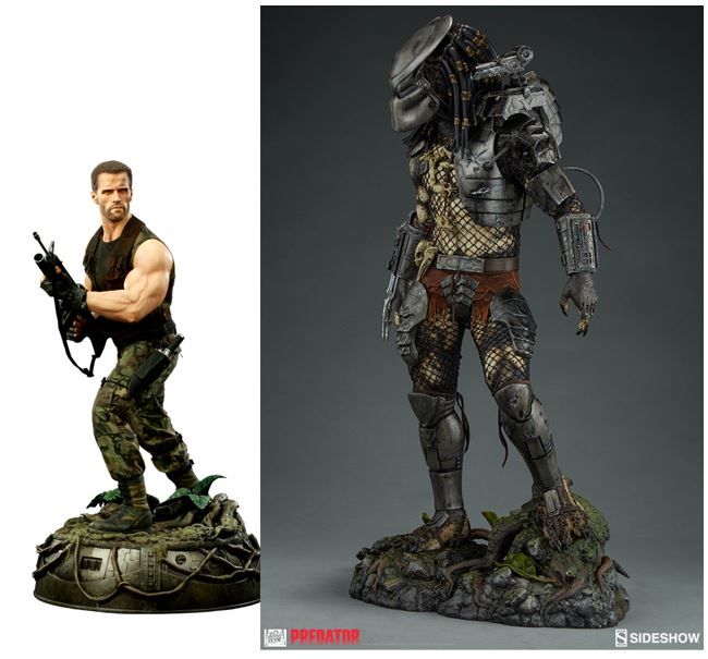
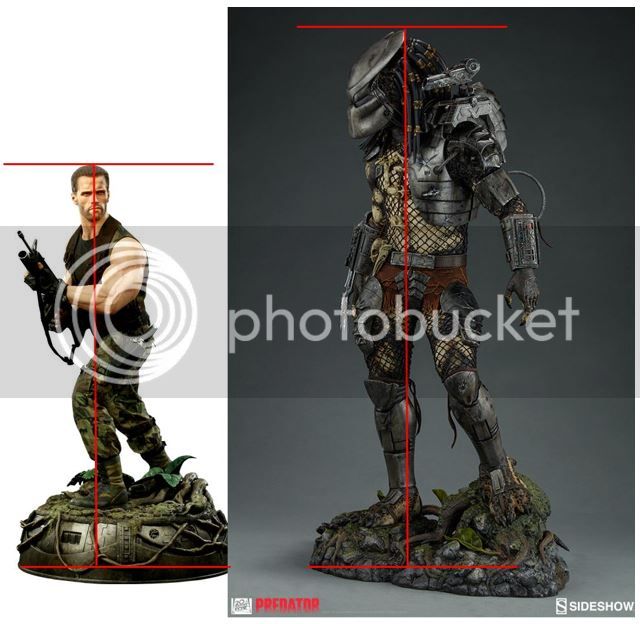
The Pred is stated as 1:4, and I think Sideshow's Dutch is supposed to be about the same.

If I've got the measurements right, this is what they look like scaled next to one-another.

Dutch seems a bit undersized until you look at movie stills (and Narin's "Encounter") + allow for Dutch's bent knees, and then it seems about right.

Everyone will have their own opinion on this as well (lol) - but I think they look great next to one-another.


Comparison%2005%20-%20Dutch%20-%20P1_zpsnbyupuhv.jpg


.
Comparison%2004%20-%20Dutch%20-%20P1_zpsrtsckali.jpg


.
 
I will order this.

What makes the head sculpt look awkward to me, and I don't think I have seen it mentioned yet, is the fact that the lower mandibles are squeezed together. I watched the scenes again after the Predator takes the bio off and at no point does he have them this close together. In all "closed mouth" scenes, there is still a considerable gap between them. I think that contributes also to the face looking elongated.

Anyway, I will display him with the bio on, so it doesn't really matter to me.
 
The Pred is stated as 1:4, and I think Sideshow's Dutch is supposed to be about the same.

If I've got the measurements right, this is what they look like scaled next to one-another.

Dutch seems a bit undersized until you look at movie stills (and Narin's "Encounter") + allow for Dutch's bent knees, and then it seems about right.

Everyone will have their own opinion on this as well (lol) - but I think they look great next to one-another.


Comparison%2005%20-%20Dutch%20-%20P1_zpsnbyupuhv.jpg


.
Comparison%2004%20-%20Dutch%20-%20P1_zpsrtsckali.jpg


.

yeah they do
 
I will order this.

What makes the head sculpt look awkward to me, and I don't think I have seen it mentioned yet, is the fact that the lower mandibles are squeezed together. I watched the scenes again after the Predator takes the bio off and at no point does he have them this close together. In all "closed mouth" scenes, there is still a considerable gap between them. I think that contributes also to the face looking elongated.

Anyway, I will display him with the bio on, so it doesn't really matter to me.

I think you might be on to something there.
 
. . . What makes the head sculpt look awkward to me, and I don't think I have seen it mentioned yet, is the fact that the lower mandibles are squeezed together. I watched the scenes again after the Predator takes the bio off and at no point does he have them this close together. In all "closed mouth" scenes, there is still a considerable gap between them. I think that contributes also to the face looking elongated . . .

I think you might be on to something there.

Indeed . . . interesting . . .

tumblr_nkxb7o0o9y1sohofko8_400.gif
Comparison 07 - P1 & P2 maquettes.JPG

.
 
The Pred is stated as 1:4, and I think Sideshow's Dutch is supposed to be about the same.

If I've got the measurements right, this is what they look like scaled next to one-another.

Dutch seems a bit undersized until you look at movie stills (and Narin's "Encounter") + allow for Dutch's bent knees, and then it seems about right.

Everyone will have their own opinion on this as well (lol) - but I think they look great next to one-another.


Comparison%2005%20-%20Dutch%20-%20P1_zpsnbyupuhv.jpg


.
Comparison%2004%20-%20Dutch%20-%20P1_zpsrtsckali.jpg


.

I think the scale looks about right, their bases's are very much the same, like one said I will be displaying him with his bio helmet on, but will admit I will be unmasking the hunter allot, some days masked, somedays unmasked. I like the fact its no longer 2 sculpted heads, but just the one.
 
Back
Top