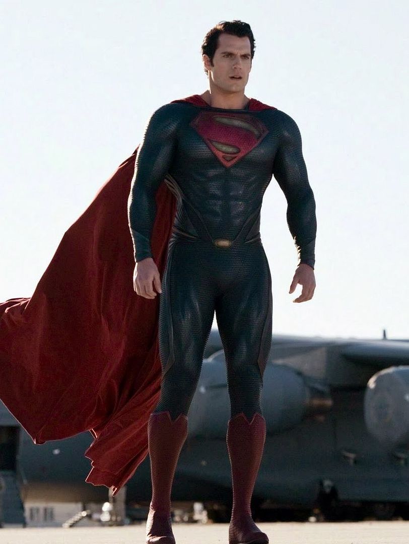
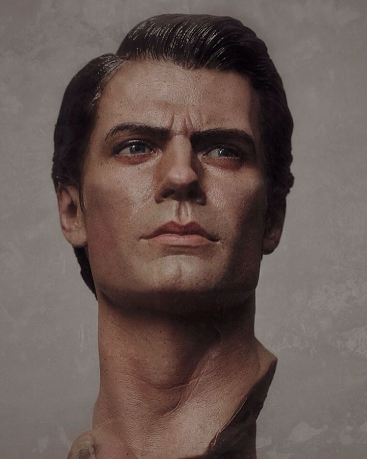
Sideshow Superman Man Of Steel Premium Format

Collector Freaks Forum

Help Support Collector Freaks Forum:

This site may earn a commission from merchant affiliate links, including eBay, Amazon, and others.
Screenshot_2017-05-18-21-03-09_zpsm0afpbc4.png


Man the photo upload feature sucks on mobile.
 

Attachments

  • uploadfromtaptalk1495166541875.jpg
    uploadfromtaptalk1495166541875.jpg
    4.3 KB
He might have a long neck, but the pose of the head exaggerates the effect.

I've never really liked this piece, and in order to fill my need for a Supes in my collection I felt that I had no choice but to get the half scale from Prime 1.

But I'm also hoping their future 1/3 Justice League line has a comparable Supes in their lineup.
 
WHY did SS go with a PVC body on this????

Imo PVC wasn't what trully killed this thing.

Yes the costume is great, but nearly everything else was a problem.

If they had executed everything perfectly, then imo it would have sold alot better, even with the pvc body.
 
Well, I tried... man I tried... I put the MoS under some studio lights this afternoon to see how well he would photograph with soft lighting. Suffice to say, it was an enormous challenge to shoot both the suit and the skin without deflectors-galore to eliminate the shine on his face. Many of you (including me) have said it, and shown it, but alas I think harsh lighting from above is how he looks best.

I don't think these turned out bad, all things considered. But nevertheless, here's my most recent effort...

DSC00068.jpgDSC00053.jpgDSC00056.jpgDSC00065.jpgDSC00066.jpgDSC00067.jpg
 
Well, I tried... man I tried... I put the MoS under some studio lights this afternoon to see how well he would photograph with soft lighting. Suffice to say, it was an enormous challenge to shoot both the suit and the skin without deflectors-galore to eliminate the shine on his face. Many of you (including me) have said it, and shown it, but alas I think harsh lighting from above is how he looks best.

I don't think these turned out bad, all things considered. But nevertheless, here's my most recent effort...

View attachment 364151View attachment 364152View attachment 364153View attachment 364154View attachment 364155View attachment 364156
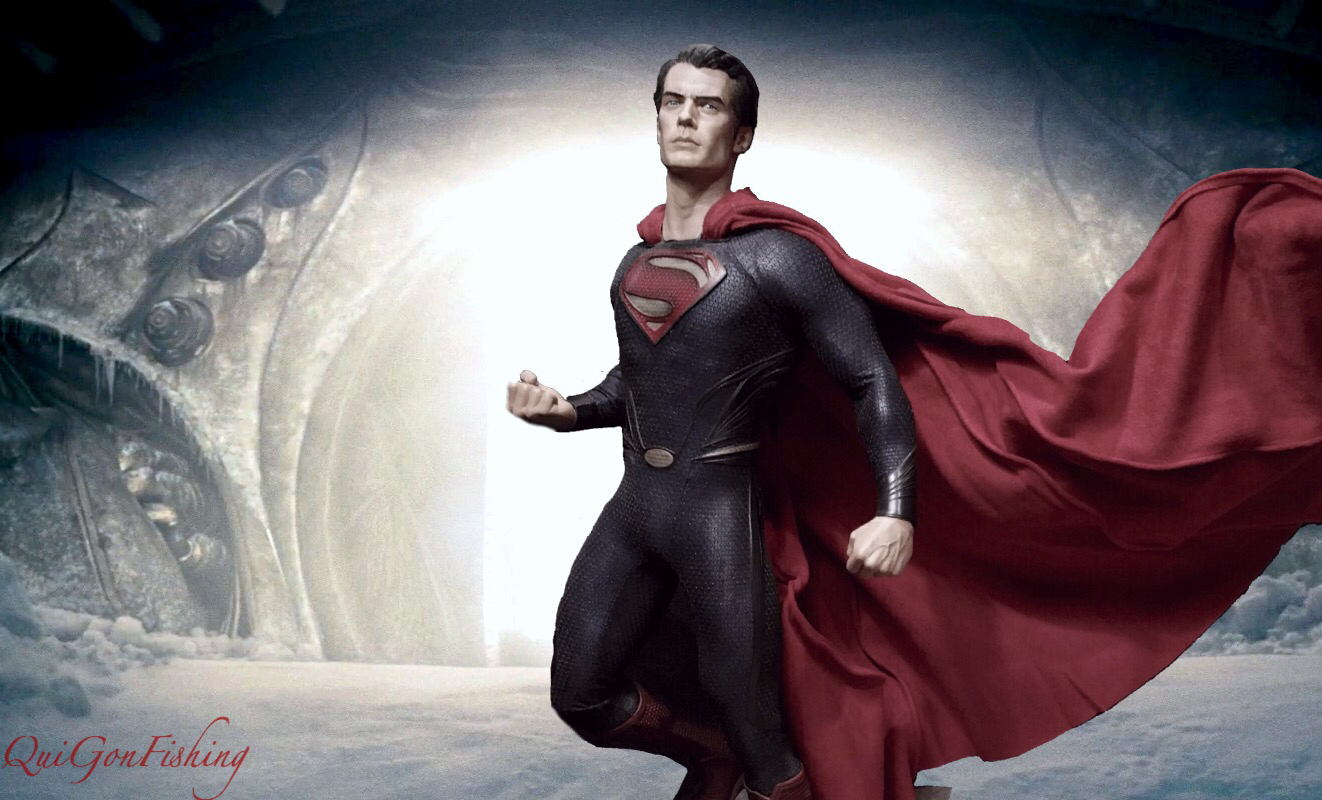
Nice pics! I really like this statue for the 216.00$ with shipping I got mine off ebay for. I would have felt gypped paying over 300 for it though.
 
Well, I tried... man I tried... I put the MoS under some studio lights this afternoon to see how well he would photograph with soft lighting. Suffice to say, it was an enormous challenge to shoot both the suit and the skin without deflectors-galore to eliminate the shine on his face. Many of you (including me) have said it, and shown it, but alas I think harsh lighting from above is how he looks best.

I don't think these turned out bad, all things considered. But nevertheless, here's my most recent effort...

View attachment 364151View attachment 364152View attachment 364153View attachment 364154View attachment 364155View attachment 364156

Beautiful shots, Sammy!
 
I know, right! Phenomenal piece.


Totally!

I do not want to say this, but think I will. Well, what more can happen than folks going ape over me! Lol! Apologies in advance. :)

I would have loved SS Supes (comic) more if the chest logo was placed higher and he was not wearing (kind of) granny pants. Also, the movie PF, I just cannot come to terms with the belt sitting so high! Still, they are awesome collectibles! The reason why am I writing this is that KC Supes looks so God Damn awesome that it overshadows both the other PFs, imho.

Anyways. I am ready for the bashing! :lol

I don't disagree. The trunks on the comic Superman do look a bit granny-ish, the insignia also a bit too low, and the belt on the MoS does ride a bit high. KC blows them both away in my opinion too. Just posted the pic to show that the MoS really doesn't look out of place in there.

So no bashing from me ;)
 
Back
Top