SSC Helmeted Cobra Commander

Collector Freaks Forum

Help Support Collector Freaks Forum:

This site may earn a commission from merchant affiliate links, including eBay, Amazon, and others.
I'm ok with the chrome as I'm sure the original figure would have it if it came out the same year as Destro.

My question is why not reproduce the card are for all these figures?

GIJoe and DC Heroes. I want them as they were created. Not adjusted interpretations.
 
I'm ok with the chrome as I'm sure the original figure would have it if it came out the same year as Destro.

I disagree. CC and Destro came carded the same year. They updated CC to include the swivel-arm battle grip, they could have certainly updated his mask if they wanted to. The Vipers came out three years after Destro and they weren't chrome. I think it was a specific thing for Destro alone.
 
I like the mirrored face mask, personally (though weird - again, now that it's been pointed out - that it doesn't encase his entire head), and it's always how I imagined CC. Guess I can see not being into it for accuracy reasons, though. But generally, anything chromed looks cool.
 
Yea the helmet might not look so dorky if the shield was larger more bubbly like the original figure.
 
Based on the card art, the chrome/silver would be up for interpretation.

Looking at pics, this helmet/mask would work.

r_cobra-commander-pilot-003.jpg


The flares curve and aren't Vaderish like the SS one.
 
Head looks good.
Chrome Looks good
Baghead looks good, better than first version.

Inflation is ok, becuse it leads to eventual deflation ( or bankruptcy, one of the two)
 
Placed my order AND just bought myself a throne too.

Really excited for them both.

Got no interest in the helmet head - always loved the cloth covered face. Will never ever display the helmet head.

Just need Baroness to go up now and I might consider Zartan before too long.

Those three and Destro were always my fave characters and he makes the line in the end.
 
I do accept the chrome. Every once in a while the comics would depict the mask as a mirror.

cobra-commander.jpg


I do agree that the card art should be emulated first and foremost but I accept anything vintage which include the comics and cartoon.

I love that this figure features his light blue outfit with hood, mauser, and pants tucked into boots. That's exactly as he appeared in issue #5 of the original Marvel comic. Stirrups might indeed have been cooler but it's still a vintage inspired design.
 
It begs the question as to why they didn't just use a 1/6 scale version of the PF helmet/mask. I can't say I'm a fan of the chrome. Not sure why people are so excited about it. Destro was chrome, but CC never was.

I don't like his face being a mirror as much as an empty void of grey like the original figure and cartoon.

Do we all at least agree that the new hooded version is the best representation of that particular look?

I think the new hooded version looks excellent. Much more menacing. Also, I think the hooded sculpt looks better with the cloak and scepter than the helmet. That said, I'm glad we're getting both looks with this release. Every Joe they do should come with an alternate portrait IMO, even the green shirts.
 
Just realized they went back to clunky one-piece boots after releasing the CG and Zartan with two-piece. :cuckoo:

Yeah, but in fairness I don't now now well a two piece would work with just a simple leather boot. The sculpt is nice looking though.

Now if they had been smart and done the stirrups it would have been a moot point since they could have just had a boot bottom.

I'd say that is some shoddy stitching down the side of the torso and that spot in the middle of the shoulder...

As for the helmet, yea something similar to the PF would have been better.

I noticed the stitching on the shoulder, that's what convinced me it must just be one jacket they're showing since all shots have that same triangle/mistake.

I did notice some shots have what looks like a black version of the awful Padwan Kenobi neck, and then some either it's a different neck piece or the photoshopped it out. A black neck with deep skin texture seems like a bad call, but I don't know what his neck should look like :huh 
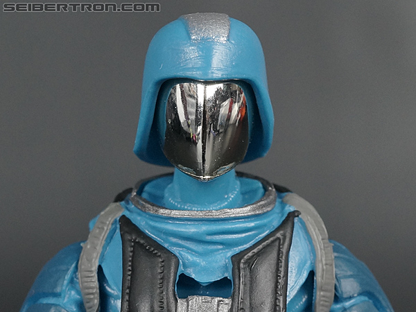
I think like Vader they might be using 2 different figures for their pictures... in some the visor seems really short, but in others the length (going past the bottom of the helmet) looks good.
 
Looks to me like another (VADER!) shoddy job of prototype photography. Shoddy futzing, confusing pictures which look like different items, and a complete and total lack of consistency in what we are seeing. Just like Vader, another amateur outing by the photo/production team.

Its like the pictures are taken at different times in the months of production of the figure and then cobbled together for the reveal. WTF?!?
 
True.

I'm confident once its in hand, any questionable nonsense should sort itself out, but after hundreds of 1/6 figure reveals how can Sideshow ****** up two in a row. And of all times to drop the ball, Vader and CC :duh

Maybe new people making decisions at Sideshow :dunno

You'd think taking and uploading some pictures would be the easiest part of the entire process.

They need to hire me to futz and photo, at least then people would know what they are getting :lecture
 
Back
Top