Since Abrams was only allowed to let Struzan read the first third or so of the script to get ideas for the poster I was hoping that he'd get to do another one with full understanding of the film's events, especially since the current version is unfortunately the weakest composition out of all seven films. Oh well. It's still Struzan and a full painting and he goes all the way back to the original Style D "Circus" 1978 one-sheet so I had to have it.
You are using an out of date browser. It may not display this or other websites correctly.
You should upgrade or use an alternative browser.
You should upgrade or use an alternative browser.
Star Wars: The Force Awakens (12/18/15)
- Thread starter Khev
- Start date

Help Support Collector Freaks Forum:
This site may earn a commission from merchant affiliate
links, including eBay, Amazon, and others.
jye4ever
Broke and happy
Yeah he needs another crack at it.
I want a version where he perfectly captures the essence of the weak X-Wing assault on Starkiller base.
I want a version where he perfectly captures the essence of the weak X-Wing assault on Starkiller base.
He should really just do the same exact design Khev is referring to, but replace Luke's head with Rey, Leia's head with Finn, Vader with Kylo, R2 with BB8, Solo with Poe, etc.
I want a version where he perfectly captures the essence of the weak X-Wing assault on Starkiller base.
He should really just do the same exact design Khev is referring to, but replace Luke's head with Rey, Leia's head with Finn, Vader with Kylo, R2 with BB8, Solo with Poe, etc.
I was thinking more along the lines of something like this but with TFA characters:

I love it because it is so dense, there's just so much going on.

Gotta love McCallum, the one guy whose sole contribution to Star Wars was helping produce the awful Special Editions and then the awful prequels. There's some bragging rights for you.

$14.99
DC Comics, 12-Inch Superman Action Figure, Collectible Kids Toys for Boys and Girls
Bopster USA Inc
Agree, I prefer this over the Struzan for TFA.
Great choices on the OT versions.
No one has seen Struzan's version of the Release Poster/One-sheet (the D23 poster was not it). Disney declined it, and Abrams bought the original for his personal collection (and likely can't even show it due to contractual or legal reasons).
It will probably never see the light of day.
The writing is on the wall. Disney wants to go with Photoshopped poop from now on. And they pissed off Struzan anyway. Sadly, I'm pretty sure that particular tradition is dead now. He MIGHT come back for INDY 5, but only if Spielberg can tell Disney to go pound sand when it comes to the posters, something Abrams was sadly unable to do.
Last edited:
And he's just ready and waiting for the idiots at Disney to give him the green light:
Drew Struzan Talks about His Force Awakens Teaser Poster - Tested
So if Struzan gets the call to illustrate the posters for the next Star Wars movies, will he be there? "Damn straight," he says. "Of course I will. I haven't changed my mind. These movies have been keeping me and my family alive and eating dinner since 1977. What am I am gonna do, turn my back on 'em? It ain't gonna happen. I'm gonna love it, and do this for all the fans around the world as long as I can. Even though I'm retired (laughs)."
Drew Struzan Talks about His Force Awakens Teaser Poster - Tested
Well I guess he isn't THAT pissed anymore.  Cool.
Cool.
 Cool.
Cool.BTW, Disney also digitally altered Han's face on the D23 Teaser Poster.

I'm really surprised he's (claiming to be) that enthusiastic about working with them again. Either he's being diplomatic, or he really does love Star Wars that much.

I'm really surprised he's (claiming to be) that enthusiastic about working with them again. Either he's being diplomatic, or he really does love Star Wars that much.
Well he did say that he'd enjoy "doing it for the fans." So it sounds like he's focusing on the positive even if it means having to deal with Disney's dopey marketing department.
Speaking of our buddy Rick McCallum, it looks like after Kathleen Kennedy fired him he moved over to WB to produce a Pa Kent spin-off film for the DCEU:
The Rock Pile (2017) - IMDb
The Rock Pile (2017) - IMDb
jye4ever
Broke and happy
Directed by Josh Trank?
Yep.
McCallum: "It's just so dense, there are so many rocks in every frame."
Trank: "And there would have been even more rocks if the studio had let me! Boo hoo! *delete*"
McCallum: "It's just so dense, there are so many rocks in every frame."
Trank: "And there would have been even more rocks if the studio had let me! Boo hoo! *delete*"
And I suppose TFA's photoshopped one-sheet could have been worse. Check this out:

A serial killer who dutch ovens newlywed couples to death.
When reflecting on the lost art of movie posters, I always refer back to the opening moments of The Mist. After hot shot poster artist David Drayton (Thomas Jane) loses his latest masterpiece in the storm that causes the titular mist, Drayton laments to his wife, Stephanie, that he'll have to call the studio and request an extension on his deadline. When she asks what other choice the studio would have in the matter, Drayton responds:
"You kiddin'? They could whip up some bad Photoshop poster in an afternoon. They do it all the time, two big heads."
And indeed, when Hollywood ad agencies aren't blatantly ripping off poster artists without compensating them, they're whipping together photoshopped atrocities that combine Stevie Wonder's understanding of perspective with an intentional misunderstanding of how human anatomy works.
Until now, Good Luck Chuck and Bangkok Dangerous were considered the far and away worst offenders of photoshop failures in movie posters. Until now.
Ladies and gentleman, may we present to you the poster for Hit By Lightning.

We have no idea what the plot of Hit By Lightning is, but based on the poster, we're going to assume that it tells the tale of a child-bodied alien in an ill-fitting mansuit and the Earth woman whom he switches bodies with at the moment of orgasm. And then murders people, maybe. Or it's about a pair of siamese twin brothers joined at the bathrobe and their quest to lose their virginity. Or Will Sasso plays a serial killer who dutch ovens newlywed couples to death. We're thinking it's the latter, because if Sasso's face is reading anything, it's "farty."
Why is Will Sasso clothed in this poster? Like, fully clothed? And why was that particular photo of him used when he was *clearly* standing when it was taken? Does Jon Cryer really have the torso of a 13 year-old boy and the head of a brontosaurus? And is his skin tone really that smooth? (Because if so, damn bruh.) Where is Stephanie Szostak looking, exactly? Why, oh why, couldn't they line the *****ing names up under the right *****ing actors?
This poster comes to us courtesy of Bravo Design, Inc. a company which we're going to presume have since been laughed right out of the industry.
A serial killer who dutch ovens newlywed couples to death.

A Jon Cryer/Sasso joint deserves no less from a movie poster. . .well, maybe they also deserve Zach Snyder to direct.
Khev will appreciate these:


Khev will appreciate these:


So good.

The Force Awakens truly is "the next chapter in the continuing saga of Star Wars."

karamazov that was a sweet pic, you shouldn't have deleted it. 
Phil Tippett continuing the holochess match begun in 1977 once again with stop motion armatures. Great stuff:
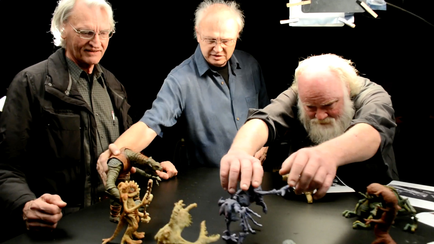
STAR WARS - THE FORCE AWAKENS: Holochess reel by Tippett Studio - The Art of VFXThe Art of VFX
Phil Tippett continuing the holochess match begun in 1977 once again with stop motion armatures. Great stuff:

STAR WARS - THE FORCE AWAKENS: Holochess reel by Tippett Studio - The Art of VFXThe Art of VFX
Similar threads
- Replies
- 0
- Views
- 166
- Replies
- 0
- Views
- 129
- Replies
- 0
- Views
- 294
- Replies
- 12
- Views
- 1K


