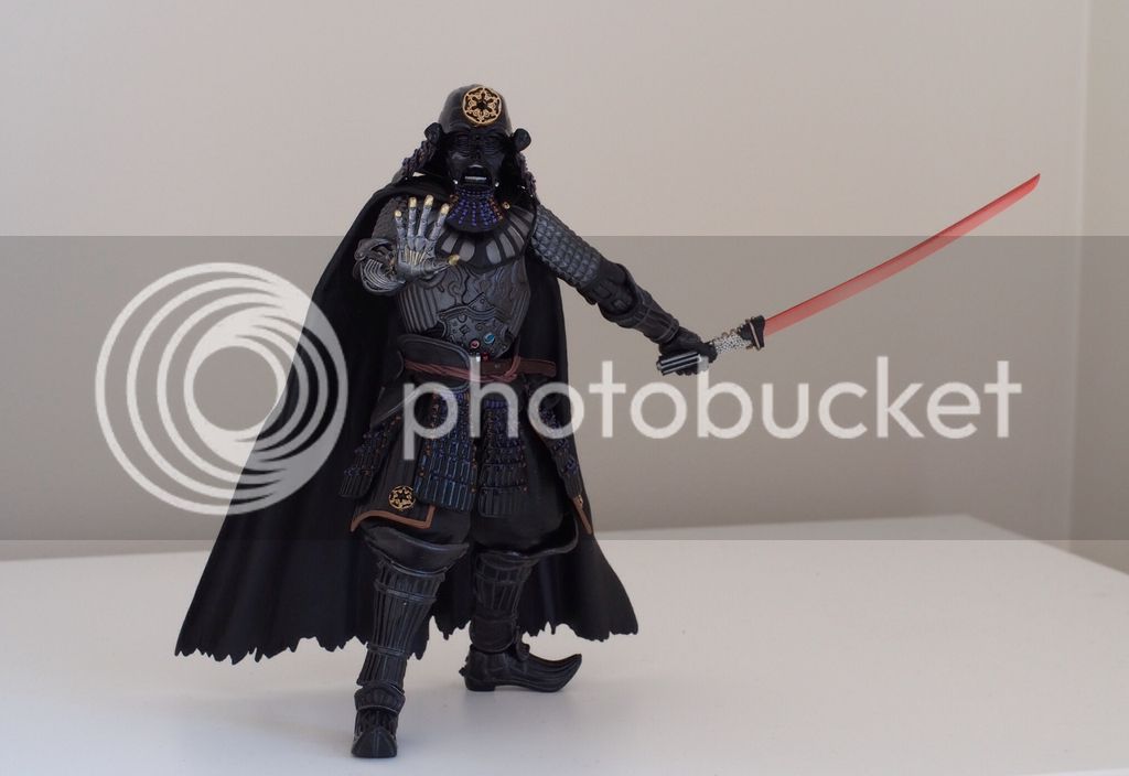
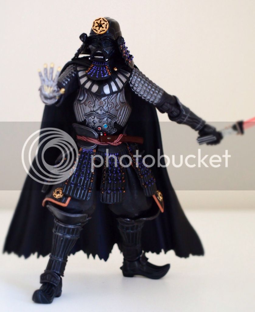
I received my Vader 2.0 today. I won't go into great detail on this figure as others have covered that pretty well already. Instead I just want to focus on my impressions of the difference between the original version and this new version.
Head
The facemask on the new version is in my opinion superior. However the skirt on the original flares out more and looks much better. At this point the head crest is a matter of opinion. Some like the larger Death Star, I think it looks a little ridiculous. It's not the size, it's more the size combined with the shape. To me it looks like a big round shield. I feel it would be much improved if the top part closing the circle were removed to shape it more like horns. But that would probably detract from the image of the Death Star. As such I prefer the smaller imperial cog. Weighing all that up, I'll stick with the original head.
Chest
The chest of the original looks more like ceremonial amour, where as the new one is very Geiger-esk with the bone like structure. The waist is virtually identical. The belt looks a little better on the new version, but loses the Tanto. Overall, I prefer the original ceremonial look with the Tanto.
Arms
The arms are identical with the exception the new version replaces half the right arm with a mechanical arm. It does feel a little more terminator than Star Wars but I think it looks fantastic and much prefer the new versions arms.
Legs
Appear Identical, however the skirt on each bears either the imperial cog or the Death Star symbol depending on which version you have. While I don't like the Death Star on the head dress, I do like it very much on the skirt.
Accessories
Both come with lit and unlit lightsabres. The difference being the first looks more like a squared off version of Vaders movie sabre with the second release having a much greater Japanese flavor with rayskin and a curved hilt. The second release also comes with a regular Katana and sheath to make up for the lack of a Tanto at the waist. You could take or leave the extra Katana, but the 2.0 Sabre is the clear winner here.
Finish
Surprisingly the finish on the original is in my opinion the winner here. As you can see in my second pic, the colors really pop against the black armor. The 2.0 paint scheme has used a more dark and earthy red instead of the original releases purple which unfortunately doesn't have the same effect and gets a little lost in the black in comparison.
Overall, on balance, I prefer the original. That said I have mixed and matched where possible and created my own Frankenstein version using what I think is the best of both. The only exceptions being I can't get the 2.0 face mask on the original head and while I prefer the Death Star logo on the leg skirts, I think it looks a little weird without the matching head dress. I might change my mind on that and swap the leg skirts still though.


 If they do start making versions of non armored characters I'll have to try to ignore them...

