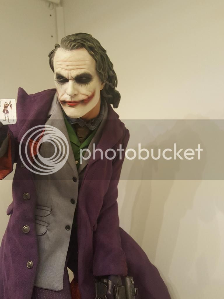
Premium Format The Joker ‘The Dark Knight’ - 1/4 Premium Format Statue

Collector Freaks Forum

Help Support Collector Freaks Forum:

This site may earn a commission from merchant affiliate links, including eBay, Amazon, and others.
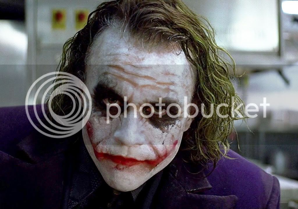
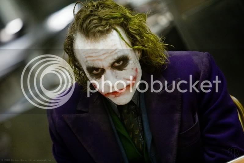
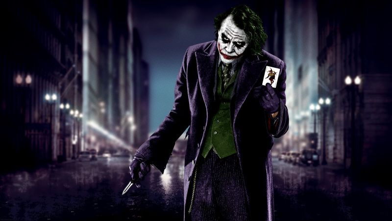
You're proving my point, really. The pictures from the actual film don't resemble the Sideshow piece at all. In the film, he does tend to slump over a lot of the time, but it's nowhere near to the extent that the Sideshow statue is showing. It's such an awkward pose, with his right hand pulled back and up so high and his left shoulder slumping down so hard. It looks like his shoulder was dislocated. This isn't even bringing up the "on the toes" half squat position his legs are in. It's just so awkward.

The poses below would have been much more preferable and made more a better statue.
attachment.php


attachment.php

:goodpost:
 
It does look good there (as far as proto to product goes) but it appears the tailoring was a bit better and thus, had a tighter look to it on the proto because the coat on the product doesn't appear to hug the body like it did on the proto.

But it could be that the right side of the coat is not futzed properly, due to the wiring in the coat, because the left side appears to be quite tight. :dunno

I'm pretty sure it just requires some futzing man. Obviously can't confirm without having it in hand myself, but I'm fairly certain if you take a bit of time to get the fabric to sit right and hit it with some steam, you can get it looking very close to the proto. I've seen the DX11 and Enterbay Joker look much worse when people didn't bother to take the time to futz the clothes properly.

Either way, production pieces rarely get close to the proto, so I'm quite impressed that they've managed to do it with this really.
 
I'm pretty sure it just requires some futzing man. Obviously can't confirm without having it in hand myself, but I'm fairly certain if you take a bit of time to get the fabric to sit right and hit it with some steam, you can get it looking very close to the proto.


Well only time will tell.

I've seen the DX11 and Enterbay Joker look much worse when people didn't bother to take the time to futz the clothes properly.

Yes but it's kind of different with PFs, usually the clothing hugs the body, this is not the case with dolls, the clothing has to be a bit loose so it is possible to pose the figure.


Either way, production pieces rarely get close to the proto, so I'm quite impressed that they've managed to do it with this really.

As far as proto to production goes it is a success.
 
You're proving my point, really. The pictures from the actual film don't resemble the Sideshow piece at all. In the film, he does tend to slump over a lot of the time, but it's nowhere near to the extent that the Sideshow statue is showing. It's such an awkward pose, with his right hand pulled back and up so high and his left shoulder slumping down so hard. It looks like his shoulder was dislocated. This isn't even bringing up the "on the toes" half squat position his legs are in. It's just so awkward.

The poses below would have been much more preferable and made more a better statue.
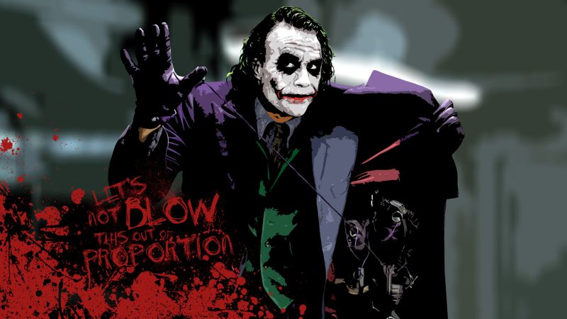
Two things.... SSC rarely captures and exact moment in time in a movie....

My point is with my photos is that Joker is always Awkward... If you watch the film especially in moments of action he is even more hunched and awkward (not easy to find screen caps of that). What SSC has done is capture his essence...

You don't like the pose and that is cool.

I look at it and think that it is perfect and feels like Heath's Joker.


As for those pics you posted. Yeah they would have been cool but that limits the artists creativity to just copying. That is what Hot Toys is made for :)
 
You're proving my point, really. The pictures from the actual film don't resemble the Sideshow piece at all. In the film, he does tend to slump over a lot of the time, but it's nowhere near to the extent that the Sideshow statue is showing. It's such an awkward pose, with his right hand pulled back and up so high and his left shoulder slumping down so hard. It looks like his shoulder was dislocated. This isn't even bringing up the "on the toes" half squat position his legs are in. It's just so awkward.

The poses below would have been much more preferable and made more a better statue.

Nobody ever said it had to be a perfect copy
 
I think the in hand pics look great and are very close to the proto which is why I bought it in the first place. Can't wait to get this on Monday. Super excited.

Although I do think the pics of the open coat with the hand-grenades and the one with the knife and Card would also make great statues.
 
Well said Jaws, great statue. I am liking it much better as the days go on. I cannot wait to get the prime one joker I will be getting that no doubt!
 
Me either I do not see the pose over exaggerated it could be better but again, I think your dead on with your pics and comments!
 
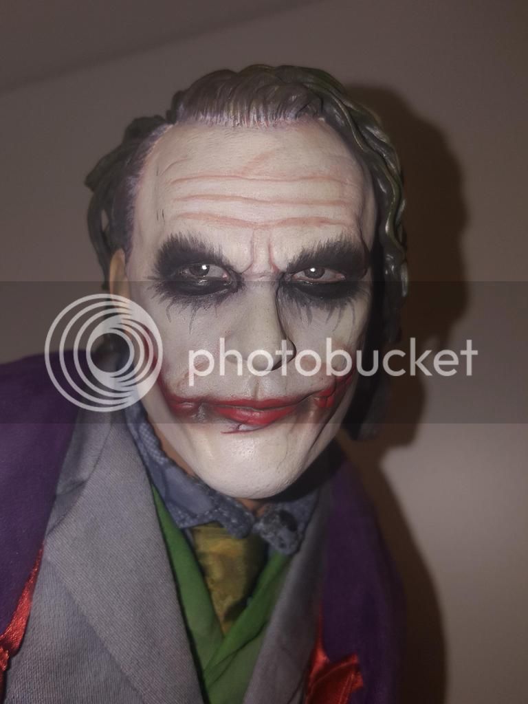
Saw this in the store and thought it looked awful. He looks alright from the side profile, but straight on, sheesh, that square head and chin are atrocious. The likeness to Ledger is pretty much non existent. Reminded me of the generic looking TDK troll/gremlin looking Jokers from Mattel to DC Direct to even Hot Toys' first figure in early 2008 where they clearly weren't pursuing any resemblance to Ledger.

The pose is so bad too, it looks like he's surfing on a concrete slab in lava. I don't get what they were going for with this. Batman's pose works, but what the hell is Joker doing? You could have had him double gripping his machine gun, skipping down the street or pulling the grenade rig out of his jacket or something more dynamic. This just looks silly and uninspired. I'd love to see the original concept sketches and what went wrong in the development.
 
Last edited:
Saw this in the store and thought it looked awful. He looks alright from the side profile, but straight on, sheesh, that square head and chin are atrocious.

Yes they totally messed up the head shape, it looks the same as the DX11 head shape, especially the jawline, it should be more angular, have a square chin and the cheeks should bulge out. But instead it has a round jawline with a pointy chin with flat cheeks.


attachment.php


However, the sculpt has not changed since the proto, so you either hated or like this sculpt from the very beginning.


The likeness to Ledger is pretty much non existent. Reminded me of the generic looking TDK troll/gremlin looking Jokers from Mattel to DC Direct to even Hot Toys' first figure in early 2008 where they clearly weren't pursuing any resemblance to Ledger.

I agree, but the make up painted on there could be hiding the facial likeness, the same way the facial likeness on EBs was hidden. So I would like to see this unpainted.

The pose is so bad too, it looks like he's surfing on a concrete slab in lava. I don't get what they were going for with this. Batman's pose works, but what the hell is Joker doing? You could have had him double gripping his machine gun, skipping down the street or pulling the grenade rig out of his jacket or something more dynamic. This just looks silly and uninspired. I'd love to see the original concept sketches and what went wrong in the development.

Yes I think most people agree those poses you mentioned would have been better but the pose on this is the same as the prototype so same thing goes for what I said about the head sculpt you either hated or liked this pose from the start.
 
Last edited:
I still say it looks like as if Ledger Joker was drawn in a comic book.

It's a very comic book statue that melds SO well with the entire DC line of PFs - rather than being stuck in an awkward ultra realism niche by itself.

Ultra realism is not what any of the SSC exude, it would look out of place. Hot Toys are like that - super realistic face, no artistic interpretation, attached to a doll body?! It doesn't seamless blend together from body to head never mind statue to statue.

This where I think SSC shines! It is all filtered similarly to blend effortlessly together.
 
I still say it looks like as if Ledger Joker was drawn in a comic book.

It's a very comic book statue that melds SO well with the entire DC line of PFs - rather than being stuck in an awkward ultra realism niche by itself.

But it is meant to be a companion piece with the Bale PF and not comic book characters drawn from comics, and the Bale PF is actually realistic and doesn't look like Bale from a comic book but actually looks like Bale as Batman from the movie, so having a comic book style Ledger with a realistic Bale PF makes no sense.

Ultra realism is not what any of the SSC exude, it would look out of place. Hot Toys are like that - super realistic face, no artistic interpretation, attached to a doll body?! It doesn't seamless blend together from body to head never mind statue to statue.

This where I think SSC shines! It is all filtered similarly to blend effortlessly together.

Really don't understand what you are trying to say here.
 
Last edited:
I still say it looks like as if Ledger Joker was drawn in a comic book.

It's a very comic book statue that melds SO well with the entire DC line of PFs - rather than being stuck in an awkward ultra realism niche by itself.

Ultra realism is not what any of the SSC exude, it would look out of place. Hot Toys are like that - super realistic face, no artistic interpretation, attached to a doll body?! It doesn't seamless blend together from body to head never mind statue to statue.

This where I think SSC shines! It is all filtered similarly to blend effortlessly together.

This has to be the dumbest thing I have ever heard. A f ING comic Ledger Joker? I already have a comic joker premium format that looks way better than this. It is based on a live action, human actor, not a damn cartoon movie. People complained Bale premium format headsculpt didn't look enough like Bale, and then you come up with this crap statement?? Don't comment anymore at the risk of sounding more ******** than you already have.
 
This has to be the dumbest thing I have ever heard. A f ING comic Ledger Joker? I already have a comic joker premium format that looks way better than this. It is based on a live action, human actor, not a damn cartoon movie. People complained Bale premium format headsculpt didn't look enough like Bale, and then you come up with this crap statement?? Don't comment anymore at the risk of sounding more ******** than you already have.

So with this anger towards my sentiment, you think SSC was going for a 100% realistic portrait?

If that is the case this is a complete failure of a sculpture, I'm not sure what other way you can view this with no more room for the obvious stylization that was given to not only this portrait BUT the recent Gal Gadot, Batfleck, Henry Cavil, Bale and so forth, NONE of these are spot on, some are wildly not accurate to the source material.
 
I'm not sure what other way you can view this with no more room for the obvious stylization that was given to not only this portrait BUT the recent Gal Gadot, Batfleck, Henry Cavil, Bale and so forth, NONE of these are spot on, some are wildly not accurate to the source material.


It's because they wing it.

To call it stlyized I think is justification or an excuse to put out a shoddy looking statue. Or maybe they're simply just not capable of putting out a product that looks like it did on film. Then again, you have people like HeubertMichael who repainted the BvS Batman face and totally brought out the brilliant Affleck likeness that had been buried under there all along showing it was a production issue, not a talent one.

But if stylized is what they're going for with these film PFs, then maybe they should just stick with the comic interpretations instead. Those are much better looking and fitting for their characters than a "stylized" version of say the Chris Reeve Superman or Ledger Joker they've done just looks awkward and inhuman. It shouldn't when it's based on real loving and breathing people.
 
Back
Top