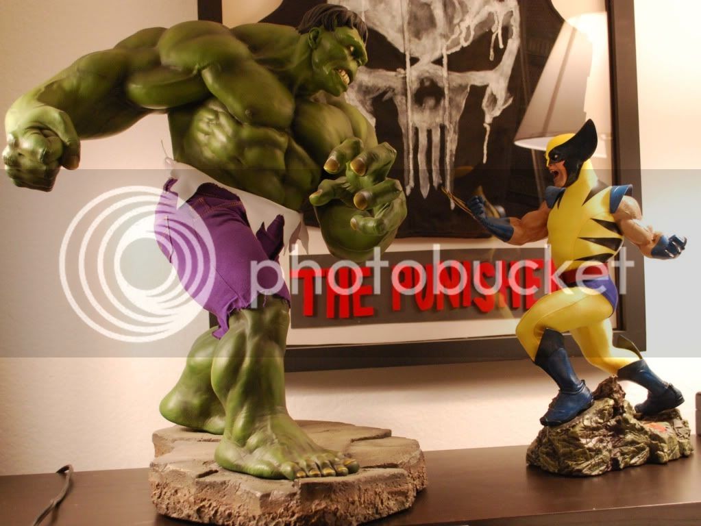
Great shots Batman29.
Thanks King!

Great shots Batman29.
Thanks for the comparison shots. The pictures tell the tale. If folks want to get so hung up on the clothing that they can't appreciate the awesomeness of the PF, that's their right, but the comiquette just can't hang IMO. My main issue is the head sculpt, which just looks freaky. Just like with Cap, the PF is the iconic Wolverine statue that fans should own.
Perfection


Whatever you are smoking, I want some!You really need to take a look at a dictionary at some point, because this PF definitely doesn't match the definitions of 'iconic' or 'perfection'.
The awkward pose and horrible cloth application definitely outweigh the sculpt and metal claws.


Thanks for the comparison shots. The pictures tell the tale. If folks want to get so hung up on the clothing that they can't appreciate the awesomeness of the PF, that's their right, but the comiquette just can't hang IMO. My main issue is the head sculpt, which just looks freaky. Just like with Cap, the PF is the iconic Wolverine statue that fans should own.
Perfection


Yeah, that exclusive head does nothing for me.I really like this PF, but I only think the regular version is necessary for this one unless you're Skiman.
^^ This is what your posts look like when you are high. Be cautious children, or your posts will sound equally ridiculous.

You really need to take a look at a dictionary at some point, because this PF definitely doesn't match the definitions of 'iconic' or 'perfection'.
The awkward pose and horrible cloth application definitely outweigh the sculpt and metal claws.
I really like this PF, but I only think the regular version is necessary for this one unless you're Skiman.


I really like this PF, but I only think the regular version is necessary for this one unless you're Skiman.