X-Men: Apocalypse - May 27, 2016

Collector Freaks Forum

Help Support Collector Freaks Forum:

This site may earn a commission from merchant affiliate links, including eBay, Amazon, and others.
I think the only thing I like about it is the collar and the cables coming out of the back of his head.
I actially like the overall design, it's a nice blend of egyptian and biomechanical motifs.
Now the skin should've been pale grey, the face should've been more detailed and CB accurate.
And, of course, the actor got not enough of a physical presence. He looks puny and ruins the design.


Kara, what's your avatar?
The Police - Ghost in the Machine
 
So what expression says immortal mutant with Darwinian philosophy?

this pretty much nailed it.

Apocalypse_legendary_bust_2008_Side.jpg
 
I actially like the overall design, it's a nice blend of egyptian and biomechanical motifs.
Now the skin should've been pale grey, the face should've been more detailed and CB accurate.
And, of course, the actor got not enough of a physical presence. He looks puny and ruins the design.
Well yeah you're right, the outfit itself is cool.

I disagree on the face though, I think it should be less detailed, lose the weird lines on his forehead, you're right about the grey, make his ****ing mouth how it's supposed to be, no pupils and optionally red eyes.

And I guess the height can be fixed with CGI, I hope they do that.
 
this pretty much nailed it.

Apocalypse_legendary_bust_2008_Side.jpg

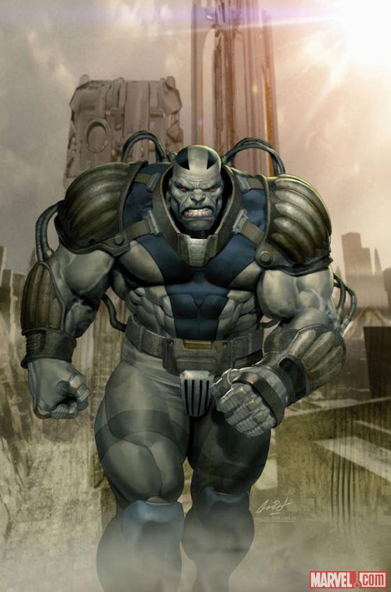
now that I think about it, I have never liked Apocalypse's comic design. not the best of designs really... I know he is a great character but when you really look at him, doing a true to the comics interpretation would be ridiculous too.
it's a lose/lose situation.
 
now that I think about it, I have never liked Apocalypse's comic design. not the best of designs really... I know he is a great character but when you really look at him, doing a true to the comics interpretation would be ridiculous too.
it's a lose/lose situation.
I've never cared much for the comic design either, so maybe that's part of why I'm not as offended as many others appear to be by his look here.
 
A closer look (sorry if this has been posted already):

tumblr_nrqkew84EL1skjrdeo1_1280.jpg


He's got the lips -- sort of -- but the skin is still totally wrong.


I've never really read about the character. What is the purpose of the lip design?

The gray skin and blue lips are an unfortunate byproduct of his mutant genes. Baby Apoc was supposed to appear sickly and deformed, which is why his own people abandoned him and others rejected him as he grew up. Those we see worshiping him in the DOFP post-credits scene are not his original race.


now that I think about it, I have never liked Apocalypse's comic design. not the best of designs really... I know he is a great character but when you really look at him, doing a true to the comics interpretation would be ridiculous too.
it's a lose/lose situation.

Eh, this wouldn't have been too bad.

5134ff7a7e455.jpg


apocalypse-marvel-scenes-i-hope-to-see-in-future-movies-x-men-apocalypse-death-is-coming-archangel-or-gambit-jpeg-127758.jpg


I realize every movie has to do something different with the design to make it blend into a less fantastic world (not that what we ended up getting with this film's Apocalypse succeeded :lol), but I miss the helmetless head and the bulk. And the gray skin.

Hell, this wouldn't have been bad either. Still a bit of a departure, but his awe-inspiring statue is preserved.

32300.jpg
 
Last edited:
disagree on the face though, I think it should be less detailed, lose the weird lines on his forehead
I like them, adds to the biomechanical and messed up feel of the character.


no pupils
Never gonna happen, the lack of pupils scares Hollywood.


And I guess the height can be fixed with CGI, I hope they do that.
It's not so much about his height...
Oscar Isaac is a very average looking guy physically, there's no way to make him imposing naturally.
 
A closer look (sorry if this has been posted already):

tumblr_nrqkew84EL1skjrdeo1_1280.jpg


He's got the lips -- sort of -- but the skin is still totally wrong.


The gray skin and blue lips are an unfortunate byproduct of his mutant genes. Baby Apoc was supposed to appear sickly and deformed, which is why his own people abandoned him and others rejected him as he grew up. Those we see worshiping him in the DOFP post-credits scene are not his original race.


Eh, this wouldn't have been too bad.

5134ff7a7e455.jpg


apocalypse-marvel-scenes-i-hope-to-see-in-future-movies-x-men-apocalypse-death-is-coming-archangel-or-gambit-jpeg-127758.jpg


I realize every movie has to do something different with the design to make it blend into a less fantastic world (not that what we ended up getting with this film's Apocalypse succeeded :lol), but I miss the helmetless head and the bulk. And the gray skin.

Hell, this wouldn't have been bad either. Still a bit of a departure, but his awe-inspiring statue is preserved.

32300.jpg

it still looks weird.
If Apocalypse was an Alien then yeah that would work (That's why Thanos look works, because he is not human, he might look like a weird annoying orange but it still works)

But as a human mutant it is too over the top. I understand the lips are because of his mutant genes but why does he have lines going to his head?
he doesn't even look human, the Hulk ends up looking more human than him.

the only way they could have done Justice to Apocalypse would have been with a FULL CGI head, which would have cost a lot more.
have him look like Hulk or Thanos since Apoc looks so weird.

But for the movie I have no idea how a CGI-less design could have worked
 
And if he did look full on like the comic version, people would criticize him for being a Thanos rip-off anyway. I'm not sure much could be done to save Singer from criticism, though there is certainly room for improvement with this version of Apoc.
 
So far the bad in this is nowhere as close to the prerelease bad in DOFP and that movie turned out good.

So everyone chill dafaq out!

Maybe that's really Trask playing a fake Apoc like Trevor and Mandarin.
 
Last edited:
And if he did look full on like the comic version, people would criticize him for being a Thanos rip-off anyway. I'm not sure much could be done to save Singer from criticism, though there is certainly room for improvement with this version of Apoc.

yeah, exactly.

This design might not be great but I don't know what else they could have done.
 
So far the bad in this is nowhere as close to the prerelease bad in DOFP and that movie turned out good.

So everyone chill dafaq out!
I keep thinking back to this. Not only for DOFP, but for First Class. When the premise came out, and then those horrible initial pictures, everyone (self included) thought it was going to be a total disaster. But it ended up being the best comic movie released that year.
 
Probably having unclean thoughts about Chris Evans, what else? :D

Seriously though, I haven't seen him posting in awhile. Maybe he got burned out of Jurassic Park talk.
 
Back
Top