The walkie-talkie head had a better likeness.
You are using an out of date browser. It may not display this or other websites correctly.
You should upgrade or use an alternative browser.
You should upgrade or use an alternative browser.
Big Chief Studios - 1/6 Doctor Who - #09 Christopher Eccleston
- Thread starter thedarkknight
- Start date

Help Support Collector Freaks Forum:
This site may earn a commission from merchant affiliate
links, including eBay, Amazon, and others.
urutoraseven
Super Freak
That head looks like a copy of some cheap military figure. Total failure.
Looks a lot better here:


urutoraseven
Super Freak
Seems that the first pictures where painted in a computer. This new one is the real thing and looks a lot better.
Darklord Dave
Super Freak
- Joined
- Sep 3, 2005
- Messages
- 19,026
- Reaction score
- 81
As I've mentioned in the new rules, CONSTRUCTIVE criticism is useful. Saying it's awful, is NOT.
I think the reason some are not really seeing the likeness, is the expression. I think the likeness is there but I'd prefer to see him with a knowing smirk. We very rarely ever saw him with such a neutral expression.
I think the reason some are not really seeing the likeness, is the expression. I think the likeness is there but I'd prefer to see him with a knowing smirk. We very rarely ever saw him with such a neutral expression.
Good point. Eccleston is a very expressive actor. That may be hurting the likeness.

$14.99
DC Comics, 12-Inch Superman Action Figure, Collectible Kids Toys for Boys and Girls
Bopster USA Inc
JonWes
Super Freak
- Joined
- Oct 29, 2009
- Messages
- 4,688
- Reaction score
- 23
Seems that the first pictures where painted in a computer. This new one is the real thing and looks a lot better.
It's the same head sculpt and paint job. Only the lighting is different.
Looks a lot better here:

The face could do with being a little thinner imo,more chiseled.
JonWes
Super Freak
- Joined
- Oct 29, 2009
- Messages
- 4,688
- Reaction score
- 23
For my money, it looks great overall. It was just a smidge off. When Gregg first showed it to me I sort of struggled to even understand and commnicate what it was about it that WAS off. If you compare the sculpt with pictures, most everything seems to be in order. Then, I realized, I think it was the eyes. Eccelston's eyes just seem to have more presence in most of the pics you see of him. It was something that was getting a bit lost in the pics. In the one expression that they based this sculpt on, his eyes are actually a bit more closed. In my mind's eye, Eccelston is almost always more wide-eyed. I think that was really the big difference. Even though the sculpt and paint was matching a photo of Eccelston, it wasn't quite matching my "mind's eye" version of his face.
I think if they widen the eyes a bit he'll be fantastic. I do think this'll be a figure that really wins people over once it comes in.
I think if they widen the eyes a bit he'll be fantastic. I do think this'll be a figure that really wins people over once it comes in.
It's good enough for a purchase (assuming the outfit turns out really nice), but I still have to agree with most here that it doesn't capture Eccleston nearly as well as it could have.
It's one case where what looks like a great likeness in a digital sculpt just doesn't translate nearly as well when actually painted.
It's one case where what looks like a great likeness in a digital sculpt just doesn't translate nearly as well when actually painted.
GodParticle
Super Freak
- Joined
- Jul 30, 2013
- Messages
- 1,296
- Reaction score
- 183
The first pictures looked pretty bad, but that recent one looks a lot better. I just wish they could be consistent with sculpt quality 10 and 11 have been pretty good, while the rest have for the most part been pretty average
I think the detail on the sculpt is awesome, but a few changes could be done to make it look more like Eccleston.
I believe this was the reference they were going for.
Just from what I see, the part on the forehead above the point of the brows needs to be a bit fuller, cheeks need to be a bit fuller, the right (left in picture) middle brow crease needs to come in more before going up, chin width reduced and right side smile crease (left in picture) needs to be corrected.
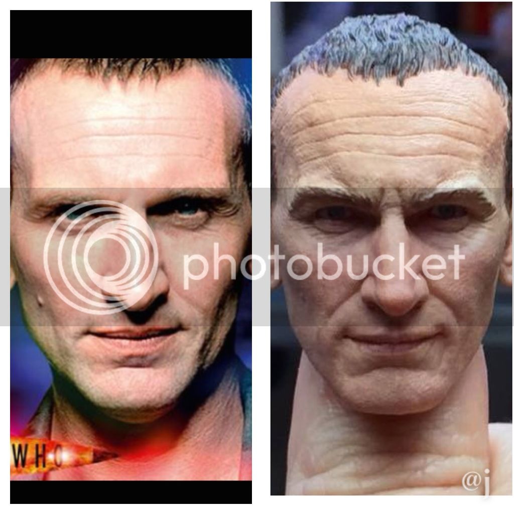
I'll be getting the figure either way, but will be happier if they make the changes.
I believe this was the reference they were going for.
Just from what I see, the part on the forehead above the point of the brows needs to be a bit fuller, cheeks need to be a bit fuller, the right (left in picture) middle brow crease needs to come in more before going up, chin width reduced and right side smile crease (left in picture) needs to be corrected.

I'll be getting the figure either way, but will be happier if they make the changes.
Oh yeah, that's definitely the main pic they were using. Although as far as I can see, the only things that really need tweaked are the cheekbones and chin. Everything else looks more than close enough I think.
GodParticle
Super Freak
- Joined
- Jul 30, 2013
- Messages
- 1,296
- Reaction score
- 183
It's mostly the eyes. The brow is off. That was the problem with the first doc figure- they made them too pronounced and crazy looking
Captain Britain
Super Freak
- Joined
- Jan 26, 2008
- Messages
- 3,596
- Reaction score
- 6
I think the detail on the sculpt is awesome, but a few changes could be done to make it look more like Eccleston.
I believe this was the reference they were going for.
Just from what I see, the part on the forehead above the point of the brows needs to be a bit fuller, cheeks need to be a bit fuller, the right (left in picture) middle brow crease needs to come in more before going up, chin width reduced and right side smile crease (left in picture) needs to be corrected.

I'll be getting the figure either way, but will be happier if they make the changes.
Thanks for these Vash. I've been away all day, interesting to come back and see what's been happening.
First, I thought it was great that Gregg responded to the criticism, which was widespread enough to warrant his response. The photo he posted does make the sculpt look a lot better, though it's still in no way perfect. It was also great to see Jon cracking down on personal abuse on his FB group when people are simply saying politely that the sculpt doesn't strike them as all that good.
Not sure I agree that you can't just say 'the sculpt looks off' sometimes it just does, and it's difficult to describe precise details when you don't have good photo skills (and i can barely post a photo never mind enlarge it, compare it to another or write on it).
However, since Vash has kindly posted these photos, I think the sculpt's strengths and shortcomings are pretty clear. Yes, it looks better, though it's worrying that shadows are partly responsible for this. But close up the following is obvious:
- As Vash said, the forehead needs to be fuller. The sculpt generally has a slightly pinched look to it, which leads me to:
- The cheeks and jawline need to be fuller, the right hand photo on the top row of the original photos shows this very well. It is too angular, compare it with the picture on the cover of the 2006 Doctor Who annual, which is from a similar angle.
- Yet while the cheeks and jawline need to be fuller, the chin is, as Vash said, too wide, and too square.
- The face isn't wide enough at the cheekbones.
-Top lip is fine, but the bottom lip is... wonky, for word of a better word.
-The nose is too bulbous, not sculpted enough, particularly towards the tip.
-What's with the massive shadows and creases under the eyes? I don't mean the bags I mean the shadows underneath they are far more pronounced on the sculpt than on 2005 era Chris, and this is another of the sculpt's problems - either the sculptor or the painter has made Nine look waaaaaay too haggard and old, which he wouldn't have looked on screen. The wrinkles are too deep - on his forehead, above his nose, the lines from his nose to his mouth and the lines on his chin under his mouth - are all far too pronounced. He looks pouchy and tired.
-Eyes are too deepest and need to be larger and bluer.
-Chris's skin never looked that old on screen, it looked much smoother... because he was wearing make up! When it comes to paint jobs I like pores as much as the same fan, but there is such a thing as too many pores and broken blood vessels.
Edit - I'm not sure any BCS paint job has ever been helped by the 'matt' appearance of the paints, going back to the very first pictures of the original Tennant figure. I don't know anyone else, other than companies, who males their figures 'matt' rather than shiny. Human skin is shiny, especially when it's got make up on it.
I agree with the sculpt's skin texturing being a bit too deep that it ages him.
Here's another side by side pic with my custom sculpt just to show the aging difference textures can make (and yes, mine also has a lot of issues, but it was my first sculpt lol)
lol)
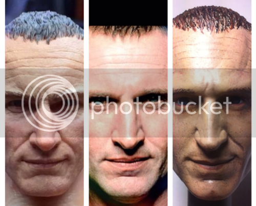
Funny, I chose this expression because I thought BC would do a more neutral one and hopefully offer a smirking head sculpt.
Still a big fan of BC and since this is just a prototype, I hope they would listen to some of the more constructive suggestions.
Here's another side by side pic with my custom sculpt just to show the aging difference textures can make (and yes, mine also has a lot of issues, but it was my first sculpt

Funny, I chose this expression because I thought BC would do a more neutral one and hopefully offer a smirking head sculpt.
Still a big fan of BC and since this is just a prototype, I hope they would listen to some of the more constructive suggestions.
Last edited:
juanca33
Super Freak
The forehead has to many lines and his cheek bones are off plus the sides where the mouth ends and the cheeks begin look too deep. Thats my description.
duck of death
Super Freak
I think Captain Britain nailed the main issues with the sculpt. I agree 100% with everything he says and I would add that I think the eyes are slightly too far apart.
It's a little but hard to tell -- definitely the irises on the proto head are about 3/4 the size they should be which is just a paint thing rather than a sculpt thing -- but if they were the right size it would be a lot easier to tell if the eye sockets shouldn't be set fractionally closer to the nose.
Other than that, like everyone says, the nose needs to be longer and pointier at the tip. The bottom lip needs to be fuller (although that may also just be a paint issue), there needs to be way more cheekbone, way less of those crazy lines, and then I think it would start to be a lot closer to Chris E.
Doom Saber
Super Freak
Thanks for these Vash. I've been away all day, interesting to come back and see what's been happening.
First, I thought it was great that Gregg responded to the criticism, which was widespread enough to warrant his response. The photo he posted does make the sculpt look a lot better, though it's still in no way perfect. It was also great to see Jon cracking down on personal abuse on his FB group when people are simply saying politely that the sculpt doesn't strike them as all that good.
Not sure I agree that you can't just say 'the sculpt looks off' sometimes it just does, and it's difficult to describe precise details when you don't have good photo skills (and i can barely post a photo never mind enlarge it, compare it to another or write on it).
However, since Vash has kindly posted these photos, I think the sculpt's strengths and shortcomings are pretty clear. Yes, it looks better, though it's worrying that shadows are partly responsible for this. But close up the following is obvious:
- As Vash said, the forehead needs to be fuller. The sculpt generally has a slightly pinched look to it, which leads me to:
- The cheeks and jawline need to be fuller, the right hand photo on the top row of the original photos shows this very well. It is too angular, compare it with the picture on the cover of the 2006 Doctor Who annual, which is from a similar angle.
- Yet while the cheeks and jawline need to be fuller, the chin is, as Vash said, too wide, and too square.
- The face isn't wide enough at the cheekbones.
-Top lip is fine, but the bottom lip is... wonky, for word of a better word.
-The nose is too bulbous, not sculpted enough, particularly towards the tip.
-What's with the massive shadows and creases under the eyes? I don't mean the bags I mean the shadows underneath they are far more pronounced on the sculpt than on 2005 era Chris, and this is another of the sculpt's problems - either the sculptor or the painter has made Nine look waaaaaay too haggard and old, which he wouldn't have looked on screen. The wrinkles are too deep - on his forehead, above his nose, the lines from his nose to his mouth and the lines on his chin under his mouth - are all far too pronounced. He looks pouchy and tired.
-Eyes are too deepest and need to be larger and bluer.
-Chris's skin never looked that old on screen, it looked much smoother... because he was wearing make up! When it comes to paint jobs I like pores as much as the same fan, but there is such a thing as too many pores and broken blood vessels.
Edit - I'm not sure any BCS paint job has ever been helped by the 'matt' appearance of the paints, going back to the very first pictures of the original Tennant figure. I don't know anyone else, other than companies, who males their figures 'matt' rather than shiny. Human skin is shiny, especially when it's got make up on it.
I agree with the pores. When I first saw the images, it looked rough because of the pores. I think ever since the first Doctor fig, BCS have been using the pores for most of their figures, though I think the Capaldi head doesn't have as much.
As for the matted skin appearance, I think matted flesh is used because a glossy or a semi-glossy finish would make the figure look sweaty or shiny.
Similar threads
- Replies
- 0
- Views
- 237
- Replies
- 1
- Views
- 200
- Replies
- 107
- Views
- 11K
- Replies
- 20
- Views
- 2K


