GODZILLA: KING OF THE MONSTERS - Legendary Pictures' Godzilla 2

Collector Freaks Forum

Help Support Collector Freaks Forum:

This site may earn a commission from merchant affiliate links, including eBay, Amazon, and others.
Here's a clean copy of the SDCC poster art.
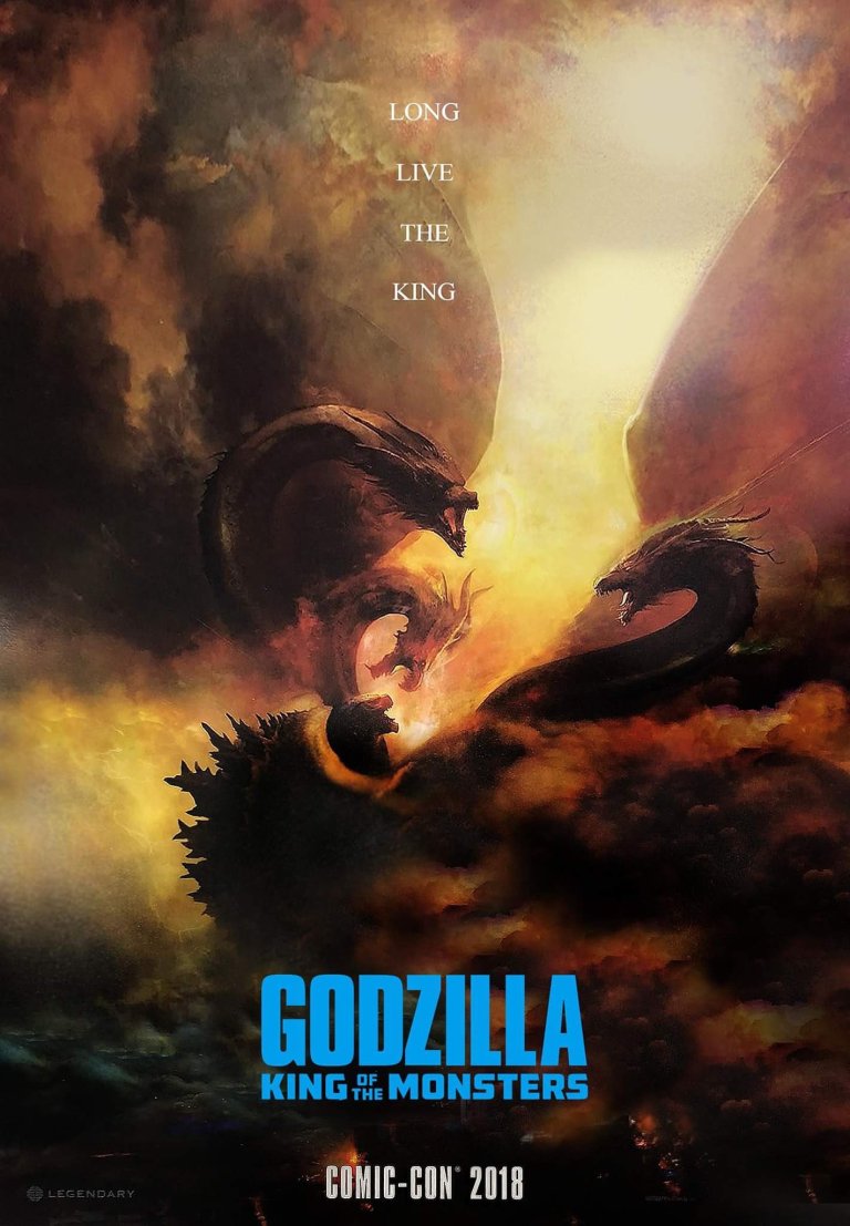
king-of-the-monsters.jpg
 
I ran into some of the viral merketing here at the con. Its built around people saying Godzilla is our protector and we should save Godzilla. The guy was not prepared for my Godzilla knowledge so it ended up being a pretty funny moment. He gave me a business card though

DE52DD65-F145-4DEA-B822-CEC99917F142.jpg

E9FE48B0-22BD-4523-9C3D-FA67C5BC2238.jpg
 
One possible issue might be too many antagonists, that's what I think ruined Iron Man 2.

I thought the new Kong movie worked great in that it felt like a '70s monster mash with modern effects and stylish shots. If anything, this should be an improvement because the other creatures will be icons, not just oversized animals or generic lizard beasts.


Pretty great, not gonna lie. They certainly have the sense of scale, mystery, and power down. Really hope the next posters retain this style, but with the other monsters.
 
That poster sucks.

Just because it’s Frazetta style does it mean it’s good.

Foreground has no defining character because Godzilla and the other monsters look tiny on a huge poster.

Background is a cloudy mess.

Creatures are just thrown into the mix with no thought put into their placement.

Yuck lol

2cp9m9w.jpg
 
I think the notion that every movie poster has to depict its main (or titular) character at a certain size in a certain spot rather limits what can be done with the form. We need to see that Ghidorah is larger than Godzilla. But rather than featuring only the three heads, WB opted to include the wings to emphasize its biblical scale. That means Godzilla's going to be even smaller in the image. There's more than one way to show scale or importance in these things.

As for the background, this is an apocalyptic scene. Clear skies wouldn't fit. You'd also see too much of the creatures and it's harder to maintain a sense of elegance with that much information, especially in a battle between two chunky beasts. I'm betting WB doesn't want to reveal the entirety of Ghidorah's design either.

Creature placement is solid. Somewhat centered, but with bright negative space that moves the eye diagonally across the image rather than focusing on that central spot.

Have you seen Jye’s photoshop posters? Negative space is NOT something he’s familiar with :lol
 
So who's the "king" the poster is referring to: Godzilla, King of the monsters... or King Ghidorah?

I think Charles Dance is referring to Ghidorah when he says "long live the King".


Also, what the hell is wrapped around Godzilla in that poster?
 
That poster sucks.

Just because it’s Frazetta style does it mean it’s good.

Foreground has no defining character because Godzilla and the other monsters look tiny on a huge poster.

Background is a cloudy mess.

Creatures are just thrown into the mix with no thought put into their placement.

Yuck lol


InfantileTidyBichonfrise-max-1mb.gif
 
I like the way it looks like an old style painting by like Michelangelo or something, adds to the mythology aspect. I agree that the logo font looks way out of place, they should have used something that felt more fitting to the art style.
 
Back
Top