That "tail wrap" then is really poorly incorporated.
I vote KG's middle head.

That "tail wrap" then is really poorly incorporated.

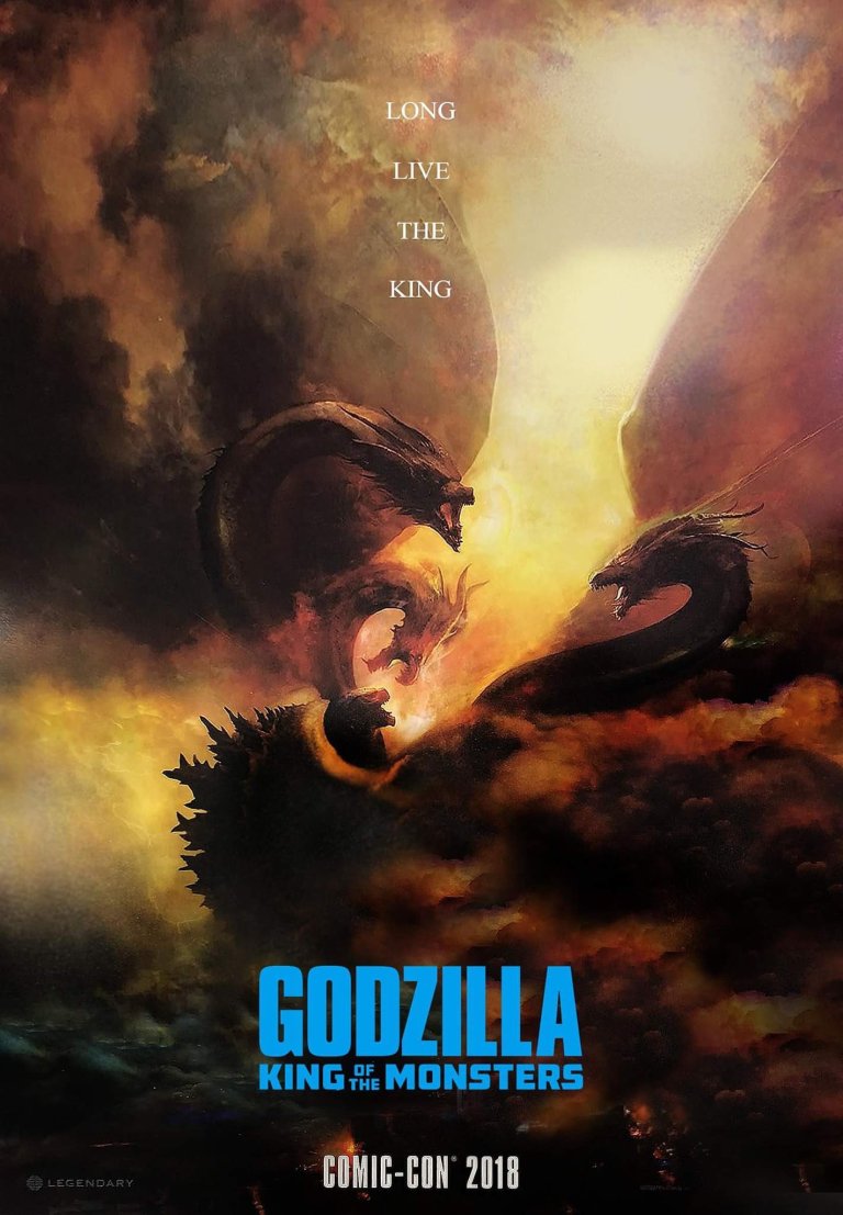
That poster sucks.
Just because it’s Frazetta style does it mean it’s good.
Foreground has no defining character because Godzilla and the other monsters look tiny on a huge poster.
Background is a cloudy mess.
Creatures are just thrown into the mix with no thought put into their placement.
Yuck lol
But the KING OF ALL MONSTERS is the size of postage stamp in his own poster I mean he’s not even Queen size lol
Here's a clean copy of the SDCC poster art.


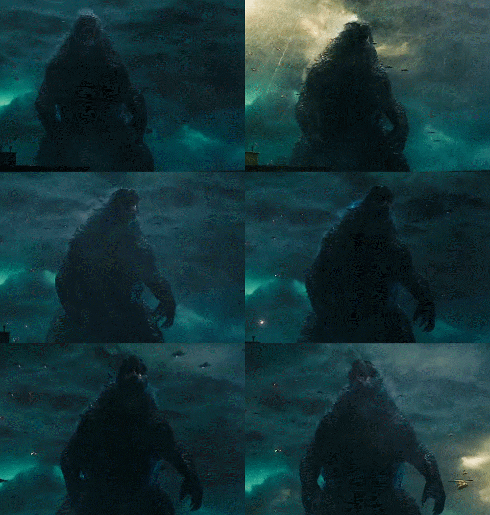
This scene looks cool.


Anybody else love how Godzilla's eyes glow when he uses his breath? That's really cool
