I love Trevor's sculpt too, but I don't see the point of constantly comparing it to HT's effort unless there are some suggestions for how HT could use the example of the SS sculpt. Trevor's sculpt is the best so far, but it isn't perfect. I think with some work the HT one could be even better
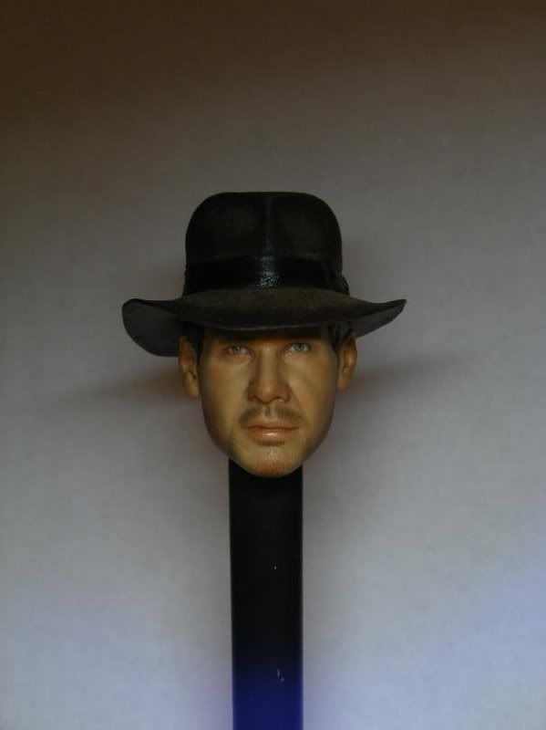
Well without even getting into the geometry of the face right now, I'd say the HT fedora lacks the character of Trevors. Its too stiff and flat in the brim and the back doesnt tapper downward like Indy's. Trevor did a great job of making his hat look worn and conform to Fords head rather than put on straight out of a hat box.
Trevs hat brim dips in the front and arches back to the rear most noticeably on the viewers left.
Then on the (viewers)right side, the brim it almost looks like its catching a gust of wind and forcing it upwards a bit.
Obviously Indy and his hat didnt always look the same through out the movie but Trevor was great at isolating the little things that added up to almost an iconic perfect sum.
HT needs to isolate more little things and the rest will fall into place.
Right now the HT hat looks like the Toys McCoy or even the Medicom hat. Technically correct but artistically wrong. That makes all the difference imo.
(Actually look at Dinolasts signature above me, the HT hat doesnt look any where near as dynamic)
As far as the face goes, the darkness of the eyes is off putting. Harrison has hazel eyes not dark brown.
Maybe its the poor lighting at the show but it looks alot like Mark Wahlberg and the eyes dont help.
Trevor did well in capturing what I can only describe as Harrisons right upper lip sneer or "Elvis lip".
Again, Trevor isolated the important Indy trademarks. Dont see it as much in the HT version.
Finally the face to hat ratio seems to be off in the HT version, his face looks too square and compact.
Again it might be the non professional shots taken at the show but thats the vibe I get.


