Hot Toys - MMS 106 - Alien - BIG CHAP collectible figure

Collector Freaks Forum

Help Support Collector Freaks Forum:

This site may earn a commission from merchant affiliate links, including eBay, Amazon, and others.
I quite like the fact that the playing field is still open for someone to really nail an Alien figure. I'm surprised actually that more people haven't thought "Feck it, I'm sculpting one myself", because lord knows there are enough talented sculptors out there.
 
Some of the debating is stupid or at the very least driven into the ground.

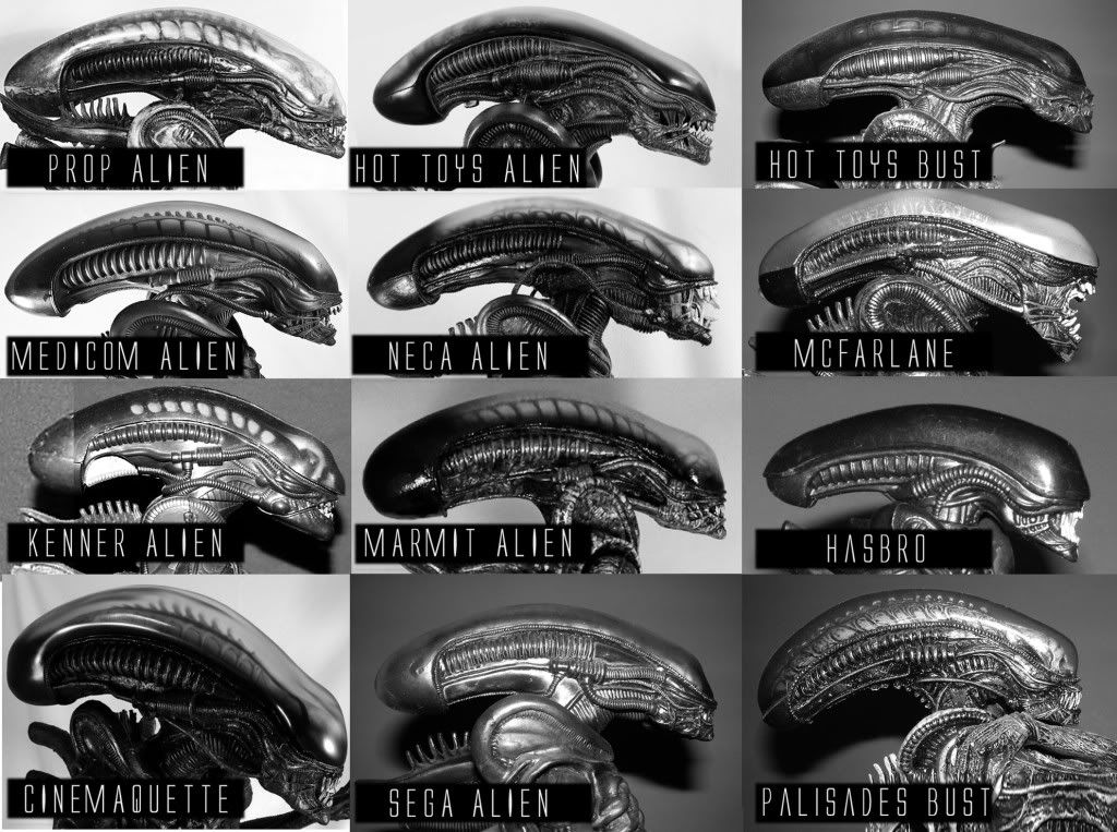
The head comparison picture though is a lot of fun. The Hot Toys does have the best looking silhouette I think. The proportions of the head to the shoulders and the location of the head on the neck as well as the slope of the neck seems the most similar to the pictured prop.

On a lot of them the neck is too thin and straight up and down and doesn't flow into the jaw right. It's true of pretty much all of them but the Hot Toys. The jaw being too heavy and low hanging though on the HT kinda screws up the line of the neck.
 
I quite like the fact that the playing field is still open for someone to really nail an Alien figure. I'm surprised actually that more people haven't thought "Feck it, I'm sculpting one myself", because lord knows there are enough talented sculptors out there.

I think it's really easy to critique the Alien head based on single angle comparisons but to get everything right on such a complex design with not a load of good reference I think is really hard.
 
The Hot Toys does have the best looking silhouette I think. The proportions of the head to the shoulders and the location of the head on the neck as well as the slope of the neck seems the most similar to the pictured prop.

It's not far off in that respect, although the highest section of the dome is too far back, and the angle of the slope down to the face is therefore too steep.

I reckon if someone had the time to make these into silhouettes, the Medicom one would fit over the prop photo almost exactly. The Kenner wouldn't be far off either, although it's a bit short!
 
I think it's really easy to critique the Alien head based on single angle comparisons but to get everything right on such a complex design with not a load of good reference I think is really hard.

Oh totally. But as previously discussed, there is plenty of reference material, once you've decided which suit or head to try and base a figure on.
 
Guess it just shows that either everyone takes some measure of artistic license, or like certain actors (Harrison Ford) the perfect likeness is very elusive.

Maybe we need to put Trevor Grove on the case :lecture

As for my Big Chap I can say I've very, very happy with him. There is still something overall about the head that doesn't quite emote the original ALIEN as well as I would like it too... but its still one of the coolest figures in my collection.
 
Can I just say that I love that comparison montage Wookster, and I really enjoy this sort of discussion.

I'd love to see the finished Hellpainter Kit in amongst that line up, and maybe even the little Revoltech when it arrives!
 
Here's a comp shot I prepared for my review... just shows how differently he's been interpreted over the years-

ALIENheadcomp.jpg

Some excellent interpretations here. HT isn't so bad when you really see what else is out there.
 
I reckon if someone had the time to make these into silhouettes, the Medicom one would fit over the prop photo almost exactly. The Kenner wouldn't be far off either, although it's a bit short!

Quick and dirty but here ya go.

head-comparison.png


On all of them the spinal spike seems to be way too low (except maybe for McF?) and none of them seem to have gotten the shape and scale of the shoulder tube thing right.
 
Heh heh! Excellent work. Not much in it at all.

This reminds me of dinosaur books I had as a kid for some reason. Like we're looking at different variations on a species or something, and their skull shapes! :)

Here's the Work-in-progress Hellpainter in the rough orientation, if anyone's interested:

hellpainterAlien3.jpg
 
I don't think you guys want me to hate it. :D
I'm just having fun. This is the most fun thread I have read in ages.
I mean, I LOVE the Alien! I have loved it since seeing it at a theatre, on a rainy night in Atlanta in 1979 and missing meeting Dudley Moore in person at a premiere of the movie 10 at another theatre I was already at.
So I have given up a lot of stuff over ALIEN in my life. Trust me.

And, copying Giger's art style in high school and the early 80's, I taught myself better how to shade and draw dimensionally. So, again, I LOVE ALIEN. It is very much a part of who I am as an artist even now.

That being said, I will join the gripe group one time, and list, my main gripes about the figure as a whole, but I will also list what I like about it too.

Here goes...


My PRIMARY comments about the Hot Toys ALIEN Big Chap

WHAT I DON’T LIKE:
(Starting from the top and working down the body…)

The dome seam. Not as terrible to me personally, but noticeable.
The inner skull surfaces. Not high enough to see well enough, and no boney ridge at it’s top, so as to have that spinal look to it that you can see in profile when backlit.
The angle of the jaw and how it extends down in back a bit too much.
The angle of the front of the teeth, and how they don’t protrude enough, have long enough fangs on the sides, which make for the sort of round “tunnel” space for the inner tongue to come through, even when the mouth is not too widely opened.
The inner tongue is totally too small, and has no details like the movie one, and needs proper teeth and fangs. It’s lower jaw needs to extend more also if posed open.
How they could have made the entire head from plastic, rather than rubber coated, as it is ball jointed and no need for a full rubber skin, excepting of course the needed rubber mouth areas and tendons stuctures.
Some details of the holes in the front ribcage chest area are not the right shapes.
The “headrest” has too many spines and they are not quite the right shapes, and the tip of the headrest needs to curve upward at it’s tip a bit more, echoing the head shape hovering just above it.
The back tubes need to be thicker, especially the bottom two, and the recessed ribbed surfaces need to be enlarged and lengthened, especially on the insides to almost full length.
The shoulder joints being a bit limited in outer pose range.
The elbow points need to be thinner, straighter and longer.
The wrists need to have extended rubber ring “cuffs” so as to hide the wrist joints better and allow for bending while covered.
The hands need the fingers to taper more at the tips, and have longer, flatter nails.
The abdomen needs more accurate details, including the “tops” of the structures that seem to run down to the legs.
The limited crotch due to the tight rubber, there, but that is maybe not as big a problem to me as I don’t care to pose him too extremely.
The three ringed structures on the sides of the butt, need to be moved a bit more forward to the sides.
Same with the three knee side rings.
The knees could be a tad less knobby.
The tail could use more pronounced ribbing structures,
The tail tip needs to be smaller and sharper and curved inward a bit.
The feet need slightly smaller toenails, but are close.
The structures on the back of the feet need to be longer and extend out more.

And, I wish the lips could close over the mouth if you wanted them to.


WHAT I DO LIKE:

The scale. I love the size and scale to other figures. Looks to be really nice 1/6 for a change.
The overall effect of the figure as a solid piece and it’s look on a shelf.
The overall body build and engineering. Amazing how they made a new, thin body that seems to resemble Bolaji Badejo. And how it works at the elbows and knees. Even how the head fits.
The bendy hands in general.
The arm poses possible due to the nice elbow locks.
The knee poses possible.
The feet.
The length of the tail and it’s posability.
The basic shape of the head.
The head to body size ratio.
The basic shape of the dome and how light plays off it.

Overall, even though my complaints list is longer than my likes list, I like the figure very much. It works on my shelf and in my collection, and is a very emotionally satisfying figure to have for me.
If improved it would be better of course, but it isn’t, so I am happy with it as is.

However, if a better one comes along someday, I will endeavor to get one. And I do "get" the complaints. It's just fun to pick on you guys that don't like it when I do. :D

Now, back to your fun debate. :monkey5
 
Last edited:
Nice pro and con list, Les.

There's a lot more there than I would have noticed.

When I finally do get my Alien, I'm gonna look to your lead in my fixes; namely the tongue swap and the silver pen highlights.

I figure I'll try the tongue swap and if it goes awry I'll just glue the mouth closed as I had originally intended.

Question Les: I don't have the McF so I'm going to use the Halcyon 1/5 scale tongue... you have that, right? Think that will work?

alien.jpg
 
I'm just going to have this mofo shipped to me now and screw the pile of loot and the shipping prices! I'm ready for some HT alien love!

Great run-down of the figure Les.

And thanks for the super-cool comparison chart Jeff, it's great to see all those cool collectibles side by side!
 
I think I will definitely do a teeth swap on mine. I just did a quick test and I can get very good results but sanding down polystyrene.
 
Remove and replace. They're too small to cap I think. I wish I had an extra to test on :)
 
Back
Top