Centrocal
Super Freak
Looking at the original the HT looks mighty fine to me.
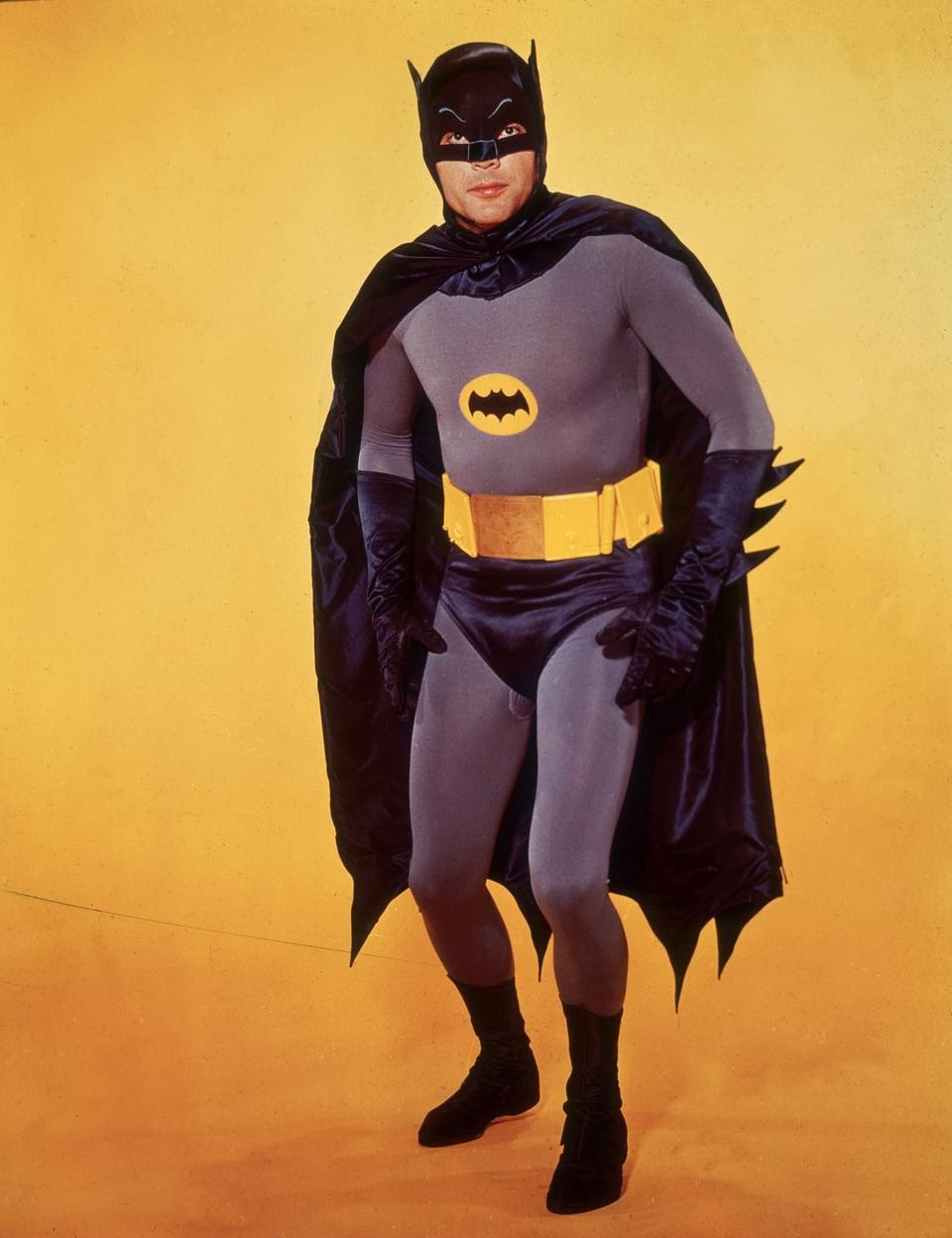
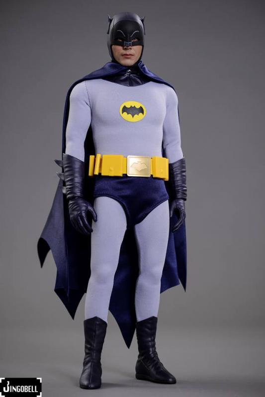
The only thing that really stands out is the belt is to low on the figure.
The likeness looks pretty good on the sculpt. (excluding the line in the middle)
Looking at the original the HT looks mighty fine to me.


The only thing that really stands out is the belt is to low on the figure.
The likeness looks pretty good on the sculpt. (excluding the line in the middle)


Hi Guys and Gals...I'm new here. And I'm sorry to have my first post be such a Danny Downer, but myself and other fans have tried to get Sideshow and Hot Toys to listen to our criticisms of this figure since we saw them at Comic Con. Clearly they paid no attention. I had high hopes for this figure, but clearly it's far from a home run.
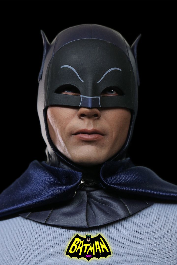
First off, the "peanut head" shaped cowl (with the taper at the top) is all wrong. The seam down the middle of the cowl is annoying, as is the score line around the black portion of the face mask. There was no seam there on the originals. The black was simply painted on to the fabric, not sewn in. And the ears should be painted black or at least dark blue.
The chest emblem is wrong and much too large. The trunks are too short (a common design problem in many 1966 figures and toys) as the top of the trunks hit the naval dead-on.
The utility belt looks ultra-cheap. They should have cast the belts using some sort of leather-look texturing for detail. The fat pad is really annoying as well (not to mention inaccurate to the original look), and the boots seem "clunky."
But the worst offense in this whole design is the cape. The manufacturers and designers had oodles of experts out there who know these costumes forwards and backwards, but they didn't tap that resource. And the result is disastrous. The cut of the cape is completely wrong. The originals had 11 points and 10 scallops. This looks like 8 scallops at best. The edges of the cape flared out like bat wings, but this cape's edge is cut straight. The cape should completely encompass the figure front and back when unsecured. When secured, the cape is folded back, attached with a snap, and then folded back forward to give a multi-tiered, 3-level look. The original designer of the costume said this layering made Adam's shoulders look bigger.
I'm wondering why, with Hot Toys' amazing attention to detail in the past, this figure (and the Robin too) is such a disastrous misfire.


Any other figures you can sell?
Amazing how HT can nail the cowl for this and the Keaton figures. Bale? Third attempt and it still sucks.
The relaxed hands help the figure to look more realistic - same with the Man of Steel relaxed hands. The DX12 hands are like massive bin lids and look awful.

 I find it insane that 6 years on the Medicom cowl is still the best.
  Not only is it the best, I'd argue that it's near perfect.
Here's another issue my buddy had pointed out (no pun) to me in another forum. Why are the ears bend outward.
Outward bend ears......Hot Toys dropped the ball again.................
HOT TOYS PLEASE RE-DO THIS FIGURE THE CORRECT WAY, WE'RE USING OUR HARD EARNED MONEY TO PURCHASE THESE THINGS.
FOR NOW MY ORDER HAS BEEN CANCELED FOR THIS FIGURE.


HOT TOYS PLEASE RE-DO THIS FIGURE THE CORRECT WAY, WE'RE USING OUR HARD EARNED MONEY TO PURCHASE THESE THINGS.
FOR NOW MY ORDER HAS BEEN CANCELED FOR THIS FIGURE.


Hi Guys and Gals...I'm new here. And I'm sorry to have my first post be such a Danny Downer, but myself and other fans have tried to get Sideshow and Hot Toys to listen to our criticisms of this figure since we saw them at Comic Con. Clearly they paid no attention. I had high hopes for this figure, but clearly it's far from a home run.
First off, the "peanut head" shaped cowl (with the taper at the top) is all wrong. The seam down the middle of the cowl is annoying, as is the score line around the black portion of the face mask. There was no seam there on the originals. The black was simply painted on to the fabric, not sewn in. And the ears should be painted black or at least dark blue.
The chest emblem is wrong and much too large. The trunks are too short (a common design problem in many 1966 figures and toys) as the top of the trunks hit the naval dead-on.
The utility belt looks ultra-cheap. They should have cast the belts using some sort of leather-look texturing for detail. The fat pad is really annoying as well (not to mention inaccurate to the original look), and the boots seem "clunky."
But the worst offense in this whole design is the cape. The manufacturers and designers had oodles of experts out there who know these costumes forwards and backwards, but they didn't tap that resource. And the result is disastrous. The cut of the cape is completely wrong. The originals had 11 points and 10 scallops. This looks like 8 scallops at best. The edges of the cape flared out like bat wings, but this cape's edge is cut straight. The cape should completely encompass the figure front and back when unsecured. When secured, the cape is folded back, attached with a snap, and then folded back forward to give a multi-tiered, 3-level look. The original designer of the costume said this layering made Adam's shoulders look bigger.
I'm wondering why, with Hot Toys' amazing attention to detail in the past, this figure (and the Robin too) is such a disastrous misfire.

Here's another issue my buddy had pointed out (no pun) to me in another forum. Why are the ears bend outward.
Outward bend ears.....The right ear should be where the left ear belongs and Vice versa. Hot Toys dropped the ball again!!!
HOT TOYS PLEASE RE-DO THIS FIGURE THE CORRECT WAY, WE'RE USING OUR HARD EARNED MONEY TO PURCHASE THESE THINGS.
WITH THIS (outward ears thingy) AND THE BULGE BELLY LOOK............. FOR NOW MY ORDER HAS BEEN CANCELED FOR THIS FIGURE.


HOT TOYS PLEASE RE-DO THIS FIGURE THE CORRECT WAY, WE'RE USING OUR HARD EARNED MONEY TO PURCHASE THESE THINGS.
WITH THIS (outward ears thingy) AND THE BULGE BELLY LOOK............. FOR NOW MY ORDER HAS BEEN CANCELED FOR THIS FIGURE.


Not a bad figure apart from being a disastrous misfire IMO.
"This grey jumper will keep me warm whilst I fight crime and walk past cardboard windows".

Yeah he should have at least worn a Vivienne Westwood jumper and not some no brand cheapo.
Extra itchy Joker brand - to tickle the Caped Crusader to death.
How will Batman escape from this one?
Robin - gone!
Commissioner Gordon - frozen!
Join us next week Bat-fans! Same Bat-time! Same Bat-channel!
Must watch Batman and Robin again one of these days to see if it is truly the sixties throwback some retroactively claim it to be. Perhaps it is appreciable on that level.