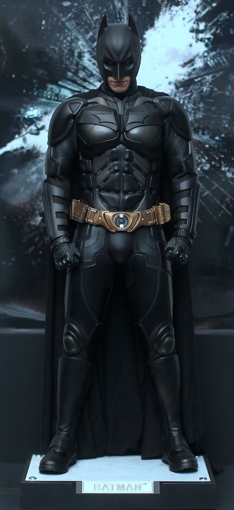
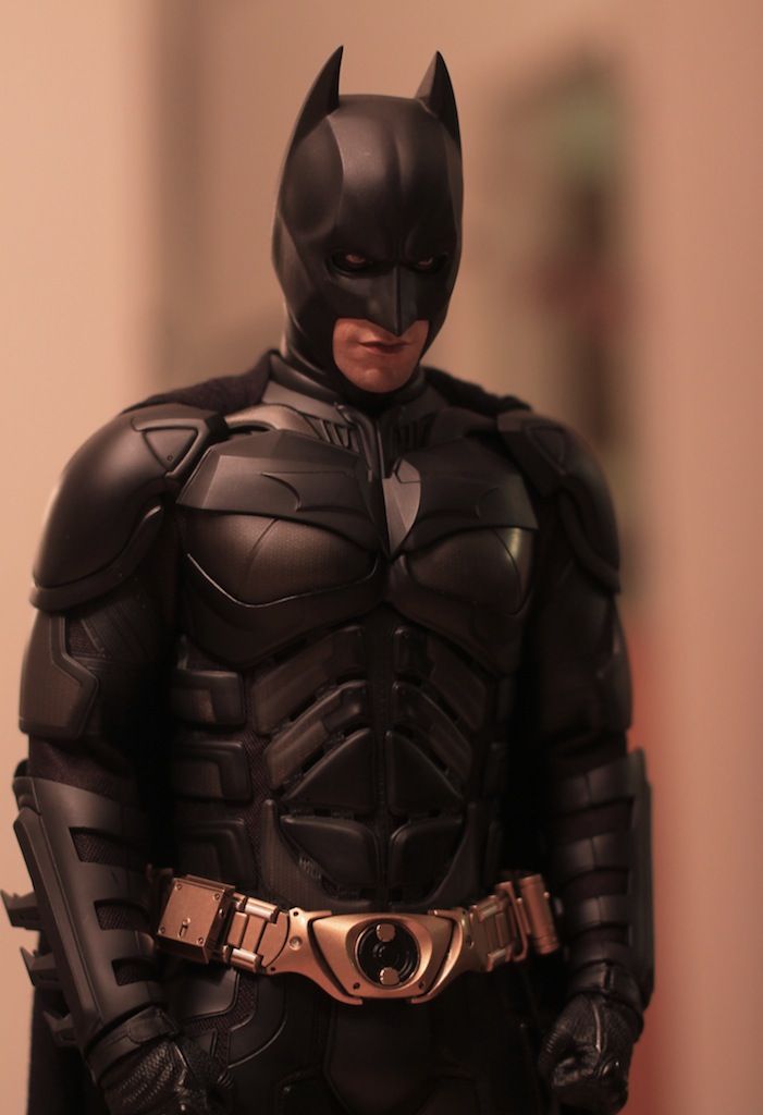
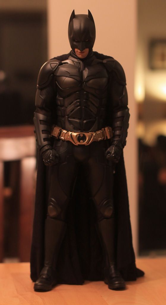
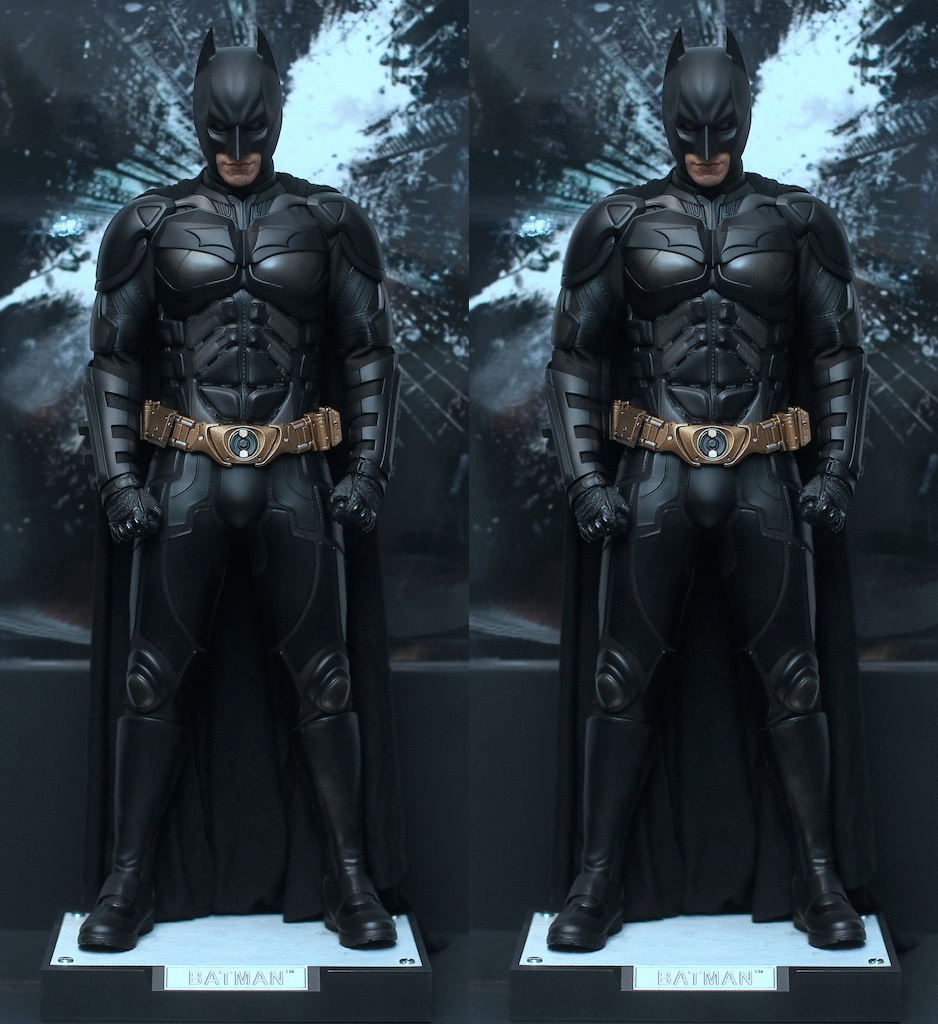
Hot Toys TDKR: 1/4th scale Batman [QS001] - Full Reveal & Specs

Collector Freaks Forum

Help Support Collector Freaks Forum:

This site may earn a commission from merchant affiliate links, including eBay, Amazon, and others.
Oh, it will be subtle to most. But for me, it's the only thing that could get me to keep the figure. Each little mod I do to the shoulders goes a tiny bit further to make it look like a normally proportioned man in a suit.

Not to be judgemental but I think of all your problems with the figure in your video the tummy one I found the most :dunno It was difficult for me to see a problem there.

Back to the head though - I think its too small rather than the shoulders being too wide. When the endoskeleton came out shorter than the Enterbay Terminator figures I thought it was perhaps due to the endoskeleton design in real life not corresponding very well to a normal human physique and Hot Toys weren't to blame for that. Then Hot Toys released this Batman and he too came out shorter than the Enterbay figures. So that made me go back on the endoskeleton and realise, no, he's shorter just because that is what Hot Toys have decided 1:4 scale should be, no other reason. And I think likewise with the size of the heads, HT have simply decided 'this is how big we'll make the heads on our 1:4 scalers'. That little bit smaller. The endo has a pretty narrow head.

Having said that you're right, when you can't do anything about the head size, do something about the shoulders instead.
 
The problem I'm having with mine is getting the right side of the ab straps up under the armor. I have tried heating it and pushing it up almost to point of almost breaking something. It just won't go. I'm starting to think the upper armor on mine was put together unevenly. :dunno
 
And you're right, that fist pose does look like a pain. Looks like he's pulling his pants up.

:lol

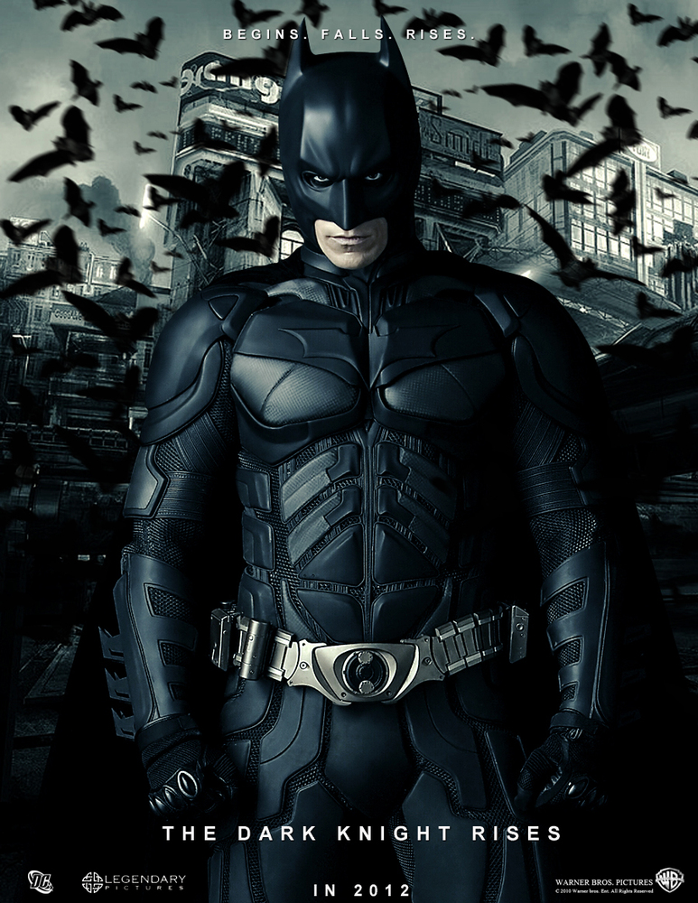
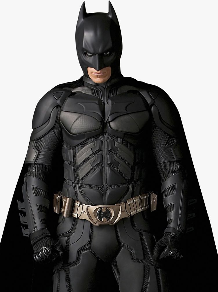
Here's the pose that inspired the fists in front idea:

DarkKnightRisesPoster1.jpg


I tweaked the arms on mine a bit to match:


IMG_7083.jpg


Better?


Right shoulder tucked inside chest plate.

I think I like his right shoulder better as well. To be clear, the chest plates are kind of a separate issue. I'm still working on them. I think I actually prefer his left chest plate right now...

One of the practical differences between his left and right shoulders right now is that the left shoulder requires the arm to be a little higher to have the shoulder plate covering the bicep armor. The other real difference is that the kevlar connector is shorter on his left right now.

Basically, the left shoulder plate is tighter to the body right now (which I like), but has a bit too much slope to it, I think. Like it's not square enough.


Not to be judgemental but I think of all your problems with the figure in your video the tummy one I found the most :dunno It was difficult for me to see a problem there.

Back to the head though - I think its too small rather than the shoulders being too wide. When the endoskeleton came out shorter than the Enterbay Terminator figures I thought it was perhaps due to the endoskeleton design in real life not corresponding very well to a normal human physique and Hot Toys weren't to blame for that. Then Hot Toys released this Batman and he too came out shorter than the Enterbay figures. So that made me go back on the endoskeleton and realise, no, he's shorter just because that is what Hot Toys have decided 1:4 scale should be, no other reason. And I think likewise with the size of the heads, HT have simply decided 'this is how big we'll make the heads on our 1:4 scalers'. That little bit smaller. The endo has a pretty narrow head.

Having said that you're right, when you can't do anything about the head size, do something about the shoulders instead.

No worries about the belly. It bothered me though, and was a very easy fix.


And I've always leaned toward the head being too small, over the shoulder plates being too big. Hot Toys loves to make undersized heads.


The problem I'm having with mine is getting the right side of the ab straps up under the armor. I have tried heating it and pushing it up almost to point of almost breaking something. It just won't go. I'm starting to think the upper armor on mine was put together unevenly. :dunno


Try this: You know how the upper body armor fits around the arms? On his right side where the ab straps are showing too much, try tucking more material up under that upper body armor that goes under the arm. If there is too much material bunching up under the arm, you will only be able to push the upper body armor down so far.


Hope that makes sense.
 
Last edited:
The ratchet joints are driving me crazy... I cant get the position I like with his arms on his side, so I'm trying fists just a little in front, what do you think?

IMG_7071.jpg


IMG_7067.jpg


I'm also having trouble deciding which shoulder I like better. For those who can tell the difference between his left and his right in the above pic, which do you prefer? I can make either look like the other.

This simple stance always works for Batman, it looks stunning, Maglor.

Pardon me if you have already mentioned it prior but I have missed a lot on this thread and am yet to do a lot of backreading, but I see that you've done the glove mod which I'm also considering once I get mine from our local dealer. Have you already painted the eyes, and is that the stock cape? The knee pads are also well-futzed.

Also, I dig more the shoulder pad UNDER the chest armor, makes the shoulder look narrower, and gives a more effective image that the armor/suit is multi-layered. Great job as usual!:clap

Thanks. :)

Definitely recommend the glove mod.

I have not painted the eyes, but I will. I'm not going to try to convey the idea of a squint, but I do want more black around the eyes. The goal will be to leave just a hint of pink on the edges.

Not the stock cape. This is a rare 1/4 scale rayon cape from lforigno. I also have a couple capes on order from Tony Mei.

The knee pads are a pain to futz, but some twisting to the pants gets them there.

I see. Will check the separate customs thread for updates and be taking notes from now on, see what mods I could and would do to my liking once mine arrives :) Thanks for your response!
 
Try this: You know how the upper body armor fits around the arms? On his right side where the ab straps are showing too much, try tucking more material up under that upper body armor that goes under the arm. If there is too much material bunching up under the arm, you will only be able to push the upper body armor down so far.


Hope that makes sense.

Thanks for the tip. I'll give it a shot.
 
The ratchet joints are driving me crazy... I cant get the position I like with his arms on his side, so I'm trying fists just a little in front, what do you think?
Fists in front works well.
I'm not exactly sure what you were going for in the first place but this looks more interesting than "arms on his side".


I'm also having trouble deciding which shoulder I like better. For those who can tell the difference between his left and his right in the above pic, which do you prefer? I can make either look like the other.
His right shoulder is definitely better, it is now well positioned and preserves the nice rounded shape seen on the real suit.
The other one looks a bit flat and and droopy like the DX12 moded shoulders, it doesn't as well work in my opinion.
 
Okay I love the figure hate the base this is my fix. It's works . I'm using the SSC 1/6 figure base I just switched out the 1/6 cradle for the 1/4 cradle.
ugynegap.jpg
6y4a8eju.jpg


Sent from my iPhone using Tapatalk

WOW !!! That looks a million times better compared to the absoultely horrid HT base with the stupid rocks and masks and metal things !!!
 
Yeah, good idea. I have to say in pictures, I thought the base looked neat at first. In hand, it is a nightmare. I have mine in a case with no stand. For a figure of it's size it is surprisingly easy to keep upright without a stand.
 
WOW !!! That looks a million times better compared to the absoultely horrid HT base with the stupid rocks and masks and metal things !!!

I hope your being sarcastic . That base is annoying the mask are cool but that rock is a pain in the ***. Totally buying a Enterbay Batman stand. for this.
 
got mine yesterday, I noticed two issues, not sure if this is acceptable at this price or Im being picky. there is a paint missing behind the left eye & the left chest plate have this weird white & black paint.
9y3ypuga.jpg

uby4a9uh.jpg
 
IDK, I asked sideshow for body & head replacements, hope they do the right thing.
 
The base does suck,well it's cool lookin but there is no good place for him to stand in a neutral pose.i was gonna use my dx02 base for him and use this base for my iron man mark 7,it works real well for a flying pose
 
got mine yesterday, I noticed two issues, not sure if this is acceptable at this price or Im being picky. there is a paint missing behind the left eye & the left chest plate have this weird white & black paint.

uby4a9uh.jpg

Looks like the chest plate is unglued to me.
 
Back
Top