xr6.turbo
Super Freak
Nice sig, turbo. You make it yourself?
Nah i got it from the ALP site. Check it out https://alienlovespredator.com/2010/05/05/happy-smothers-day/

Nice sig, turbo. You make it yourself?
My favorite piece in the line. Shenanigans, good sir.
My dilemma with the piece is primarily the backstory, as the dio itself is just a snapshot of a more expansive fight. Again, I would have liked to see one of the hind claws embedded in the Proto's abdomen, rather than appearing so starkly one-sided, with a story depicting the V.mongoliensis as a bungling dilettante.
I think the 300, at least for me, would be far better spent on the allosaurs vs. camarasaur. 3 dinos vs. one, and to me the spino's pose just seems a bit dull. Plus I agree that the lack of scars really kinda makes this a lot more "meh" than say the T. rex maquette.
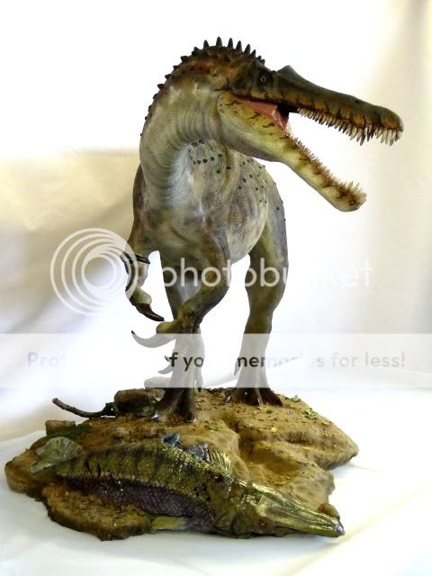
The pose feels a bit meh, but i'm sure when we see this thing in person we'll feel differently, considering the sheer size of this thing. 15" tall and 32" long!!
I just read the story and it was interesting. Definitely some funny moments, although I felt there were a few too many exclamation marks peppered throughout. Kind of brought it down to a childish level with those.
 :
:I think the Spino is pretty awsome, mabey for me it's becuase it's the biggest and the meanset looking maquette. Besides that the pose is not that great and I am not too crazy about the color. First T-rex looks like a rooster, Spino like a dragon, I personally think SS needs to start experimenting with colors. Spino looks too dark to dull, SS needs to use more vibrant colors. If these beasts are reptilian, look at the reptiles in nature now these days, full of color.
The other issue I am having is SS needs to start making more of a detail, background, with the base. Especially on the maquettes, these dinos needs to come alive within their environment, it plays a major role. Mabey it's just me but I want the bases bigger and more detialed, they are too boring and too small. Another thing I like to see is have them interact with something. Basically what I am trying to say is don't just give me a backstory (I PERSONALLY DON'T CARE ABOUT THE STORY) show me the story, I will make it up in my mind. They should show more of the story and let the collectors go wild with thier imagination.
My favorite piece in the line. Shenanigans, good sir.
I think the Spino is pretty awsome, mabey for me it's becuase it's the biggest and the meanset looking maquette. Besides that the pose is not that great and I am not too crazy about the color. First T-rex looks like a rooster, Spino like a dragon, I personally think SS needs to start experimenting with colors. Spino looks too dark to dull, SS needs to use more vibrant colors. If these beasts are reptilian, look at the reptiles in nature now these days, full of color.
The other issue I am having is SS needs to start making more of a detail, background, with the base. Especially on the maquettes, these dinos needs to come alive within their environment, it plays a major role. Mabey it's just me but I want the bases bigger and more detialed, they are too boring and too small. Another thing I like to see is have them interact with something. Basically what I am trying to say is don't just give me a backstory (I PERSONALLY DON'T CARE ABOUT THE STORY) show me the story, I will make it up in my mind. They should show more of the story and let the collectors go wild with thier imagination.
Nah i got it from the ALP site. Check it out https://alienlovespredator.com/2010/05/05/happy-smothers-day/
Personally I want the focus to be on the dinosaur, I think if they make the bases very elaborate that will detract from the dino. Not to mention add cost and make it a larger piece making them more difficult to get.

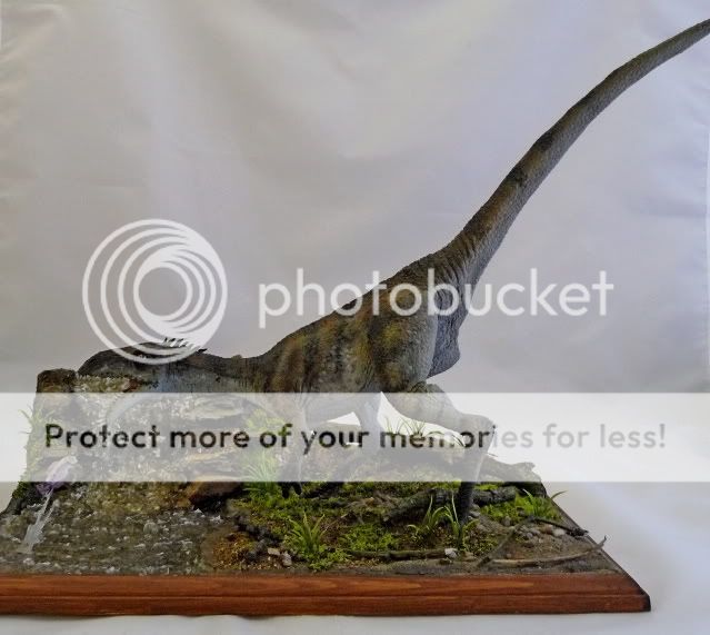
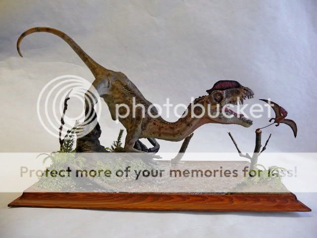
Eh, no, I suppose those don't detract from the piece to much. However on the latter two I did find my eye was drawn to the base as much as the dinosaur.
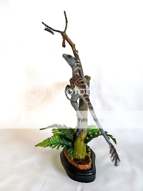
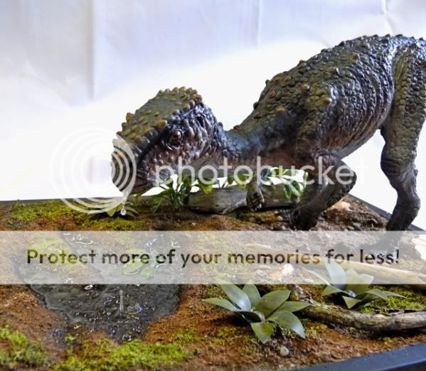
 :
:I also had to share this one as it's a really simple addition but adds so much to the piece :

A sort of sense of forboding...maybe risk or impending doom...:
Since we're also discussing bases and enviroments...how about one with snow on it ?

 Garret is brilliant.
It's not drooling, it was drinking from the puddle. See the splash right in there?Garret is brilliant.

Is that drool coming from it's mouth?
The elaborate bases would no doubt add more to the price of these, and I think they are already teetering on that very fine line of putting them out of reach for most.
I think the Spino is pretty awsome, mabey for me it's becuase it's the biggest and the meanset looking maquette. Besides that the pose is not that great and I am not too crazy about the color. First T-rex looks like a rooster, Spino like a dragon, I personally think SS needs to start experimenting with colors. Spino looks too dark to dull, SS needs to use more vibrant colors. If these beasts are reptilian, look at the reptiles in nature now these days, full of color.
The other issue I am having is SS needs to start making more of a detail, background, with the base. Especially on the maquettes, these dinos needs to come alive within their environment, it plays a major role. Mabey it's just me but I want the bases bigger and more detialed, they are too boring and too small. Another thing I like to see is have them interact with something. Basically what I am trying to say is don't just give me a backstory (I PERSONALLY DON'T CARE ABOUT THE STORY) show me the story, I will make it up in my mind. They should show more of the story and let the collectors go wild with thier imagination.
Hi Chris:
Thanks for the compliments, and while I certainly did some research before starting on the model, I didn't intend to copy any other artists specific interpretation of the animal, ala Todd Marshall for example. However, that being said, adding a crest of dorsal spines seemed especially appropriate given it's assumed amphibious lifestyle and that huge sail, of course.
I did add some scars to the left side of the upper jaw, shins and left thigh just above the knee and the base is meant to be riverside terrain with scattered fern fronds,ginko leaves and a few odd bones. I stayed away from adding any dead fish to the base because the artwork Sideshow supplied (done by Jorge Blanco, I think) showed the animal in a running pose with open jaws and the head turned to the right, so I stuck with that, and I'd seen fish incorporated into previous interpretations and didn't want mimic them. Left to my own devices, I probably would have posed the animal scavenging a carcass, but I can certainly understand that they wanted a more obvious action pose. I don't know if there are plans for alternate color schemes and as of now nobody's mentioned any more sculptures for the line.
As for the work process, I first made a half-scale maquette (16" long) to define the general look and pose and when that was approved I doubled all the dimensions on the maquette to construct the armature for the big version. As the sculpt progressed I would email pictures for approval, and when completed I made a multi-part silicone mold and produced three resin castings, two assembled and painted and the third in several pieces that would serve as the mold master for the production molds. The same process was used for the Salacious Crumb life size model I made a few years ago.
So, thanks for asking and let me know if you have any more questions.
Tony
 )
)Enter your email address to join: