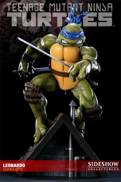
TMNT Leonardo Comiquette

Collector Freaks Forum

Help Support Collector Freaks Forum:

This site may earn a commission from merchant affiliate links, including eBay, Amazon, and others.
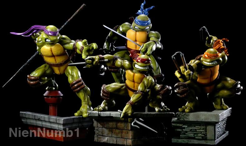
The expression looks like something a muppet would make if it got socked in the mouth with a bag full of nickels and was trying to pull his head into his shell. The other 3 look great though. Wha happened?
 
14feb6-bitter-beer-face.jpg

We have a winner!! I think P!TU nailed it...
 
The 4 look good together but Donny is far and above the best of them all.

i agree. im getting all 4 cuz i think theyre all gonna look great together but im starting to think i probably wouldnt have minded if the donny statue had 4 switch out masks with switch out hands holding the different weapons.
 
Maybe the exclusive will come with _____*ed up head and non-_____*ed up head switchout! :D
 
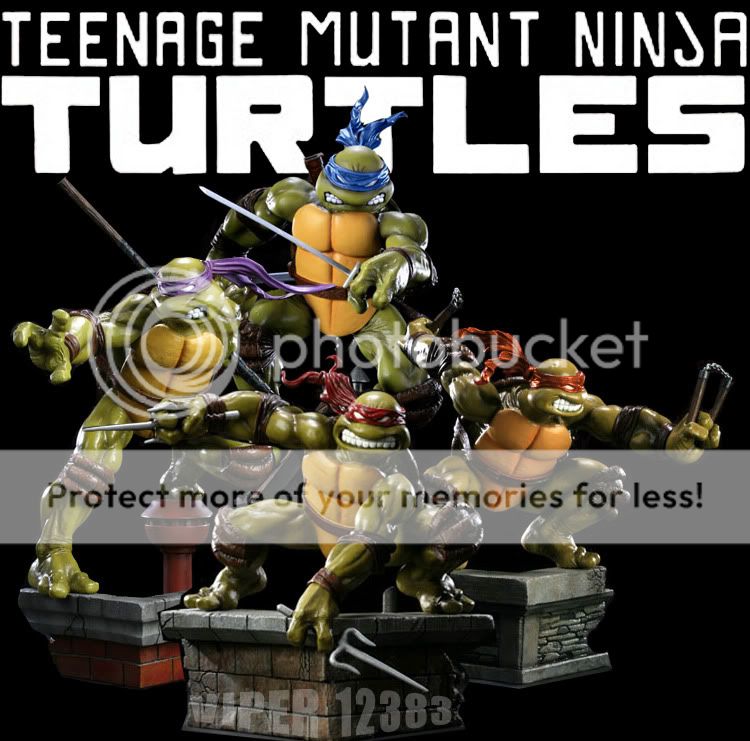
I added some teeth in photoshop. what a difference some chompers can make :wink1:
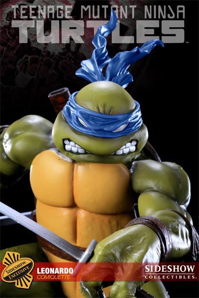
LeoTeeth.jpg
LeoTeeth2.jpg


and one in the group shot

TMNTGroup.jpg
 
in a previous post I wrote that only adding teeth wouldn't save this sculpt for me.
But having looked at viper12383's shopped image I have to take that back.
If the head would look like that I could easily look over things like the short swords, the awkwardly bent legs, or the strangely stretched neck,...
It still wouldn't be a perfect sculpt like Donatello, but at least I wouldn't be sad every time I look at him standing on my shelve beside his good looking brothers...

Let's hope that the guys from Sideshow don't ignore all the people who are disappointed with this piece. (like they do on their site by deleting all negative comments concerning Leo)
 
Last edited:
made my own group shot. i reflected donny and mikey to give it a more symmetrical look

tmntgroup2.jpg
 
wow, even though my favorite turtle looks stupid. I still must buy these pieces to complete the holy grail.
 
Now THAT`s perfect

I couldn't agree more. I am so disappointed with this. 3 absolutely perfect sculpts and then ... Leo. How in the world did they think this looked good?

Unfortunately, I complain until I'm blue in the face, but I'll end up buying it because I want all four. Blah.
 
Viper that looks so much better it's crazy. I wanted to love leo...but as he stands atm I can only hope SS changes him :(
 
I added some teeth in photoshop. what a difference some chompers can make :wink1:
LeoTeeth.jpg
LeoTeeth2.jpg


and one in the group shot

TMNTGroup.jpg

And there we have it. This is exactly how it should be done. It matches better with the other turtles and looks much better as a whole!
 
Wow, I'm not collecting these, but so far have loved the way they looked.

But that Leo sculpt is just weird... bummer way to cap off the series. I don't see a "pending approval" statement on the images, so maybe this is the approved final product :duh
 
Doesn't Leo look like his riding a bike :rotfl:rotfl

I mentioned that he looked like he was riding on Raphael's back. I don't think people took that very lightly.

**Edit** Nevermind.. That won't work
 
After sleeping on it, I'm still disappointed in the way this came out.

I'll buy the "stoic" argument, because it does reflect Leo, but if Sideshow wanted to play around with the personalities of the turtles, they shouldn't have waited until the last one to do it. Given the expressions of the other three, he just doesn't fit in well with the rest.

Calm and pensive should have been saved for Splinter.

I'm still undecided on whether or not I want to continue with the line. In the end $800 plus is a lot of money to drop on a set of maquettes when you aren't completely happy with how they turned out.
 
I think Viper's photoshop is exactly what we were all expecting. This is a debacle bordering on fiasco.
 
I don't mind the head it reminds me of the 80s tmnt movie which is what i really want to buy toys of. But this will do. Come on its tmnt what more do you want.
 
Back
Top