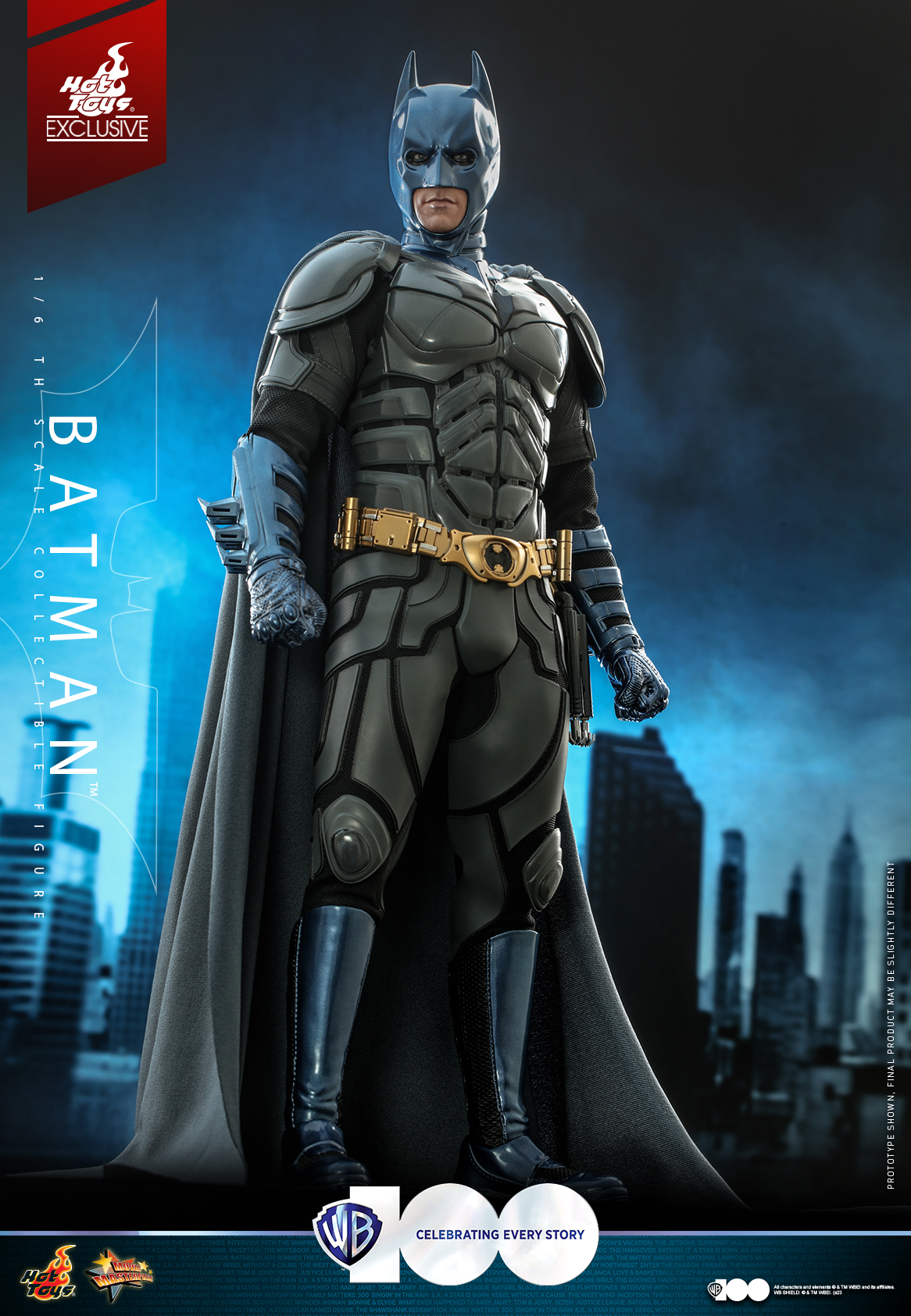
It's both the wrong suit to do it with and just poorly done. Why on earth are the blue parts finished in some super high gloss top coat? There's actual zero sense to it.
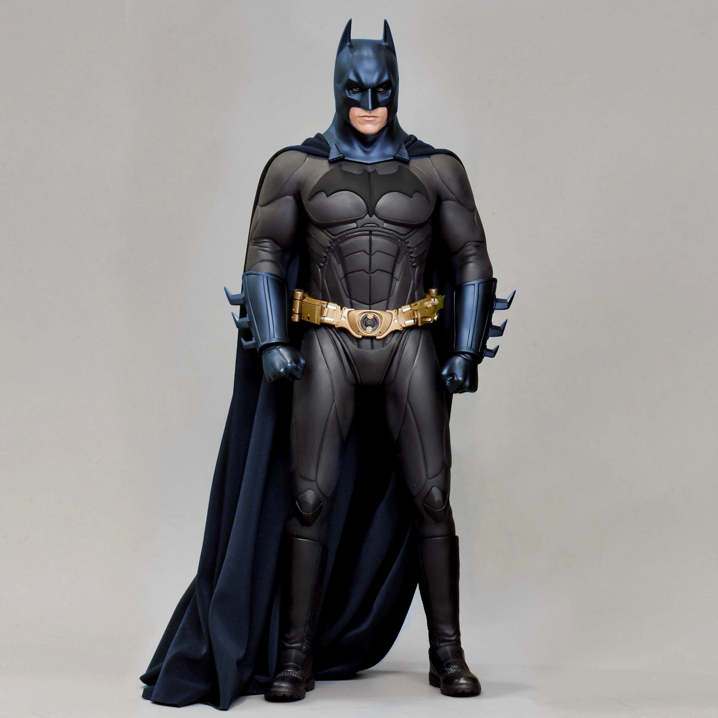
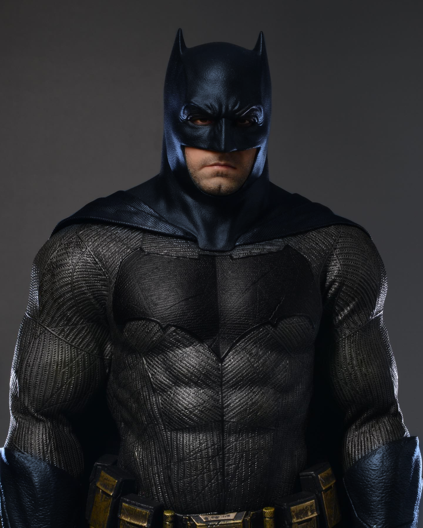
What would have sold so much more and looked a thousand times better would be doing this on the BvS figure or Batman Begins. Having Bales TDK segmented suit be a light grey just makes the suit more unflattering than it already is. Draws attention to every single suit pad that runs throughout his body instead of it being a coherent, simple and fluid suit. Your eyes goes all over the place when looking at this version of the suit. It's a ******* mess.
Did a quick mock up of the color scheme below with OTs Begins figure and a custom BvS figure. You can already see how much more coherent it looks overall. Swing and a miss from Hot Toys on this one. Only thing I like is the base with the bats floating around.


 Damnit Why couldn't it be that instead.


