jye4ever
Broke and happy
They really shouldn’t have put that side to side comparison because the original looks so much better bulkier and just all around more bad ass.
Inart show me the way.
Inart show me the way.

This!They really shouldn’t have put that side to side comparison because the original looks so much better bulkier and just all around more bad ass.
Inart show me the way.
Originals seem like Inart's nowIf people end up selling the 1.0 off cheap I might pick up one of those to tide me over until InArt release theirs in 2026-27.
Don't think anything would tempt me to order this though. The face sculpts are no better than the originals.
Well useless it’s not because it includes both options BUT for me the dual parts doesn’t make me accept the armor not looking as good as the original.Damn, this is the most useless 2.0 to date. I'm happy with the Black Chrome one.

It’s not working though.Lol! Howard trying to take the buzz away from Inart by announcing this almost the same time as Inart's Battinson official release. They attempted the same thing when Inart officially announced their BvS Superman for PO.
Me too. I love the Black Chrome one, and I bet this might be the grial in the long term, never ever redone again.Damn, this is the most useless 2.0 to date. I'm happy with the Black Chrome one.
Would have loved InArt to troll back by showing a tease of their armoured Batman prototypeLol! Howard trying to take the buzz away from Inart by announcing this almost the same time as Inart's Battinson official release. They attempted the same thing when Inart officially announced their BvS Superman for PO.

That would have been an instant killWould have loved InArt to troll back by showing a tease of their armoured Batman prototype
A new one this timePrediction: Hot Toys BvS Superman 2.0 will still use the same head sculpt.
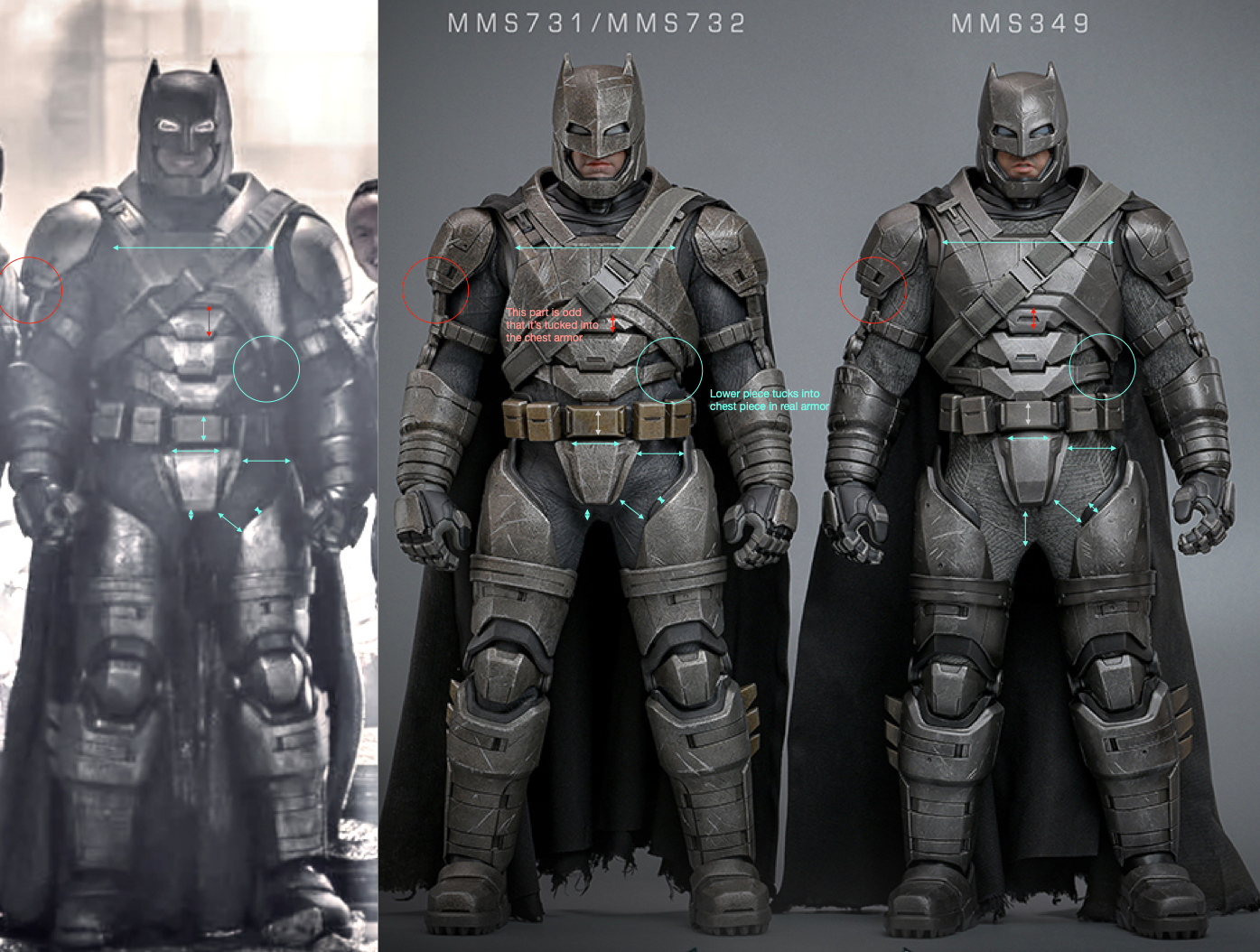
I think we all had knee jerk reactions to it. But with the image T800 posted it does look closer, I highlighted them here. It's a bit inaccurate to use lines to compare pictures with different camera perspectives. Not to mention the black armor behind the scenes image is a prototype with different helmet.Might be worth trying it with this one. Angle looks nearer and it's on set. Just pretend he doesn't look like a Lego character because he's smiling.


Yeah, I'd say it's closer. I still don't understand why they don't just copy it exactly.I think we all had knee jerk reactions to it. But with the image T800 posted it does look closer, I highlighted them here. It's a bit inaccurate to use lines to compare pictures with different camera perspectives. Not to mention the black armor behind the scenes image is a prototype with different helmet.
I've used arrows here so you can see the distances and width/length of each area. Cyan lines I think are improved, and Red seems worse. Though you can argue the chest piece is when he's hunched more, since it's two separate pieces IRL.
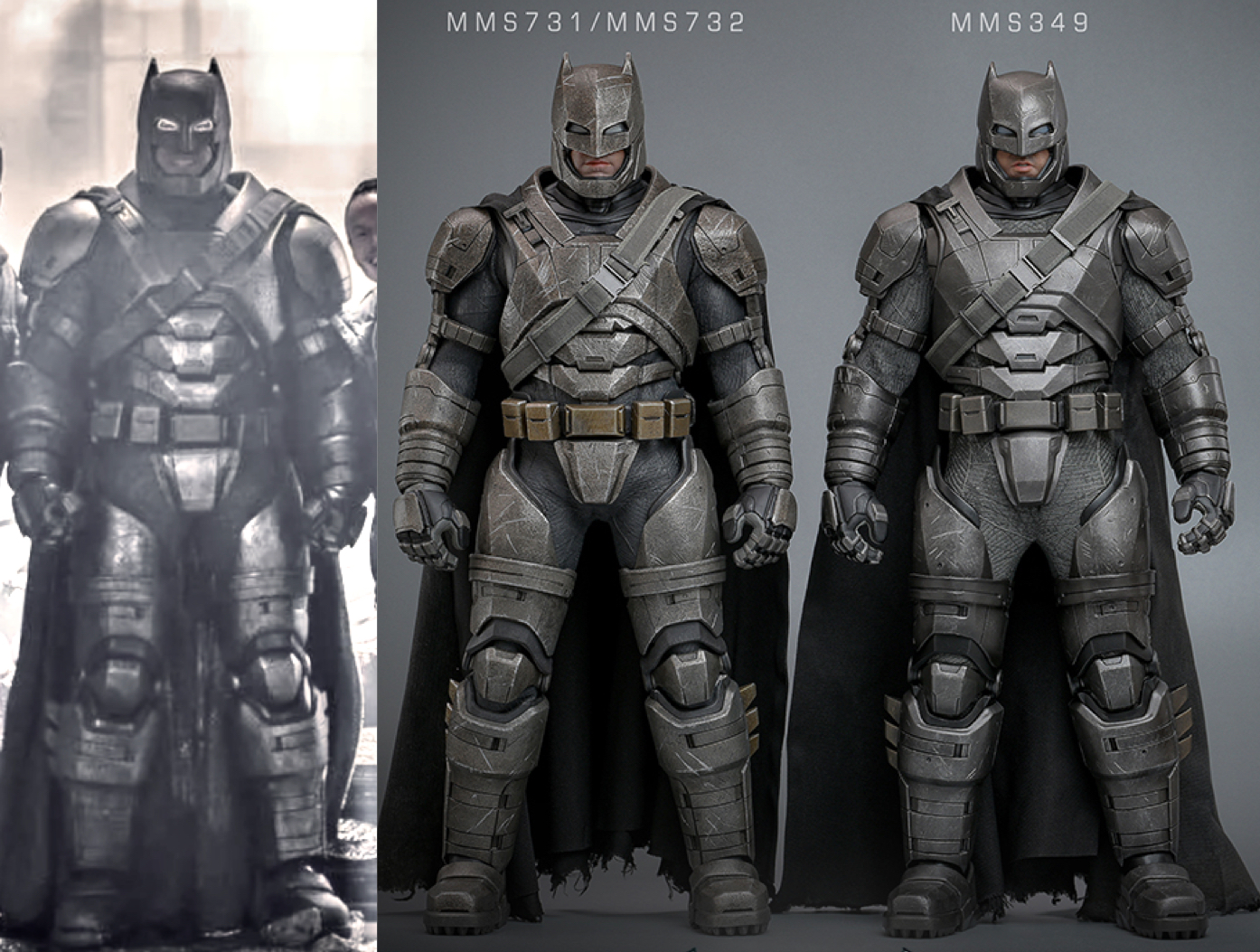
A bit hard to see with the arrows overlapping, but take a look at those areas, in the unmarked one below.
Look at them side by side now, I can see a real proportioned ben underneath all that, where as the old one looks like a toy in comparison. The side profile of the helmet is also much more accurate, but I don't have time to mark that up now

