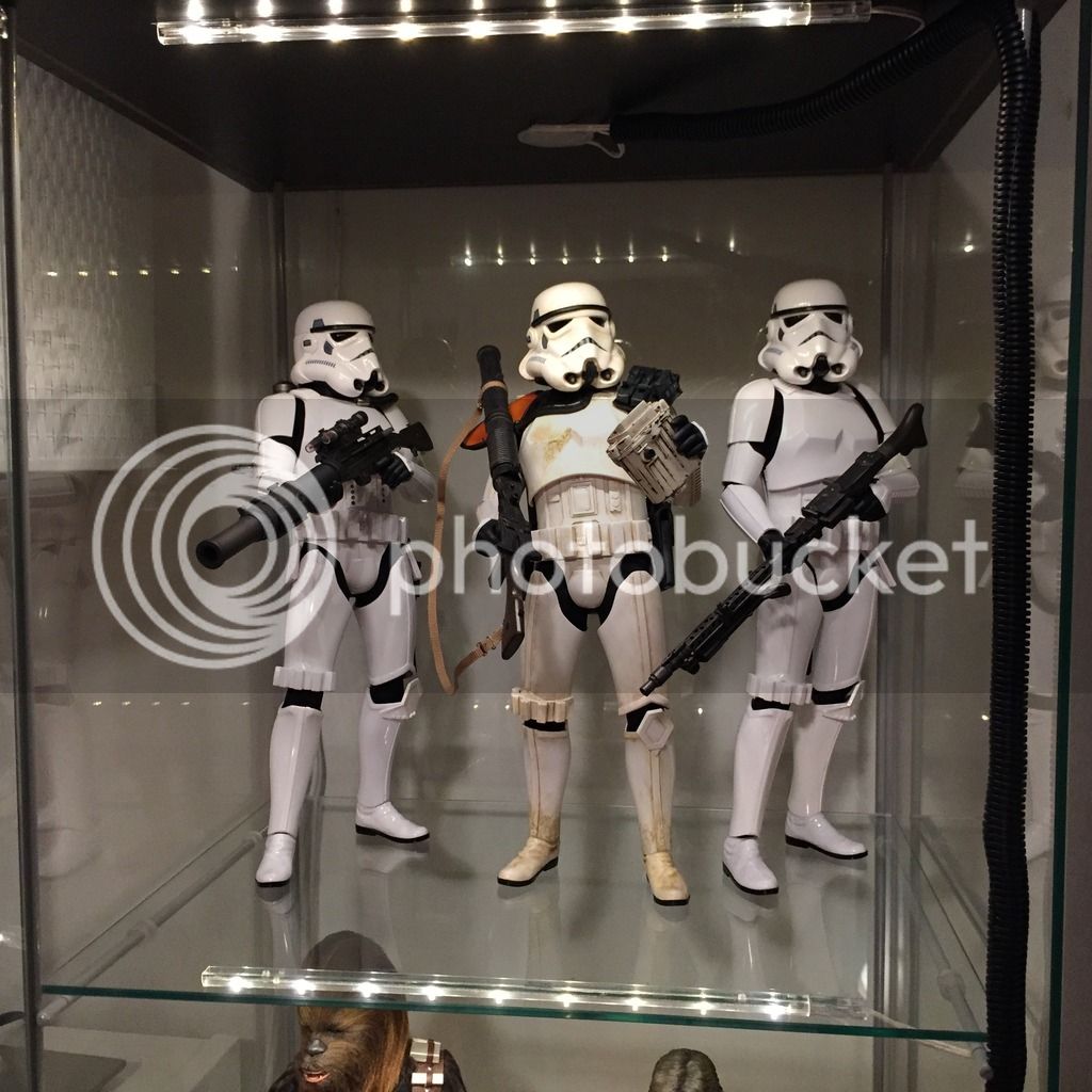
I put mine near the front so from the outside view it will look better but I found myself having to move the figures closer to the front of the detolf rather than right in the middle for better lighting. Maybe test one out and decide what works best for you.
I often do that as well as I like the shadowing this creates on most of the figures. Can sometimes look a bit too flat otherwise so that's good advice (trying different locations). I think I end up liking the figures toward the front too so they don't get blocked too much by the figures/stands above them.


