Re: Batman v Superman: Dawn of Justice
"Start the fusion reactor...lose...your mind...."
"Start the fusion reactor...lose...your mind...."

BB to TDK? You could not be more wrong.
"This is how crazy Batman's made Gotham."
The Narrows were "lost". Arkham was lost. Collateral damage everywhere from a massive terrorist attack. Still loose inmates running around according to Gordon. Scarecrow now sells a new drug that destroys people's minds. The mafia is still in complete control and now allied with the other gangs, they are recovering from a freshly murdered D.A. Gordon is several steps behind at all times. They have no faith from the public who wants Batman caught.
Even if they managed to get crime under control a bit, the hundreds of years old skyscrapers don't just magically morph from stone gargoyles to steel and glass towers.


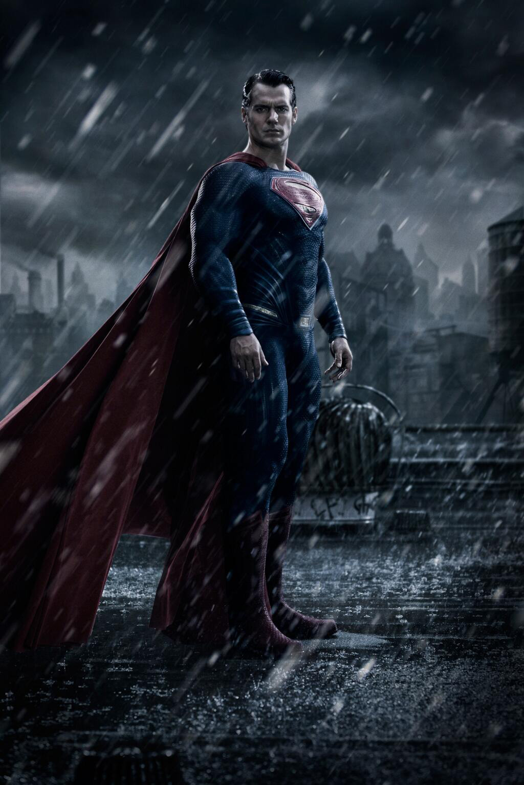
Actually reminds me of this, when SuperRollinsMan starts getting annoyed/pissed.Superman looks scarier than before. It looks like he's ****ed in the head and will kill me on that rooftop.
Well, it's a logical extension of Man of Steel, whereas Ultron is an extension of Avengers and subsequent films. If you like Man of Steel more than the Marvel Studios stuff, then you should think this way.I’m willing to bet this movie turns out much better than Age of Ultron.
Actually reminds me of this, when SuperRollinsMan starts getting annoyed/pissed.
https://youtu.be/iaysTVcounI?t=1m47s
Well, it's a logical extension of Man of Steel, whereas Ultron is an extension of Avengers and subsequent films. If you like Man of Steel more than the Marvel Studios stuff, then you should think this way.
Also, I'm with Deckard. Gotham portrayed in the Nolan films is much too sterile for a city that's experienced a depression, poverty, high crime rates, a riot escape full of basket cases, etc.
Begins was a step in the right direction, from the alley the Wayne's were killed in, to the graffiti in the trains and streets, to the homeless people in the dark, dank environment outside city hall when Bruce is spying on Finch and Rachel. Sure, the Narrows soundstage was a bit crappy as well as the CGI, but it still had a visual identity. Gotham was actually a character outside Chicago extras. You had bums outside of a ****** bars, a poor food vendor on a rainy, gritty street. It was a nice blend.
Then we get Dark Knight which looks like Chicago at it's very best (the bank heist prologue alone makes me want to live there) and TDKR that makes Pittsburgh and New York look like the best cities for tourists in the world. They had no style or visual theme because there was no style or visual theme. That's what happens when you shoot on location. Every ahot looks gorgeous like it could be on a travel card, not to mention backgrounds that feature Starbucks, Spider-Man 3 posters, Heinz ketchup, giant eagle, Doritos, etc.


Also, I'm with Deckard. Gotham portrayed in the Nolan films is much too sterile for a city that's experienced a depression, poverty, high crime rates, a riot escape full of basket cases, etc.
Begins was a step in the right direction, from the alley the Wayne's were killed in, to the graffiti in the trains and streets, to the homeless people in the dark, dank environment outside city hall when Bruce is spying on Finch and Rachel. Sure, the Narrows soundstage was a bit crappy as well as the CGI, but it still had a visual identity. Gotham was actually a character outside Chicago extras. You had bums outside of a ****** bars, a poor food vendor on a rainy, gritty street. It was a nice blend.
Then we get Dark Knight which looks like Chicago at it's very best (the bank heist prologue alone makes me want to live there) and TDKR that makes Pittsburgh and New York look like the best cities for tourists in the world. They had no style or visual theme because there was no style or visual theme. That's what happens when you shoot on location. Every shot looks gorgeous like it could be on a travel card, not to mention backgrounds that feature Starbucks, Spider-Man 3 posters, Heinz ketchup, giant eagle, Doritos, etc.
This BvS city looks like . . . Generic, grim dark photoshop. Can't really judge it. TDKR promotional posters had that same look.


Enter your email address to join: