- Joined
- Dec 31, 2009
- Messages
- 15,220
- Reaction score
- 158
I can see that the figure's shield is more squat now, but that's it.
Are you one of those people who only see yellow tonsils when they look at the Batman logo?

I can see that the figure's shield is more squat now, but that's it.

Can you imagine! The tiny stitches around the 'S'? That would be awesome. Kato are you listening? New project?!


@Cking - in spite of what the doubters are posting I'm still interested in seeing more. Keep posting pictures please.


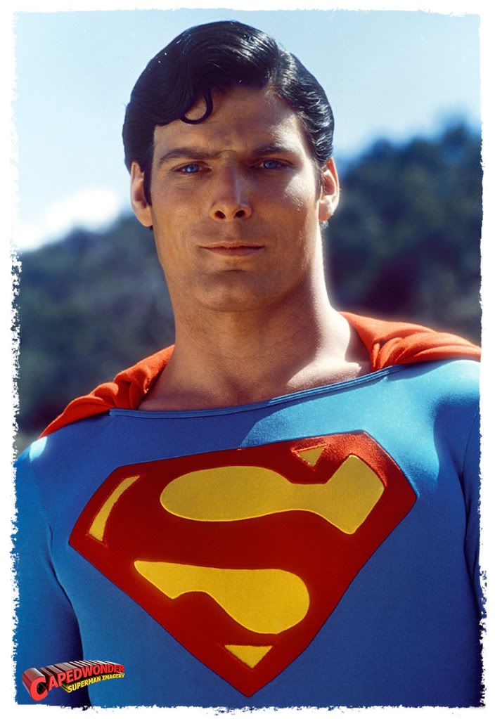
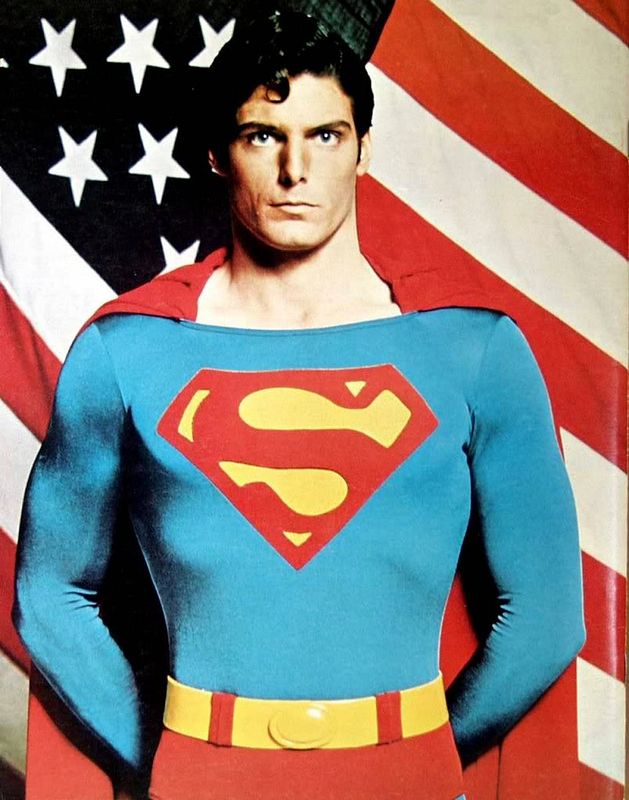
Maglor - Here's the logo from your HT fig (taken from your pic posted in the other thread - hope you don't mind) compared to the movie costume logo seen in the pic posted by Rorywan.
The HT logo has innacurate black outlines around the yellow shapes and the curves / proportions of the yellow shapes (particularly the larger ones) are no match. The "arrow" head on the upper shape is too small and the curve along the top edge of the lower shape is going down instead of up!
There was certainly some slight variation between the different costumes worn by Reeve, but none of his costumes had the shapes in the logo which look like the HT version.



How is this coming?
I'm entertaining thoughts of getting a custom "S" shield for my figure for 2 reasons:
1) Mine is a bit crocked and I'm getting sick of futzing with it.
2) Since somebody pointed out how much more squat shaped the one on the figure is I can't stop seeing that.


Enter your email address to join: