DGTWoodward
Super Freak
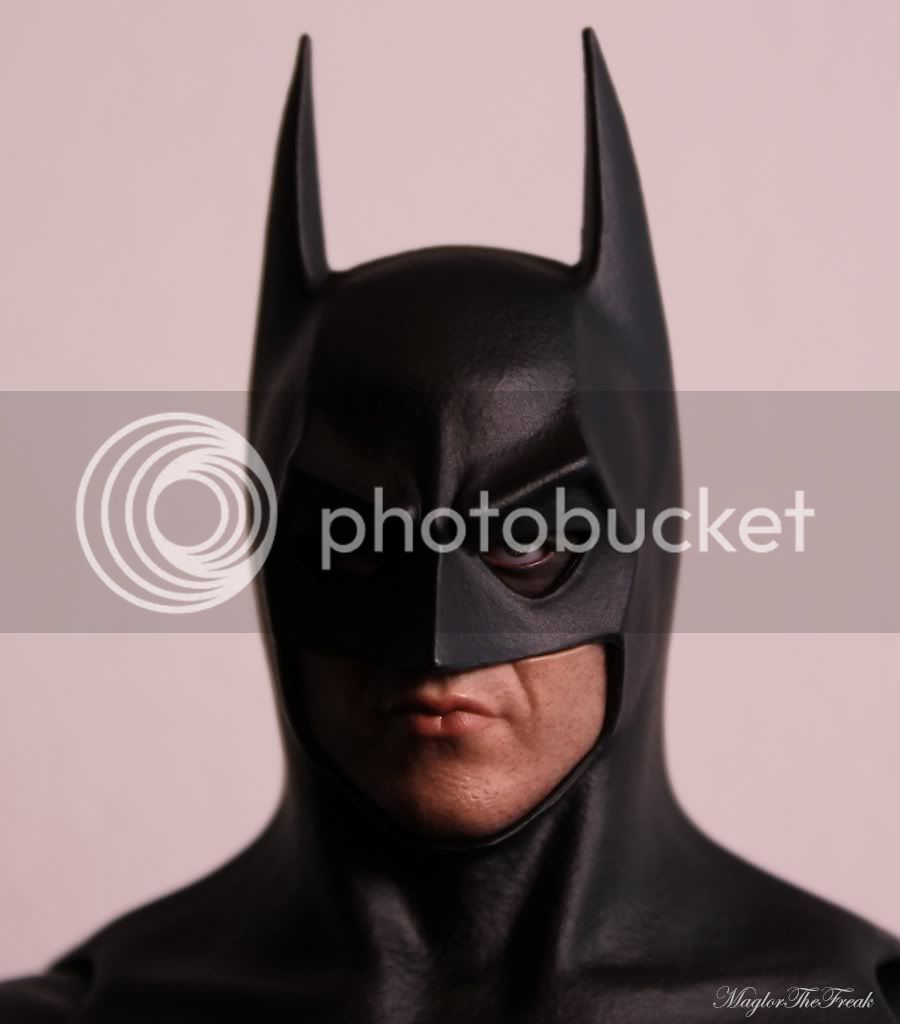
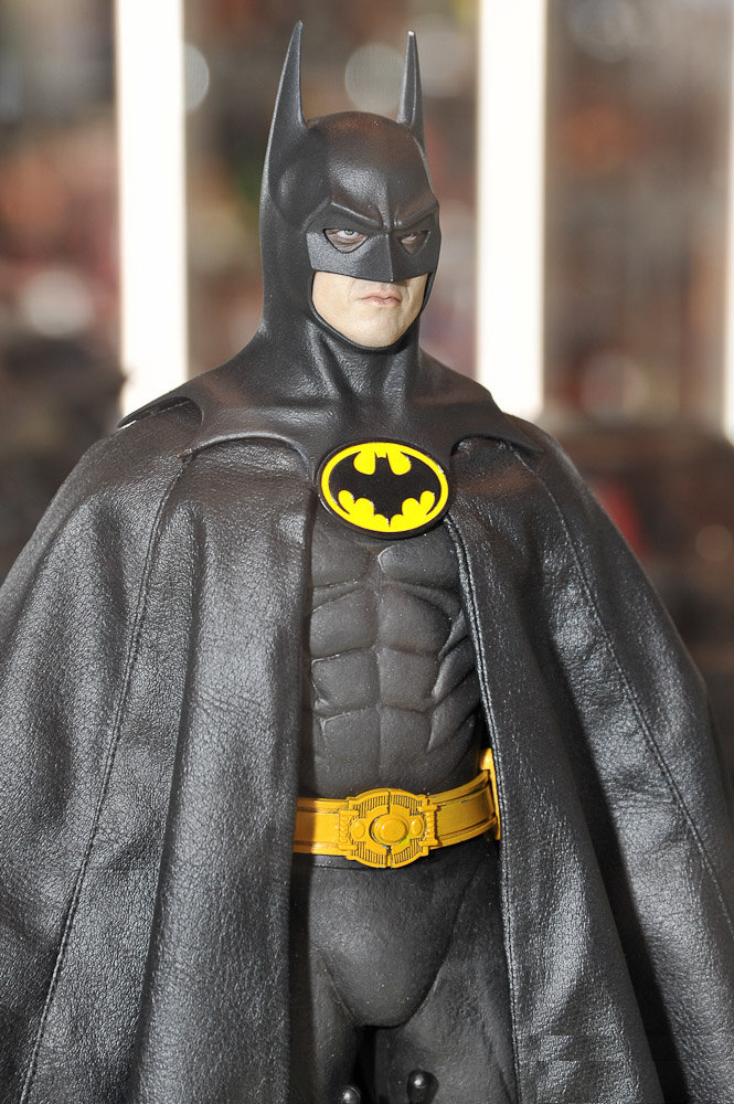
Bloody shame about the edge of the face along the top.
But this picture...
makes it look like there is much more mask overhang than ever. It is strange.


Bloody shame about the edge of the face along the top.
Bloody shame about the edge of the face along the top.
 What's wrong with it???
 OK I think I see what you are talking about on my Bats. For me it's not a big deal. you can't see it unless you look real hard for it and like you said, "It's just where the tightness of the mask's edge was pressing into and compressing the flesh of Michael Keaton's cheeks."There is nothing really actually wrong with it as such. Depending on how you are looking at it, and how the lighting is, the area of the face seems to protrude out further than the edge of the mask. I say it depends, because your photo shows nothing of the kind, but some pictures have from other owners.
Since the mask is over the top of the face, an extra outer layer of mask-over-flesh, this protrusion would be impossible.
I can see both sides of this, there are photos of figures that show it, whereas yours doesn't. So I tend to think along these lines,
That mask was a very tight fit, so on ones that do show it...that's just where the tightness of the mask's edge was pressing into and compressing the flesh of Michael Keaton's cheeks.

")
Yeah, mine drives me crazy. I swear, if someone was able to recast it and somehow get rid of that and give it an HT worthy paint job, I'd pay good money for it.
But this picture...
makes it look like there is much more mask overhang than ever. It is strange.
There is nothing really actually wrong with it as such...


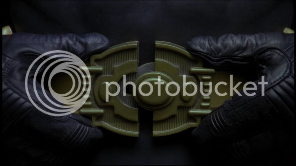
Has anyone tried to paint the belt?
I see it but it doesn't really bother me. Figure too cool to be ruined by that.


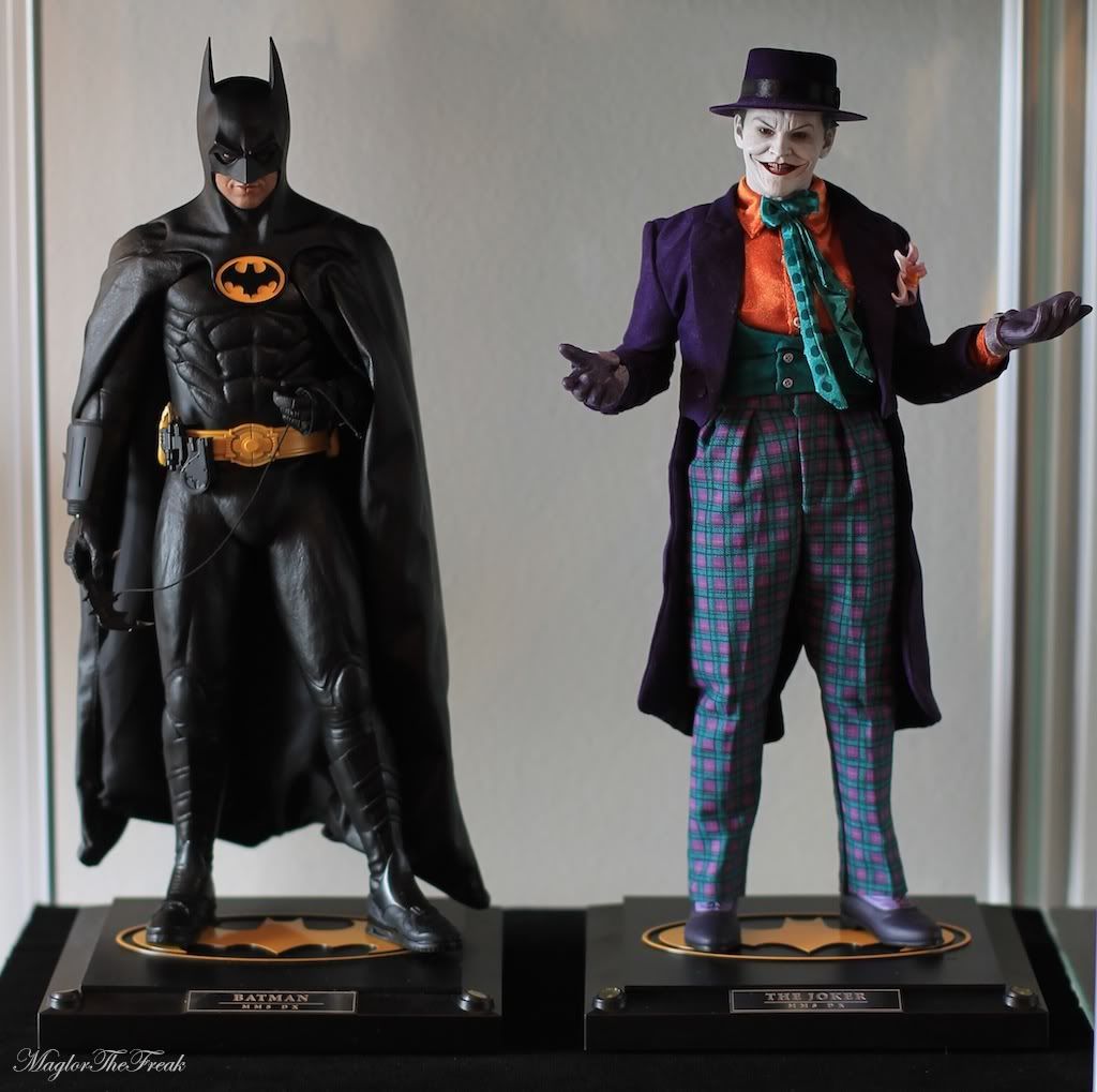
That's a prototype that was on display months before the actual production figure shipped out.
Notice how the belt buckle clasp in the middle is more accurate to the actual prop belt.

I see it but it doesn't really bother me. Figure too cool to be ruined by that.
Notice how the belt buckle clasp in the middle is more accurate to the actual prop belt.
Bloody shame about the edge of the face along the top.
Somebody (I think it was MaulFan) posted a helpful diagram of what is happening. The face does not actually stick out farther than the cowl at all, but the top edge does not have a sharp edge. The curve catches the light which spoils some of the realism.
Here's a picture that would be fantastic without this problem:
Here it is with that edge digitally "sharpened":
I've had to retouched a lot of my pictures of this figure to hide that edge. Shame really.

Dam it, I never noticed that till you pointed it out. Nevertheless, the head sculpt still looks good.
Anyone else having issues with the bat symbol lying away from his chest? It's not real bad but I'd like it to lay on his chest not poke out from his chest.
Bad pic but you get the ideal.
Any ideals how to fix it?
That looks nice. Is it yours? I was thinking of spray painting it with this stuff I found at Michael's but I wasn't sure. The color looked close though. I've asked around hoping someone had painted theirs so I could buy the right stuff but no one replied, so, I guess no one has.