Hot Toys - MMS DX 01- The Dark Knight - The Joker spec and pics

Collector Freaks Forum

Help Support Collector Freaks Forum:

This site may earn a commission from merchant affiliate links, including eBay, Amazon, and others.
Those changes add so much. I have a feeling though we (the ones who really want the changes) are all going to be depressed when all we get is an updated tie.

Please Hot Toys, make me eat my words.

I swear HT do it on purpose so they have an excuse to make another attempt at it again in the future. Surely fixing the orange lining on the coat would have been easier than designing a new tie? I think HT are just cutting corners (and their costs) by re-hashing the old red material they used on the MMS Joker.

If they are going to release the same characters versions within a short time of their initial attempts and call it deluxe they should do it goddam right :banghead
 
3737665049_5e5f367173_o.jpg

https://www.eddiewong.net/

K seriously? What is up with this paint! For a deluxe figure this needs to change. I forgave Connor cause it was not one of their DX figs...but this is the ultimate joker collectible...I want more from the paint. On another note the Mob scene Joker head looks fantastic.
 
All I see is so-so photos. Nothing against the photographer, good angles and sharp quality and all, but the lighting quality at the show doens't look so great, I haven't seen one figure that hasn't looked lesser for paint apps and color from this toy show.

I have faith in HT. John Connor was a mishap that's being corrected, they stand by quality and I'm sure the production DX Joker will be up to the quality of all HT production figures.
 
Lighting is a killer sometimes, the best most amazing figures can look rubbish once in hand because you're not seeing them in the same light as some of the great pictures that appear on the net, like Tin's work shots.
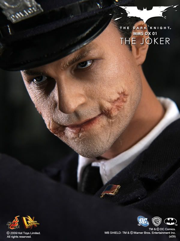
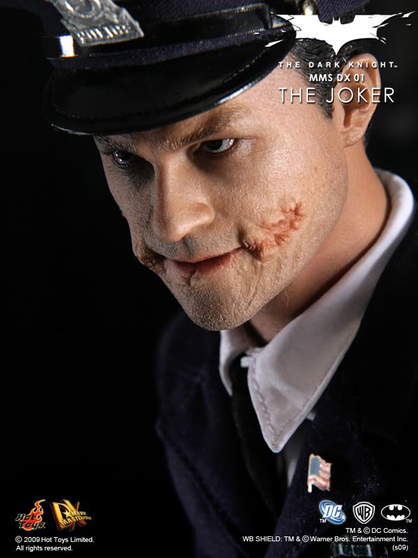
The cops face does look a little odd, plasticky too. I hope its just the washed out lighting.
 
The only thing that bothers me about the police Joker is how big the hat is now. In the solicit pics the hat sat up well above his ears and seemed to be in scale. This new one looks like a hat that is meant for someone with a much larger head.
 
I would like to see his hair a little crazier like this and not so broccoli like...but its still an amazing figure and I'm still gonna get it.
 
3737664975_48d95bfa2a_o.jpg


Looks like they made the mouth a bit more wide on the Joker sculpt. The shoes are a def improvement as far as color.

3737665049_5e5f367173_o.jpg


This is just totally wrong. Looks nothing like Heath. The face structure looks totally different then the Joker sculpt.
 
I can't wait to weather up the hair on this and the roots. I'm tempted to weather up the hair on the Bank Robber. Add a bit more realism to it. Take away that somewhat plastic shiny look it has to it's strands. Decisions decisions...
 
Looking at the joker police costume head...... Oh my, that is bad!! Its awful! I am starting to worry about Hot Toys, they are releasing too many figures of different lines and for that, quality goes down!
 
The paint apps don't seem the best on the Police Joker ,but the sculpt is spot on.

I can clearly see Heath in the eyes and nose, which is where you'd see it as he not only had the scar prosthetics across his bottom lip and over the cheeks, but he wore a brow piece.
 
Man, attending this show is really biting HT in the ass, more positive than negative is coming out of their products being seen under the lighting conditions of this convention.

I know poor photos when I see them and I know these con shots are not showing off the quality of these figures.
 
Hey coming from the "******" of SSF's I will that as a compliment and further proof to my point. :D

:lol:lol:lol

Comparing pics:

MMSDXJoker17.jpg
MMSDXJoker21.jpg


3737665049_5e5f367173_o.jpg


Some people have already pointed out it could just be bad lighting or a bad photo. And I agree. BUT.. the only problem with that idea is the fact that the Clown Joker looks fine.

3737664975_48d95bfa2a_o.jpg


I don't see how two figures in equally "bad" lighting, in an equally "bad" photo could have two completely different results!? Because Clown Joker looks fine.. it's just Cop Joker that looks really bland and crappy in the face. Kinda weird.
 
The clown version doesn't look bad, but he doesn't look good either, I don't react to the latest photos like I did this one.

3675483648_621b9ff62f_o.jpg


I think what hurts the cop head is that the skin is blurring with the tone of the overall image, there's no distinction in color, paint job's not coming through. Clown version is white and black and green mostly, not the same as the fleshy, orange tint of the photos.
 
Back
Top