Hot Toys - MMS DX 11 - TDK: The Joker 2.0 Collectible Figure specs and pics

Collector Freaks Forum

Help Support Collector Freaks Forum:

This site may earn a commission from merchant affiliate links, including eBay, Amazon, and others.
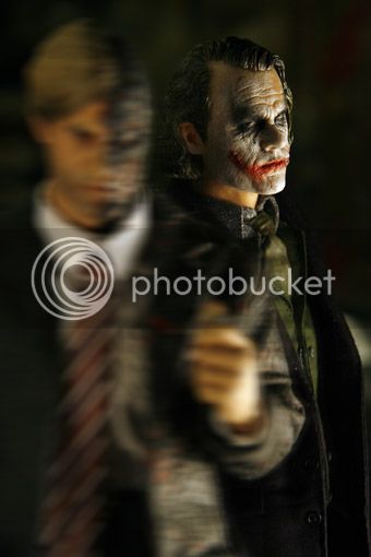
I use to think there was no likeness to Ledger in the bank Robber sculpt but on certain angles in combination with a different paint job, it is the best likeness to Ledger out of all the Joker sculpts IMO.


2ffffwf9_zpsa01d9747.jpg


20081014011535311_jpg-1_zpse8b82e7f.jpg

I think it's still my favorite. Even over the 2.0 sculpt. With a repaint that thing really shines.
 
I think it's still my favorite. Even over the 2.0 sculpt. With a repaint that thing really shines.

I agree and look how realistic it looks. The Joker 2.0 still looks like a cartoon character because of those dam PERS!

I can't understand how they could make the eye sockets look normal on the DX08 but fail to do this every time with most DX releases. :thud:
 
Last edited:
In retrospect I should have included the Police Joker and the first HT Joker in to the comparison pic to make it comprehensive. There were many reasons why I didn't though. I had just received the Joker 2.0. head in mail and was doing head swaps anyway when I took the pics. I was also experiencing camera problems and overall I was just too eager to see what it looks like on a Dx01 body. So I took some quick shots of the heads. Now, when everything in my collection is properly displayed I am just too lazy to start messing with the figures. Sorry. :p

After years of anonymity I want to share my opinion of the HT Joker sculpts though, for what it's worth to anyone. Firstly I like all the sculpts apart from the very first and wouldn't want to part with any of them. That's the beauty of the Joker character he really benefits from having multiple display options for different facial expressions, more so than any other movie character IMO.

I also think that his variety of facial expressions at least partly accounts for the differences of opinion amongst people of whether something looks like a Joker or not. I think most people just compress Joker's countless expressions in to one or two mental images of the character that to them define what he is all about. At least that's my highly unscientific theory about it. :p Most people as far as I've seen prefer the menacing look and I think both BR Jokers and Dx01 do that well. I always wanted my Joker to be a little more 'happy' though and that's why I feel 2.0. is the Joker I've waited all these years...

Here's a quick run down of what I think is wrong with any particular sculpt.

Very first HT Joker looks nothing like Ledger OR the Joker, that's all there is to it.

The two bank robber Jokers are good but their paint job could be better. Not having had a differently painted BR head in hand I can't tell how good it would be, but at least the pictures of it do not convince me that it's the best likeness of Ledger. Pictures, as always, can lie though. So all I am going to say is that I do feel that there are things that are off on both BR scupts. Eyes too sunken, too pronounced forehead and a little bit of neantherdal look maybe... Or maybe they are just too menacing and obviously evil to my tastes... :p

Police officer Joker is a great sculpt, I just hope that the paint job on it would have made him look a bit more worn out just like the Joker was in the movie.

DX01 has eyes that are too big and too white. They are also too far apart. His paint job doesn't seem to suit any camera in the world as his face just becomes a white blob. In hand he looks much better though there is always going to be one big problem, and that is his forehead and especially the clearly defined hairline! I've been thinking about painting it for a long time as it would most likely improve the figure a lot.

DX11 doesn't like light. Too much of it makes him look sweaty and too strong shadows make him lose the likeness. All in all though, his eyes are smaller and more natural colored than that of DX01's. He is a one figure where P.E.R.S. makes the eyes look natural at least when facing certain directions. To me DX11 on DX01 body is the ultimate Joker, he looks dirty, crazy, curious and kind of happy. When he comes at you with a knife you have no idea what he is going to do, maybe he doesn't know that either... and to me, that is the Joker, unpredictable not obviously menacing, but like I said opinions do vary.

Oh, and the head I didn't get, the laughing sculpt. As much as I like the happy Joker I don't like this sculpt. His mouth is too low, especially when you consider that when human beings smile their mouth's tend to rise closer to their nose and their skin tightens. His upper lip is protruding outwards unnaturally, as seen in the shots from the side, and I can only wonder how low his mouth would be if he were not laughing... Maybe he would look better in hand, but since I am not getting him, I doubt I'll ever know.
 
The Joker 2.0 still looks like a cartoon character because of those dam PERS!

right ~ last thing i want is for my comic book character toy to look like a cartoon! j/k

but seriously, i don't see it. the pers really works for me on this release.

i think people have wildly different expectations for what heath ledger's joker should look like. some want him to be more menacing maybe or to look more like the actor (though this still disturbs me).

i think the 2.0 hits a really fine balance and don't think i could be more pleased with it (though i can't wait to have it in-hand!).
 
To me DX11...looks dirty, crazy, curious and kind of happy. When he comes at you with a knife you have no idea what he is going to do, maybe he doesn't know that either... and to me, that is the Joker, unpredictable not obviously menacing, but like I said opinions do vary.

:exactly:......
 
After visiting these boards for years (I have been collecting figures for 12 years now) I never felt the need to register. Why not? I do not know. I guess I had nothing to say. I don't have much now either.

All I can say is that I've been reading this thread for months now, going back and forth whether to order Joker 2.0. or not. I had him ordered, but then I saw OMG's and others pics of him and decided to cancel. Got Bane instead. After seeing Cr0w's in hand pics I finally gave up and got the P.E.R.S head from ebay. I still didn't know what to expect until it finally arrived and now that I have it, I can honestly say that it is by far the best looking mass produced Joker sculpt out there.

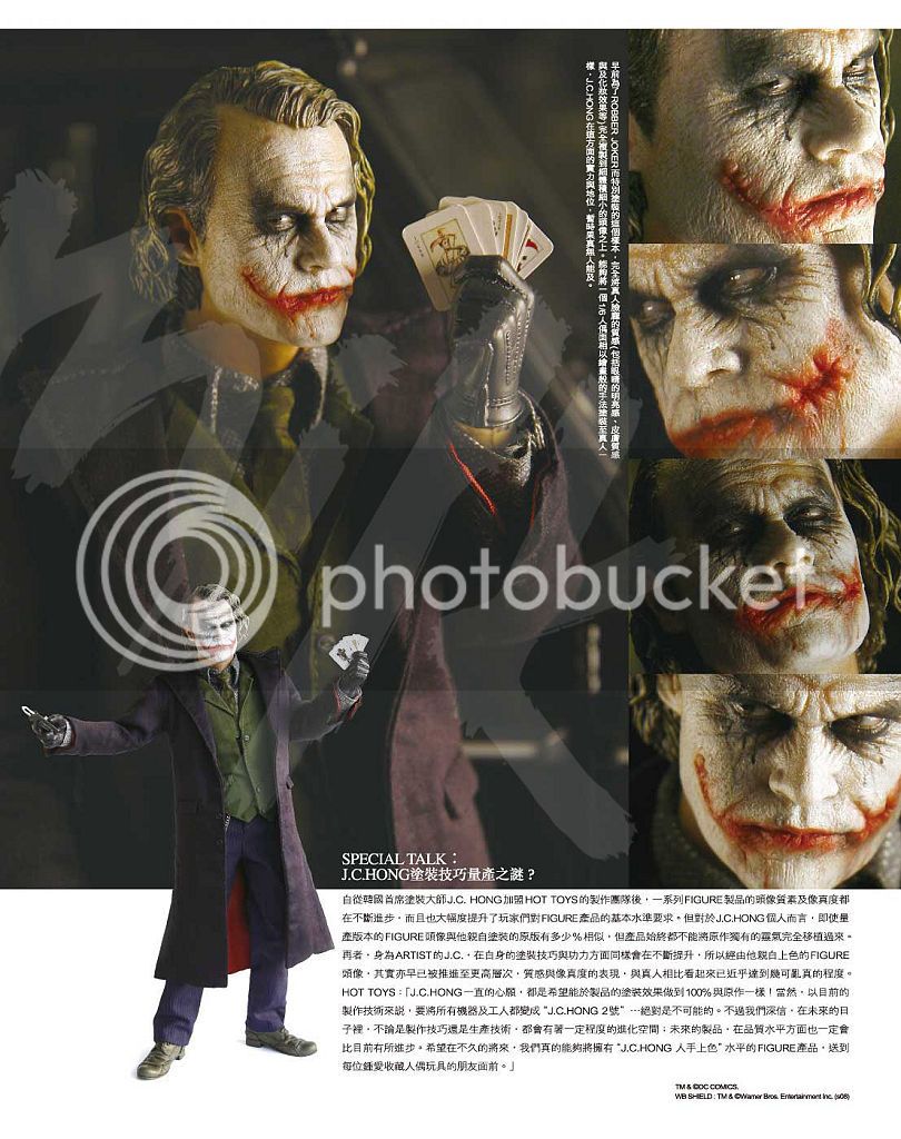
I took some comparison shots of HT's Joker heads (I haven't seen too many of those), initially for my friends, but I thought I'd share them with the board as well in case there are more people out there on the fence whether to get it or not. I am sorry in advance about the picture quality. My camera is old and probably broken. I had a chance to buy a new one, but I got another HT figure instead.

In my opinion Joker 2.0. head is best when viewed straight or from slightly below. Many people like to have their Jokers staring menacingly beneath his brow. I think the first DX head is better for this purpose, though otherwise it doesn't look that much like Ledger. Extreme lighting (seen in many professional pics) also does no favors to the Joker 2.0. sculpt. It is best in a flat light. Personally I don't see much of Ledger in bank robber Jokers. (The first Joker sculpt by HT I didn't even feel a need to include in the picture)

Indeed. The DX 2.0 does look the best when viewing them side by side. The "wet look" of the face is interesting too because it's almost like the makeup is real. Should be getting mine in a few weeks. Thanks for taking these photos.

:duff
 
Probably the only person to not like the BR sculpt :lol
I like the 2.0's sculpt but it could be a lot better

Well I don't like it but I think it is the best out of the rest we have to choose from. Plus it looks very realistic and on some angles like I showed the likeness is dead on to Ledger IMO.
 
I agree and look how realistic it looks. The Joker 2.0 still looks like a cartoon character because of those dam PERS!

I can't understand how they could make the eye sockets look normal on the DX08 but fail to do this every time with most DX releases. :thud:

If you compare the DX01 and the DX11 I think you can see how much they have improved the PERS. I am really liking the DX11, PERS and all, and Malaconia's comparisons have only cemented that sentiment for me...so many options and to me, the likeness is there in most of them.

here are some lazy shots of my DX11.
148758_10152507461685226_1032419107_n.jpg

Great shots hunterelf. :rock You take almost all of that sweaty look away from the headsculpt - looks matte.
 
If you compare the DX01 and the DX11 I think you can see how much they have improved the PERS. I am really liking the DX11, PERS and all, and Malaconia's comparisons have only cemented that sentiment for me...so many options and to me, the likeness is there in most of them.


Great shots hunterelf. :rock You take almost all of that sweaty look away from the headsculpt - looks matte.

:lecture

Yeah they improved but not to the level of the DX08. It is pretty obvious when you see Malaxonia's pics that the eyes are still too big. The reason why they do not look too big in the picture you just posted of hunters is because Hot Toys made the eyes deep set so create the illusion of making them appear smaller than they are, the bone covers the eyes when the head is tilted down. That is why they look smaller in hunter's pics.
 
You will probably notice it in hand, the eyes are still too big IMO.

i doubt i will have a problem with it in hand ~ things like this typically do not bother me. i go for the overall impression and the functionality of the toy and so far from what i have seen, the pers is a good plus on this as it provides a wide range of emotional possibilities.

we'll see soon, though!

one more week to ship. ten days tops.

: D

I didn't say it would bother you I said you will probably notice it in hand.

:wink1:
 
In all honesty I doubt that many people are going to have a problem with Joker 2.0.'s P.E.R.S. eyes. I tried to really stare at the figure a while ago and it is really hard telling whether the eyes are too big on it or not. Not to mention Joker was squinting a lot in the movie, which is something this figure isn't doing.

Granted the eyes might be too big, I don't dispute that, but there are things that mitigate it. First of all they are not pure white like DX01's eyes are so they don't pop out as much. This is something most pictures mine included do not do justice to. In hand the eyes blend in to the face a lot better and they are pretty deep in the head. What matters to me is that they do look like Joker's eyes and they aren't too far apart like on some other sculpts. If I'd change anything on the Joker it would be the tip of the nose. It should be bigger as Ledger didn't exactly have a small nose. This would also make the eyes seem more in proportion. DX01's nose is actually more accurate IMO.

Just for the record I am not a huge fan of P.E.R.S. I rarely bother to move the eyes and when it comes to Batman figures for example, I actually prefer the MMS71 headsculpt over both the DX02 and the DX12 exactly because of the eyes. But in the case of Joker 2.0., the eyes do look lifelike to me. Whether the sculpt would have been better without P.E.R.S. that I can't say.
 
Back
Top