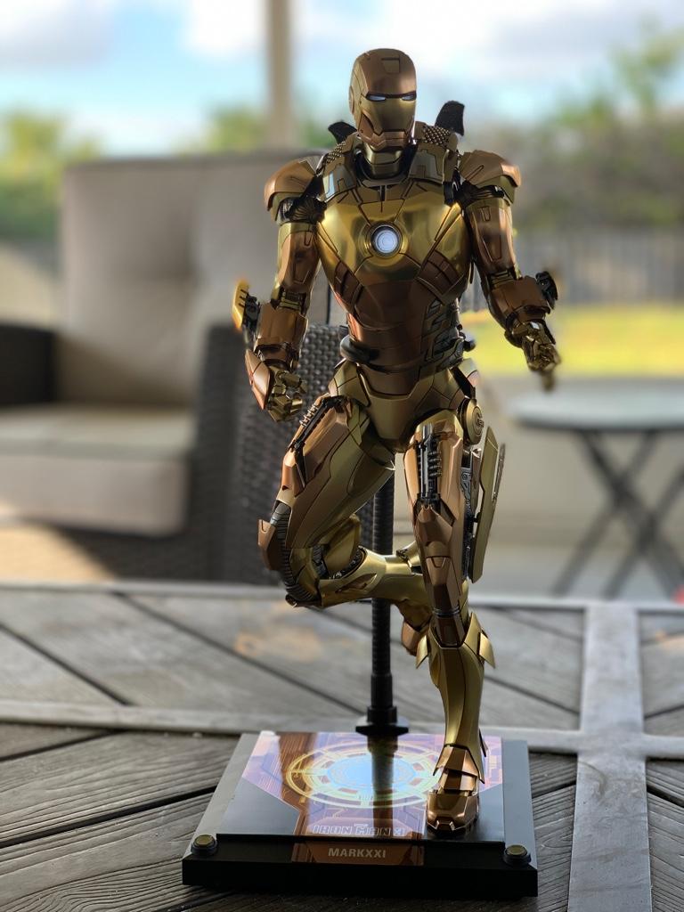
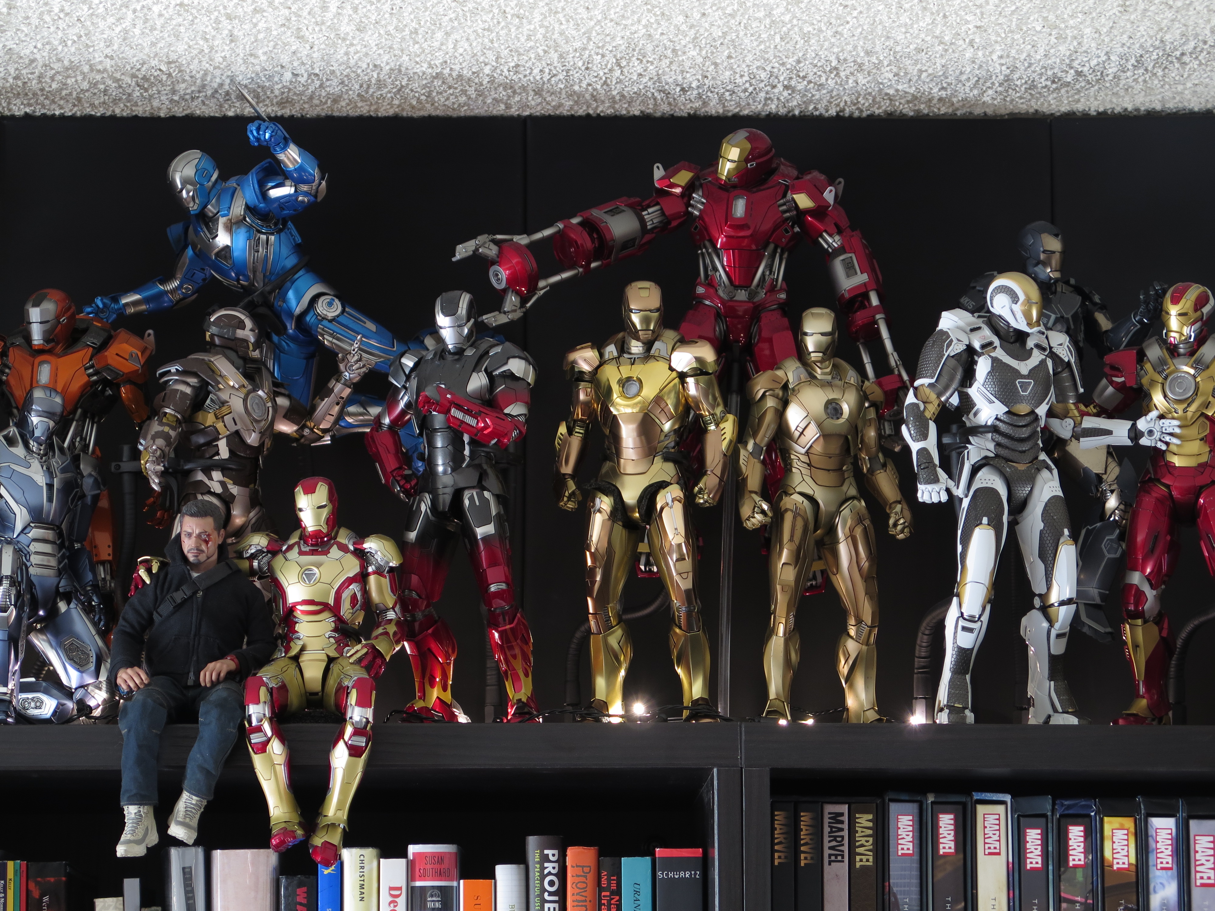
I?m hoping that Armor Wars brings back the HPP suits (and of course new ones) because I?d sell my remaining Kidney for these:
Mk. XVI Nightclub which in both dark and classic IM colors would be canon-


Mk. XVIII Casanova being a streamlined cloaking armor using Heartbreaker?s/Tank?s oversized arc reactor to be able to sustain cloak for longer durations than Nightclub

Mk. XX Python having already been released under the HPP banner might have/had some people think it is vastly inferior to recent releases. In my opinion, the current figure is good but after witnessing the overall great results of the new Mk. XXI Midas and others, a new Python would be very welcome and is a rare example of the Gray and Gold MCU armor color scheme that had dominated IM comic armors for years. The Python was Stark?s first foray into advancing armor capabilities for extended flight and higher altitudes. Beyond that, the Mk. XX looks are basically top half Mk. VII, bottom half Mk. XVII Heartbreaker while testing a new helmet design which eventually makes it to the well known Mk. XXX & Mk. XXXIII/Blue Steel & Silver Centurion respectively.

Mk. XXVII Disco also having been released under the HPP banner and to this day is still in my top 5 favorite IM armors as is. The major reason that I am including it in this list is that I believe it needs much more visibility. As one of Stark?s last armor designs focused on stealth/camouflage/cloaking abilities, it?s at or near a pinnacle of design and development and the blue-orange color scheme might sound terrible but turns out to be the exact opposite. The 2 primary colors are a very beautiful metallic paint which seen on the part Mk. VII, part Mk. XL armor of Disco, look fantastic.

Mk. XXVIII Jack was almost the final HPP figure released before Howard decided to go back on his word to finish the line. In recognizing the scene at the time, Iron Man releases were too big a part of their catalog and so many became jaded and stepped away from the numerous armor releases. Having seen this prototype in person, the Jack-O-Lantern Orange-Black color scheme, like Disco, seems bad as a concept but delivered splendidly in person. Lastly, it was one of Stark?s final armors focused on radiation protection and was therefore another pinnacle of design and development.

Mk. XXXI Piston was Stark?s second foray into enhancing energy output throughout various systems. Piston was built to focus on the the enchanted energy output for extreme acceleration and armor?s subsystems. The name Piston makes sense in that in the early stages of experiments into building a fully enhanced, efficient and powerful armor integrated into every major system and subsystems by focusing solely on acceleration, akin to building a car that does a super fast 0-60 without much importance placed on other things unless they help or hinder the acceleration. Finally, the metallic green and silver color way is wonderfully fantastic, original and evokes feelings of the famous British racing green that has adorned many winning, fast cars over the decades.


Mk. XXXII Romeo had a similar purpose to Piston in that it was a further attempt to enhance the energy output though specific systems. With this design, Stark focused on using the oversized arc reactor to power a smaller, lightweight armor. In itself, this was a challenge as the specific challenge was to give Romeo a big heart with a sleek body, which is why it was named Romeo! In the past, in order for an armor to support such power from the oversized reactor, agility & speed were immediately sacrificed but with the new developments into subsystem energy enhancement, he was able to use less and lighter materials to form a sleeker design while maintaining the doubled powered unibeam, hand and boot repulsors without blowing said armor apart while firing the enhanced weapon systems. Actually, the Mk. XXXII Romeo, was such a success that it enabled him to take a huge step forward with the the next Mark, the XXXIII Silver Centurion.

Mk. XXXIII Silver Centurion was an iconic comic armor and was said to be featured more on screen but it did not come to be. Additionally, most people remember about the depiction in IM3 are the arm blades and not the fact that after the suit?s arc reactor was destroyed, of not for the incredible work done to make the suit so powerful and resilient, Stark should not have been able to use the blades much less move his arms and even have power left over in the enhanced subsystems to allow for a graceful eject/armor unlock. With the complete design change along with a slew of upgrades to make this armor powerful and efficient came a new arc reactor which was said to fire the most powerful unibeam of all armors until the Mk. XLII prototype. In many ways the SC was the absolute pinnacle of everything he was working on after the battle of NY with most armors succeeding it were for different scenarios (ie. Peacekeeper?s sonic repulsors, Starboost?s exospheric capabilities, Igor?s heavy lifting/strongman focus) only until Shotgun and Bones were built and the realization that it might be possible to encapsulate all the best, most powerful, most useful, most dynamic systems and features invented, tested and mostly perfected in the development and deployment of the Mk. VII to the Mk. XLI into the Mk. XLII. Silver Centurion deserves a revisit simply because of the significance but as important was that, In my opinion, the figure was a bit lacking especially by modern standards. Even when it was released, it didn?t have that important, premium look and feel, the silvers were too muted, being almost matte and articulation was not even on par with the initial Mk. VII.

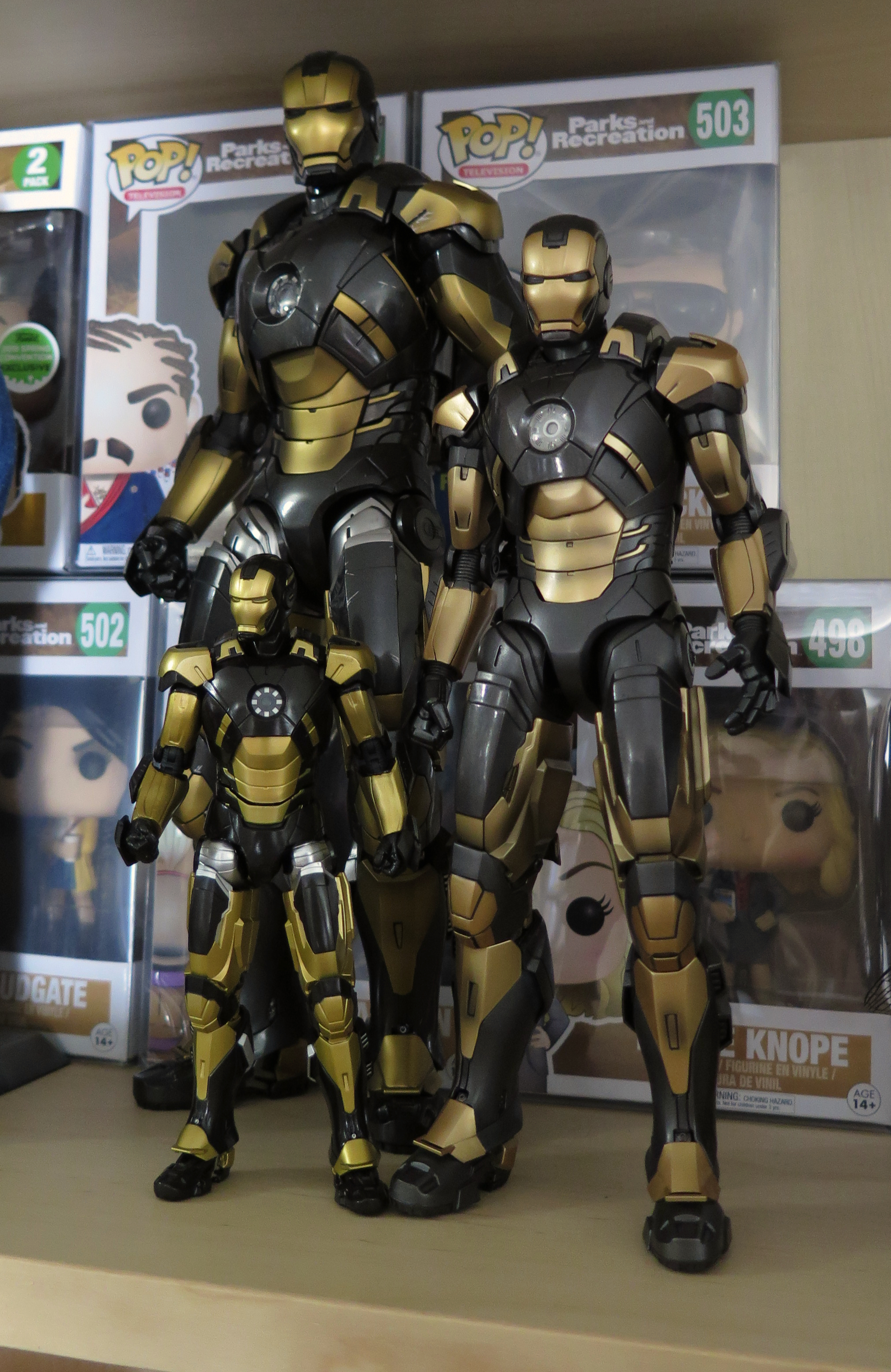
One last thing that I feel should be addressed is Rhodey?s ?color scheme?. Obviously we know that Tony was Red & Gold, War Machine is Black and Silver, and Iron Patriot is Red, White and Blue but I believe that he will no longer be an Air Force colonel, most likely retired, not officially dishonorably discharged but the new regime wants control over Stark tech and are no longer willing to have a War Machine and Iron Patriot that thinks for themselves. I?m really hoping that he adopts the Gold & Black color scheme that was popular in the comics for years. I found this 1 picture that someone changed a partial picture of the Mk. 46/47 to those comic inspired colors which looks incredibly fantastic! Most likely, we will instead be introduced to the Mk. LI to Mk. LXXXIV we missed in the 5 years between IW & EG. Again, my real hope is for great story telling, with figures that compliment it and to bring that Gold & Black armor color scheme into the MCU finally.

 No, really, I stopped trying batteries two suits ago


