I think it'll add more variety to the Hall of Armor display for those buying all the HT figs. Those whining are just trying to find some reason to hate on some aspect because, apparently, it's the "hip" thing to do nowadays.
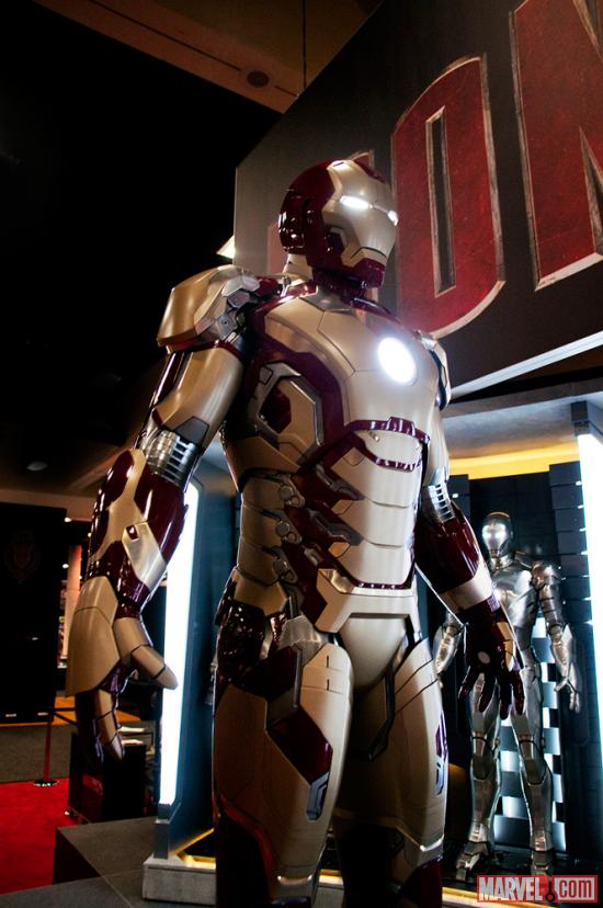
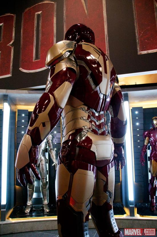
The only thing that bothers me is that they didn't just stick with the red and gold, but they keep insisting on placing grey/silver mechanical bits on the surface of the armor. Never liked that on the 6 and 7.
Sorry but I just woke up and threw up in my mouth. I have to agree that it needs more red. I also feel like the lighting is making th gold look a little mustard. I am sure we will see a ton of shots soon enough. Le me say that the 3/4 from the rear looking at the left shoulder you can see the flakes. I think they should add reverse the helmet colors and give him a read mask with gold head (cowl/helmet).
Looks like I will need to buy 2 HT so I can have one painted.
I think it looks ok. Its very streamline and I kinda like the colour. Its pretty loud, IMO! I am not crazy about that new Dredd movie shoulder armour tho. I prefer the old shoulder armour designs on MkII-MkVII.
Obviously, there's a Mk8 for IMIII but I hope they give us Mk9 and 10 too.