Statue J Scott Campbell Classic Spiderman Comiquette

Collector Freaks Forum

Help Support Collector Freaks Forum:

This site may earn a commission from merchant affiliate links, including eBay, Amazon, and others.
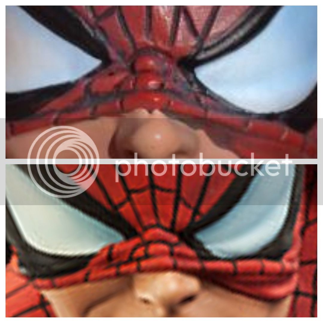
Yeah man, that proto is just drop dead gorgeous. Really unique paint app. I didn't get a great shot of the front but its fine, a little sloppy. Honestly, if anyone is into busts, that gentle giant bust is very very nice. Very clean lines and paint. I put some shots of it in the album. I actually have to write sideshow and get a replacement head, as you can see on the bottom, there is a gap. So check your heads when you get yours and make sure its flush. :)

It's a solid piece, the camera does capture more than you would probably see in person, plus these are shots in natural light. Given a proper lighting display, the piece would really pop. The overall product does bring out the character, and I do like the subtle smirk. However, I do feel disappointed from what I was previously shown at SDCC.
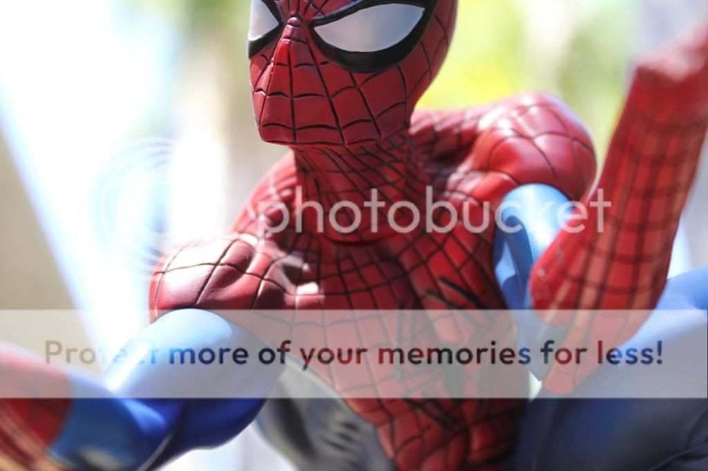

 
Came to catch up in this thread and I am not liking he last couple pages... Have there been lots of issues with this? I was so sure after MJ and Gwen that SS was going to nail this :dunno
 
Thanks Claw. It's not a bad piece, just not close to the proto.
The gloss doesn't bother me, the lines do.
I'll reserve fhrther judgment 'til Wednesday.
 
I paint a bit and can see what the difference is between the proto and the mass produced piece. As far as the lines go, Sideshows paint master used a nice liner brush to paint his lines (with a lot of skill I might add) The produced pieces lines are painted as a wash and this means the get black paint allover and use a cloth to wipe of the excess. This is why there is dark black paint in the corners and such and the lines aren't very consistant. It way faster but not as pleasing to the eye.
 
Hmmm...

2vkb8yx.jpg


I'd call that a definite case of false advertisement.
 
Sigh, canceled. The matte finish and comic feel was what initially sold me. I own the original so theres no need to own a smaller version of it.
 
Congrats Clawwolf :clap great pics! However, I can now see why so many have been left disappointed by the paint apps :( certainly nowhere near even close to the quality shown on the proto pics (but then again when are they ever the same as the proto) I thought after seeing the amazing job they did for Mary Jane and Gwen that Spidey would also be painted in similar fashion...
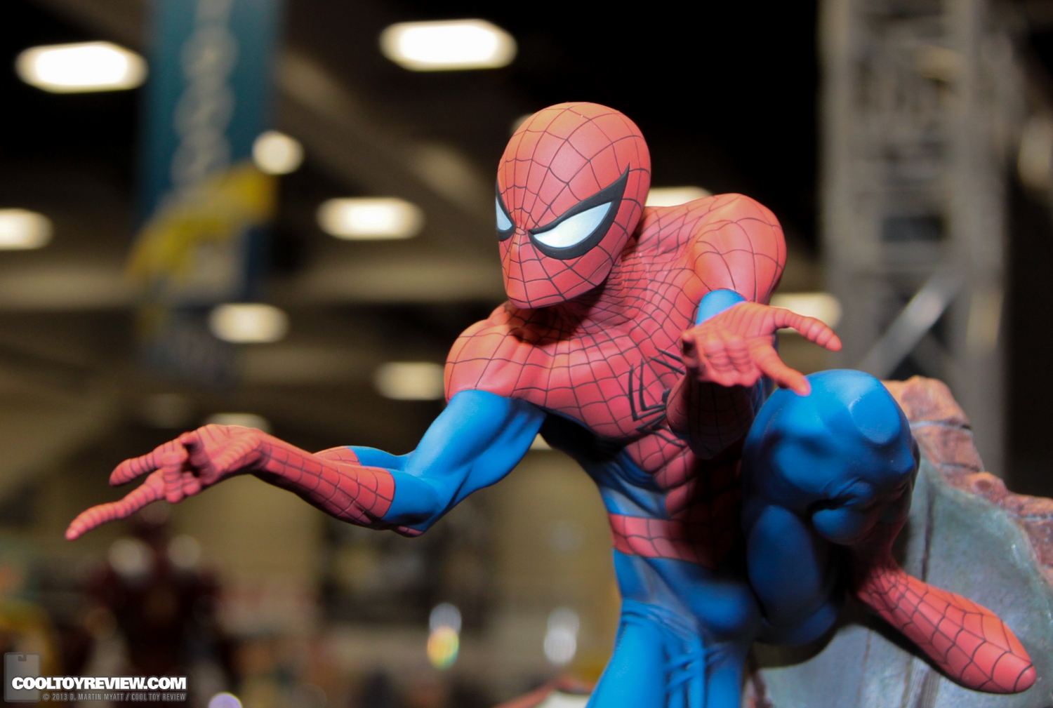
Gah, the webing effin annoys me, it's not like the proto at all.

Sigh, it bugs me that I gotta eat the NRD when they don't deliver on the proto, shame cos they did with MJ and Gwen.

Suppose I'll keep it, such a shame though cos SS were on a roll.

SDCC_2013_Sideshow_Collectibles_Thursday-196.jpg

There's a difference between not being the same as the proto and using completely different paint. It's the equivalent of showing the Doom cape in cotton then receiving it in velvet.

I wouldn't be worried about losing an NRD if anyone wanted to cancel. This is not the product they teased.

Looks absolutely nothing like the proto...No surprise there! Short cuts :slap
Sloppy paint on the symbol on his back. What's the front symbol like claw?

Thanks for more pics. Dunno why Spidey had to quote then straight away :slap :lol

Sideshow is living up to it's gamble reputation with a great proto and a production piece that strays far from it.

I noticed the difference in colors immediately but looking at some of the recent pics is bumming me out... Well I will have my spidey on Wednesday. Hope the paint app is decent

Thanks Claw. It's not a bad piece, just not close to the proto.
The gloss doesn't bother me, the lines do.
I'll reserve fhrther judgment 'til Wednesday.

Hmmm...

2vkb8yx.jpg


I'd call that a definite case of false advertisement.


Well it is an unfortunate fact that this proto had a completely unique look and feel from the original, but the production piece doesn't. The production pieces look very good, just not as great as the proto. I think that anyone who wants to cancel has a right to do so based on these changes. In the end I think this will be remembered as a great piece. Just not as well remembered as it would have been if they had nailed the finish the way they did with Gwen and MJ.
 
Sigh....Those lines were unachievable in a production piece, they got us hooked with the ladies first (they came out perfect!), I´ll keep my spidey as it looks great, but I but was expecting something closer to the proto.
 
Sigh....Those lines were unachievable in a production piece, they got us hooked with the ladies first (they came out perfect!), I´ll keep my spidey as it looks great, but I but was expecting something closer to the proto.

Then if they couldn't have been achieved on the production piece they shouldn't have been on the proto. I get that there will always be a difference between the proto and the production piece, but IMHO the changes here are actually worse than say the Rogue's ass changes because A) this is Spiderman we are talking about, and B) we aren't taking about a feature you won't see as it is turned towards the back of the display, it is all over his costume.
 
I have only seen one person address the floating lower foot. I seem to have the same issue...anyone else report this to SSC yet? I'm thinking of sending some images tomorrow to see what they say. I don't think it's a deal breaker but I wouldn't mind a little money back.
 
Sigh....Those lines were unachievable in a production piece, they got us hooked with the ladies first (they came out perfect!), I´ll keep my spidey as it looks great, but I but was expecting something closer to the proto.

The reason I was asking earlier what style they used to paint MJ and Gwen was because I am a novice about this stuff but vaguely remember hearing something about some type of specific computer based paint app and that led me to believe it could work on the lines.

I will admit I will need to see this in hand but man when you spend 1K plus (including Black Cat) on a collection of work you kind of want something close to the original. It's almost like two different companies made these ie a Bowen Cyclops next to a Koto Wolvie.

I am still looking forward to this, however on Wednesday. I like the EX smirk to go with the girls. Heck some aspects I even like better... but I can understand why so many people are feeling kind of ugh about the fact the final was so different. And not just paint app different but actual 90 degree difference in style to what they said was being sold. It's not asking for an apple and getting an orange but it is asking for an orange and getting a grapefruit.
 
I'm excited to see this in person. I've learned not to trust user photos :) your Guys pics are great, but flash sucks. Hopefully these issues won't bother me.
 
Sigh, canceled. The matte finish and comic feel was what initially sold me. I own the original so theres no need to own a smaller version of it.

Is it the flash of the photo or he appears glossy?
 
Back
Top