Masters of the Universe Classics

Collector Freaks Forum

Help Support Collector Freaks Forum:

This site may earn a commission from merchant affiliate links, including eBay, Amazon, and others.
Batman and Wonder Woman are the only DC titles that I get since the new 52.


Apart from the titles I just mentioned, and Thor, I tend to stick to collected editions of older stuff I missed. Just started on Gotham Central and loving it!

To try and bring things back to the topic I'm skipping the Sky Sled. Looks good but I'm running out of display space. Cancelled my preorder of Castle Grayskull a few weeks ago for the same reason, that really hurt :monkey2

For me, Castle Grayskull is the point. I'm just buying figures as accessories for the Castle. It was the first MOTUC item I ordered!

I'll get one Sky Sled, but if it were a little cheaper I would have grabbed two.
 
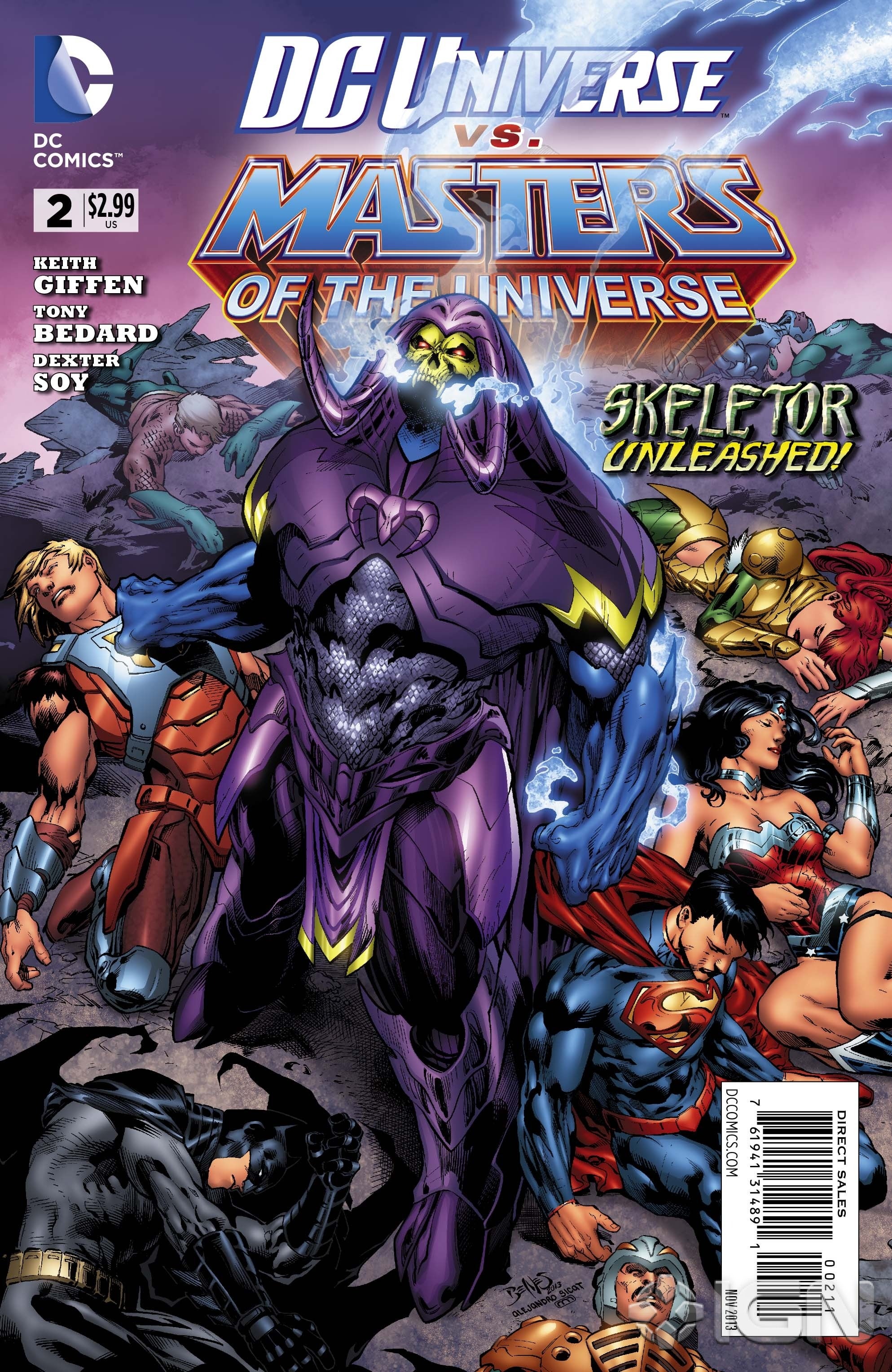
Wow. Like a Darkseid/Skeletor mash up. Sorry, but I dig!!!

He actually reminds me a lot of Onsalught from the 90s. Not exactly the same by any means but has that same random jagged shapes all over the place look.

dcu-vs-motu2printcvrjpg-882ca1.jpg


Image%202013.08.27%208%3A55%3A51%20PM.jpeg
 
I didn't like it at first.. but I'm starting to come around. He's not as awesome as Onslaught, but I can see where you're coming from. Perhaps he is actually a combination of Skeletor and Anti-Monitor, which is Onslaught-ish.
 
The Antimonitor is more classic New Gods-esque in design. He has clean simple forms instead of looking like a pile of tribal tattoos.
 
He's definitely taking design elements from multiple sources. I think I would like it more if that "helmet" was better designed. That's the real weak point for me.
 
He's definitely taking design elements from multiple sources. I think I would like it more if that "helmet" was better designed. That's the real weak point for me.

The proportions are a bit weird to me, Skeletors left forearm in particular seems way too small. I also dont like the helmet.

I've not seen the new He-Man design before, just seems really derivative and bland. Glad I stopped picking up the monthly series.
 
The proportions are a bit weird to me, Skeletors left forearm in particular seems way too small. I also dont like the helmet.

I've not seen the new He-Man design before, just seems really derivative and bland. Glad I stopped picking up the monthly series.

It is odd, but the angle isn't great either. I'll wait to see it in action before I pass final judgement, but hopefully it's temporary. I mean.. even though he lost his lower jaw I don't see why Skeletor of all people couldn't get himself a new one. lol.

The new He-Man design has grown on me. Then again, I really loved the mini-series and thought the redesign of He-Man was great. I like the armor overall, it works for me. I doubt we'll ever get figures of these designs, but to be honest they do seem very toyetic. Though not necessarily the best for MOTUC with the crazy amount of detail.
 
The proportions are a bit weird to me, Skeletors left forearm in particular seems way too small. I also dont like the helmet.

I've not seen the new He-Man design before, just seems really derivative and bland. Glad I stopped picking up the monthly series.

This DC crossover will do it for me... no more MOTU comics...
I want to support it but the guys at DC seem to have no clue about the characters, and if they are taking the directions from Mattel, then we're screwed!!
They should've left it in charge of MV Creations.


Expect that figure to be made before anything else.

Why would it? :dunno


It is odd, but the angle isn't great either. I'll wait to see it in action before I pass final judgement, but hopefully it's temporary. I mean.. even though he lost his lower jaw I don't see why Skeletor of all people couldn't get himself a new one. lol.

The new He-Man design has grown on me. Then again, I really loved the mini-series and thought the redesign of He-Man was great. I like the armor overall, it works for me. I doubt we'll ever get figures of these designs, but to be honest they do seem very toyetic. Though not necessarily the best for MOTUC with the crazy amount of detail.

Nah, I still hate the new He-Man...
I wish they were more creative instead of borrowing looks from pretty much every other DC character...
 
Most modern comic book artists I think are pretty terrible designers. Off the top of my head the only guys I can think of that are actually good at concept design are Skottie Young, Ramos, and Adi Granov. There's probably some of other guys as well that I'm not aware of but so many of them I think are pretty terrible as designers, even really well known peeps like Alex Ross and Jim Lee.
 
Most modern comic book artists I think are pretty terrible designers. Off the top of my head the only guys I can think of that are actually good at concept design are Skottie Young, Ramos, and Adi Granov. There's probably some of other guys as well that I'm not aware of but so many of them I think are pretty terrible as designers, even really well known peeps like Alex Ross and Jim Lee.

I actually think Alex Ross is an amazing costume designer. But Jim Lee managed to make every Nu52 character look like they shop at the same clothing store....
 
Alex Ross' does okay spandex designs and some cool logo design but his mechanical design is terrible.

Jim Lee is just all around bad as a designer. My favorite recent DC designs are those for Young Justice. Some fantastic updates there and unlike, as you note with Jim Lee's New52 designs the YJ people took different logical design approaches to each character.
 
$50 plus tax and shipping for Sky High & Sky Sled is an easy pass for me. Way too much for a chunk of plastic with some paint apps. I would've liked 3 or 4, but when I'm forced to buy it with a figure I don't really want or need, then forget about it. I'll wait a while for the inevitable price drop on the secondary market like the Wind Raider.
 
No offense but it's pretty obvious this art was just done for a paycheck...

I have no idea. I wouldn't say it's his finest work. But that excrete-able costume really overwhelms all other elements to me....
 
Not a fan of Ed Benes myself, generally not a fan of that 90s look where the muscles are so defined they almost look like they're skinned and all the costumes look painted on. More a fan of guys like Adrian Alphona (Runaways) and John Cassaday (Astonishing X-Men) who use a bit more restraint in drawing musculature and illustrate costumes and clothing that look like actual clothing.

A lot of those 90s guys even when drawing people in street clothes can't help but make them look painted on.

I'm also a fan of people that go for a lot more abstraction in their artwork like Sam Kieth, Skottie Young, Huberto Ramos, etc.
 
Back
Top