You are using an out of date browser. It may not display this or other websites correctly.
You should upgrade or use an alternative browser.
You should upgrade or use an alternative browser.
Show Your Entire Iron Man & Avengers Collection!
- Thread starter Fan
- Start date

Help Support Collector Freaks Forum:
This site may earn a commission from merchant affiliate
links, including eBay, Amazon, and others.
supermarvel1
Super Freak
- Joined
- Mar 20, 2010
- Messages
- 454
- Reaction score
- 38
enzolt
Super Freak
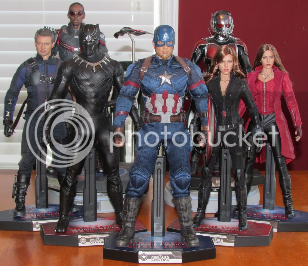
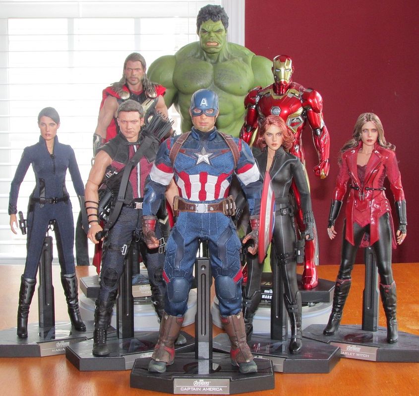
Damn!! Nice team setup!
Sent from my SM-G930F using Tapatalk
Sent from my SM-G930F using Tapatalk
ursusntn
Freaked Out
Very nice !
BagginsOfBagEnd
Super Freak
Great pics supermarvel1!! 


is the shield flaking or a repaint??looks strange on the pic

$14.99
DC Comics, 12-Inch Superman Action Figure, Collectible Kids Toys for Boys and Girls
Bopster USA Inc
supermarvel1
Super Freak
- Joined
- Mar 20, 2010
- Messages
- 454
- Reaction score
- 38
I owned that figure, the shield always looked like that in pictures, but was fine to the eye.
- Joined
- Apr 12, 2013
- Messages
- 6,483
- Reaction score
- 103
It actually is flaking a bit, but that shield always looks like that in pics, especially with the flash on.
It actually is flaking a bit, but that shield always looks like that in pics, especially with the flash on.
It's so weird looking.
- Joined
- Jan 18, 2006
- Messages
- 4,778
- Reaction score
- 284
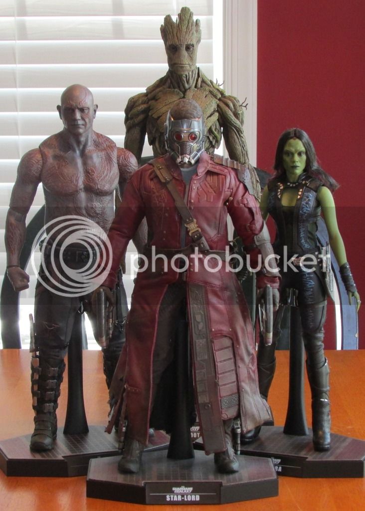
Where's Rocket?!
enzolt
Super Freak
The shield I can ignore but the awkward posing of Cap makes it look as if his right foot is limping lmaoIt actually is flaking a bit, but that shield always looks like that in pics, especially with the flash on.
Sent from my SM-G930F using Tapatalk
supermarvel1
Super Freak
- Joined
- Mar 20, 2010
- Messages
- 454
- Reaction score
- 38
I couldn't keep him, too small or something, not my cup of tea.Where's Rocket?!
I couldn't keep him, too small or something, not my cup of tea.
Buy him back they look weird without Rocket
- Joined
- Apr 12, 2013
- Messages
- 6,483
- Reaction score
- 103
The shield I can ignore but the awkward posing of Cap makes it look as if his right foot is limping lmao
Sent from my SM-G930F using Tapatalk
I'm not a fan of it either, but it's the only pose like that where I can fit him in and still see everyone else on the shelf.
CupcakeMcGraw
Super Freak
- Joined
- Apr 13, 2015
- Messages
- 1,112
- Reaction score
- 220
I'm not a fan of it either, but it's the only pose like that where I can fit him in and still see everyone else on the shelf.
You can still do a crouched pose with Cap, it just doesn't have to be so gimpy
bransen2099
Super Freak
You can still do a crouched pose with Cap, it just doesn't have to be so gimpy
The First Avenger Cap is painfully stiff, the suit doesn't allow for much articulation tbh.
Sent from my iPhone using Tapatalk
CupcakeMcGraw
Super Freak
- Joined
- Apr 13, 2015
- Messages
- 1,112
- Reaction score
- 220
The First Avenger Cap is painfully stiff, the suit doesn't allow for much articulation tbh.
Sent from my iPhone using Tapatalk
Truer words never spoken, my friend. That FA Cap suit is a pain in the ass. You're probably right that getting him THAT low doesn't leave many options, but a few minutes of futzing I was still able to get him fairly low without twisting anything out of natural alignment.

To compensate for not getting Cap quite as low, you could also not put the shortest figure (AM) directly behind him. Let Thor or SC take that spot (or even use a plinth to raise a figure up; figures at multiple heights also adds visual interest).
Anyway, just offering friendly suggestions. Your shelves are your shelves, not trying to butt in.
bransen2099
Super Freak
Truer words never spoken, my friend. That FA Cap suit is a pain in the ass. You're probably right that getting him THAT low doesn't leave many options, but a few minutes of futzing I was still able to get him fairly low without twisting anything out of natural alignment.
View attachment 344726
To compensate for not getting Cap quite as low, you could also not put the shortest figure (AM) directly behind him. Let Thor or SC take that spot (or even use a plinth to raise a figure up; figures at multiple heights also adds visual interest).
Anyway, just offering friendly suggestions. Your shelves are your shelves, not trying to butt in.
Ahhhh that type of pose, yeah that definitely works. For some reason I was thinking of him like squaring like Spider-Man for some reason

And it makes me happy to see people still at their FA Caps on display

Sent from my iPhone using Tapatalk
bransen2099
Super Freak
Had to do some moving but here's a quick pic of the new setup right now.
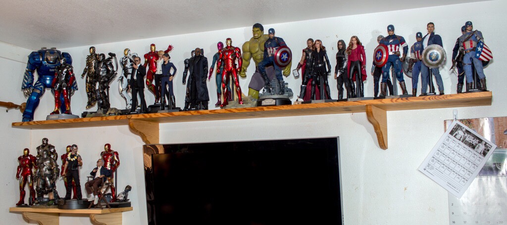
Sent from my iPhone using Tapatalk

Sent from my iPhone using Tapatalk
supermarvel1
Super Freak
- Joined
- Mar 20, 2010
- Messages
- 454
- Reaction score
- 38
Love seeing them all together!!
Similar threads
- Replies
- 542
- Views
- 44K
- Replies
- 101
- Views
- 8K
- Replies
- 42
- Views
- 5K
- Replies
- 92
- Views
- 11K
- Replies
- 0
- Views
- 353


