shocktrooper_au
Super Freak
Looks forward to posing in a good esb pose, any thoughts? There's the obvious duel, but tea party Vader anybody 

I could be wrong.. but those last three observations of Wor-Gor's were tongue in cheek.My best answers


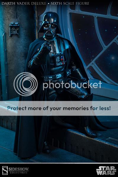
Does this really look right to everyone?
The chest box looks small, rides too high.
The shoulder/chest armor looks too small.
Neck looks elongated.
Torso looks elongated.
Belt looks small.
Cod piece looks too textured.
Photo is too sharp.
Too much blue in the background.
Vader looks very black.

Does it look correct to you?
Only nitpick I have is the chest box looks small.
That really doesn't look very good. Usually SS has great proto's and crappy final's. This doesn't fare well for the January release. But i want one pending it's not a complete cluster**** so see ya in the winter.
(Thank god i grabbed the medi 2.0 for 200$ shipped seems like a deal now)

 .
.Does this really look right to everyone?
The chest box looks small, rides too high.
The shoulder/chest armor looks too small.
Neck looks elongated.
Torso looks elongated.
Belt looks small.
Cod piece looks too textured.
Photo is too sharp.
Too much blue in the background.
Vader looks very black.


Can someone post a side by side shot of ANH Vader from the SSC website next to the one above please for comparison?
I tried sorry but I am not that computer savy folks...
Thanks.
Oh yeah the chest piece and belt are small.
Agreed. Although I think the amount of blue in the background is ok.
You can see why the pants look like pants in that high res pic. Molded rubber/vinyl/plastic of some kind not seamed fabric as usual.
Don't care what the SS fanboys say, this looks bad.


Agreed. Although I think the amount of blue in the background is ok.
You can see why the pants look like pants in that high res pic. Molded rubber/vinyl/plastic of some kind not seamed fabric as usual.
Don't care what the SS fanboys say, this looks bad.

And you will still be buying it.
OMG looks like V is going to do a hoedown or something in this pose....


**** the sculpt. They killed it on the life size bust. I thought thy would duplicate the craftmenship on this one... No biggey i guess, even though 4 of these equel out to the life size bust! Still gunna PO, maybe they will retool the sculpt before he ships.

Would like to hear a photographer pipe in about that. Seems like maybe they overcompensated for the all black outfit by blasting it with light. Can't imagine that much texture would be apparent in a normal display environment.
Nah...that would be any of Medicoms three versions. Yeah they're small but the actual sculpt and proportions on their offerings are light years ahead even now...
That would be Hurricane's custom.
I think you meant "Unfortunately this is the best licensed 1/6 Vader to date".
The chest armor looks a lot bigger and accurate in this pic compared to the one Wor-Gar posted. It almost looks like SSC took proto pics of two different figures.