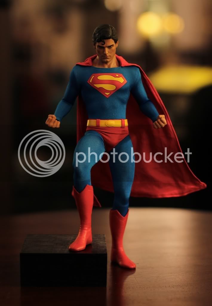
SSC Superman 1/6th Scale figure

Collector Freaks Forum

Help Support Collector Freaks Forum:

This site may earn a commission from merchant affiliate links, including eBay, Amazon, and others.
SUPES.jpg

What exactly are you trying to point out here??
 
To me it looks like his belt is a bit too big for the shorts. To much of a gap.
 
I largely base that on how the overall figure looks in terms of proportion.

jr5uuv.jpg


Borrowing Robbie's pic to show how bad it looks (the same goes to the other figs in the line):
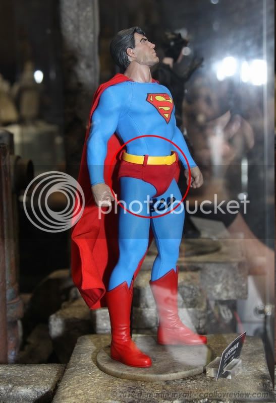
SUPES.jpg


Compare it to:
IMG_4868.jpg

Credit goes to Maglor.

Hope you can see why I said what I said earlier.:duff

Uh, one is based on comic-style art, the other is based on a human actor playing that character. As muscled as CR may have been for the role, he was still a bit under-sized compared to the comics. I think you may be missing the point of this line... :dunno
 
I think you're missing the point of his critique. It is the way the shorts fit on his body. They look loose and awkward when they should be a clean tight fit. I have actually never noticed this before, but now that I do I think it's definitely a noteworthy issue.
 
For me, It looks good enough. It's now just a matter of knowing the price and seeing if it's worth it.
 
looks pretty good, esp considering it's still a prototype. "pending final liscensor approval" doesn't mean jack when sideshow is involved.
the fact that this is the EXACT same figure we saw at SDCC just means that this is all they can show us, as it's all they've gotten approval to show us from DC.
 
Like the other 4 shown in this line so far, I love it. The sculpt is good and despite some opinions, which everyone is entiltled to, I like the clothes too.

It is a great classic representation of Supes. Not everyone will be happy with what versions of these characters are chosen to be made. But its impossible to make everyone happy.

It will come down to price if I go with the line. I hope they will be in a range I am happy with because I would like higher quality 1/6 DC comic figures.
 
I think you're missing the point of his critique. It is the way the shorts fit on his body. They look loose and awkward when they should be a clean tight fit. I have actually never noticed this before, but now that I do I think it's definitely a noteworthy issue.

Exactly! :lecture

Also, and this is me being subjective, I don't like the joints between his pelvis and femurs because they make the hips look disjointed from the upper body.
 
Counter argument? To what exactly?

I'm curious how you know what you know about how this figure is put together. And also, could you provide some side by side shots with the CR Superman? :pray:

Thanks.

Do not engage the trolls. By responding to them you give them what they want and do not deserve - attention.
 
I largely base that on how the overall figure looks in terms of proportion.

jr5uuv.jpg


Borrowing Robbie's pic to show how bad it looks (the same goes to the other figs in the line):
SUPES.jpg


Compare it to:
IMG_4868.jpg

Credit goes to Maglor.

Hope you can see why I said what I said earlier.:duff

This is a terrible comparison pic. Show me a pic of them being in the exact same position. From what I can tell, the upper torso (chest, arms) blow away the CR supes. That body is really well done with a Razor Ramon head sculpt to boot.

Sorry dude, I just don't see how you can make a side by side comparison without having it in hand.
 
What exactly are you trying to point out here??

He doesn't even know Swedish. Boy I swear, one person makes some snide comment and then others feel the need to jump in when they would never have said anything otherwise.

There is nothing wrong with the Superman or any of the figures from what I have seen. The head scullpts so far seem to be much better than their GI Joe line.

In fact, the only thing I can think of someone wanting to not like, would be the head sculpt. Maybe someone might want a younger or more cleaner looking hs...but other than that, this is a phenomenal action figure to me.
 
I think you're missing the point of his critique. It is the way the shorts fit on his body. They look loose and awkward when they should be a clean tight fit. I have actually never noticed this before, but now that I do I think it's definitely a noteworthy issue.

He and the CR and in two different poses in the pictures he tried to show a comparison to. That is a flawed comparison. SHow me pictures of both them being in the same exact pose.

Then maybe I can see the relevancy.
 
He and the CR and in two different poses in the pictures he tried to show a comparison to. That is a flawed comparison. SHow me pictures of both them being in the same exact pose.

Then maybe I can see the relevancy.

But the comparison doesn't matter. We are looking at the Sideshow figure. He was comparing to the Hot Toys, but who cares? Either way the shorts section looks loose fitting and that's an issue. It doesn't matter how the Hot Toys one looks.

And for what it's worth I already prefer this a lot over the Hot Toys one. I prefer comic renditions over the realistic looks and I think the headsculpt on this Sideshow figure is a lot more impressive. The upper body looks much better too.
 
For the most part I like this, although the headsculpt seems a little big. They just need to increase the size of the "S" and lose the thick black outline, and tighten up the tailoring on the briefs. Otherwise, a great looking Superman. Keep this line cranking.
 
Back
Top