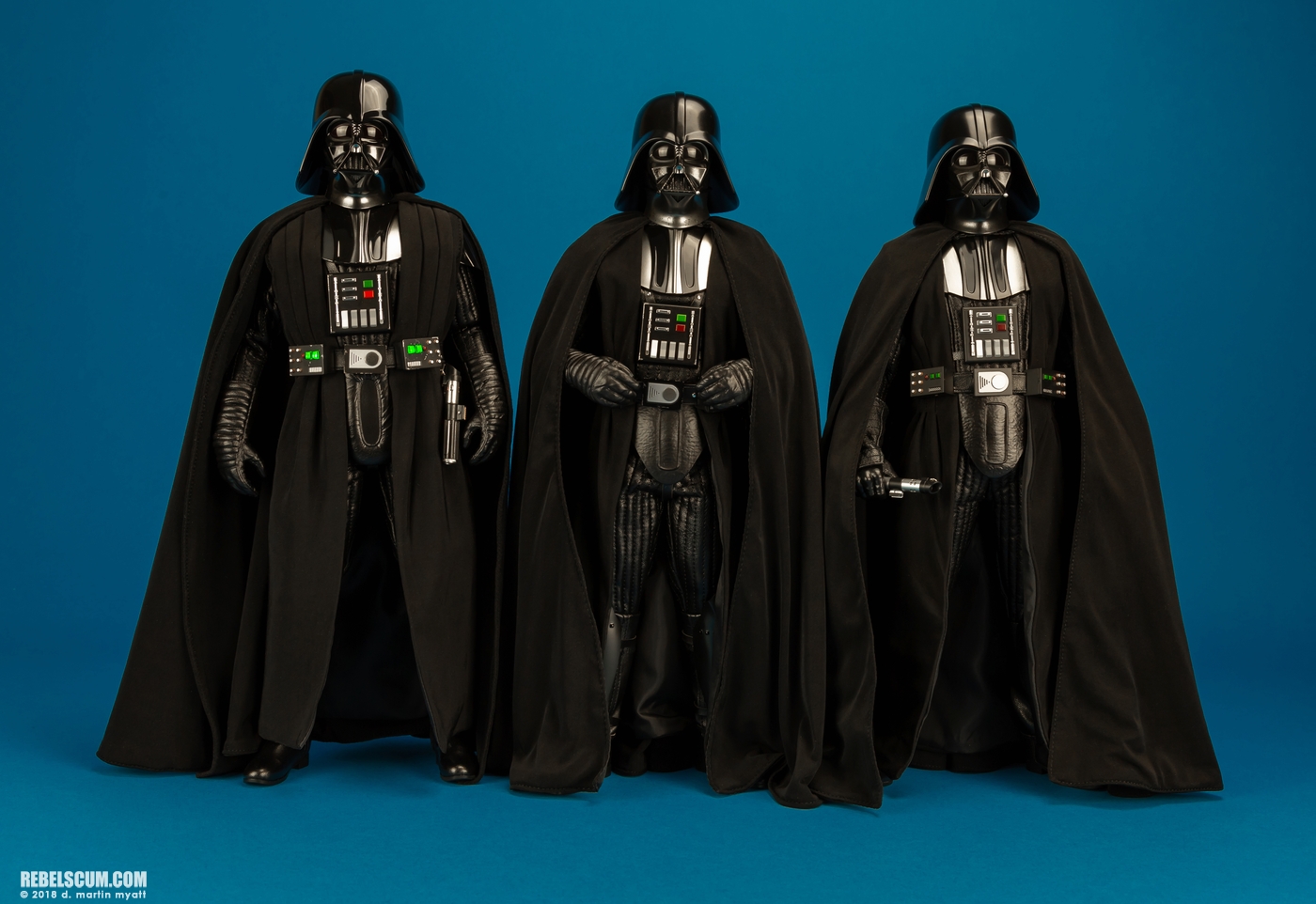
Thank you. It’s hard to make it out, but it seems like the Tarkin Vader and ANH 1.0 capes are identical. I’ll definitely be using the Tarkin Vader cape for the new Vader. If I come across an outright better one, I’ll upgrade. For now I think it’ll do the job much better than the stock ROTJ cape.Not sure if this will be helpful or not, by the below image has the 3 next to each other.
RO>Tarkin Vader ANH 2.0>ANH 1.0

You are using an out of date browser. It may not display this or other websites correctly.
You should upgrade or use an alternative browser.
You should upgrade or use an alternative browser.
1/6 Hot Toys MMS699 & MMS700 ROTJ Darth Vader
- Thread starter Asta
- Start date

Help Support Collector Freaks Forum:
This site may earn a commission from merchant affiliate
links, including eBay, Amazon, and others.
Just bought a loose ESB belt. I really want to have the boxes close to the belt buckle. I’ll upgrade the boots and possibly other things at some point, but for now I think the Tarkin cape, ESB chest box and belt paired with the ROTJ figure will largely achieve what I’m trying to go for. Stoked!


rayeknor
Super Freak
- Joined
- Jan 24, 2015
- Messages
- 1,081
- Reaction score
- 500
The OWK boots are a lot more accurate then the RoTJ boots once gotten a look at the actual ones used for the ESB and RoTJ on screen costumes, they are basically custom xl riding boots, not the flat toed army ones the figure comes with at all.
If swapping boots remember to swap ankle guards too, they are not the same between figures.
If swapping boots remember to swap ankle guards too, they are not the same between figures.
round toe or square toe, the HT boots, and the legs that go into them, are huge -- look at the above picture.
Man, what I wouldn't give for an InArt style Vader.
Man, what I wouldn't give for an InArt style Vader.
Thinking about casting the helmet bracer so I can pop the exposed Shaw head onto my ESB Vader. For the price this figure should have come with a second non-split helmet.
And the ESB cape is the best swap-out for this figure or does the ROTJ cape not have that satin strip sewn on the inside like ESB does? I have some super-drapey black fabric that I may take a shot at creating a new cape with. It's a type of fabric that has a clean edge when you cut it, so no fraying or hem necessary and I'll just trace a HT cape but make it 1/2" shorter.
And the ESB cape is the best swap-out for this figure or does the ROTJ cape not have that satin strip sewn on the inside like ESB does? I have some super-drapey black fabric that I may take a shot at creating a new cape with. It's a type of fabric that has a clean edge when you cut it, so no fraying or hem necessary and I'll just trace a HT cape but make it 1/2" shorter.
To me it's the angle of the plane of mouth triangle itself, and the angle of the eye lenses. The mouth triangle on the ESB helmet is sloping too much (ie tilted back toward the helmet,) giving that melty face or McQuarrie Concept Vader look, whereas the ROTJ sculpt they've lessened that angle quite a bit. And the ESB eyes have a sunglasses look because they slope too much.Great comparison shots, Wor-Gar.
Amazing how bad the ESB sculpt looks in comparison. His whole face is drooping to the front, creating a weird devastated expression.
The ROTJ definitely looks like HT's best Vader sculpt to date. The biggest point of improvement IMO is the inside of the mouth, the teeth and grill. There's a complete lack of depth, making it catch much more light than it should.
For the cape, since it's so integral for his silhouette, I definitely recommend the custom route. But the penny trick looks like a good quick fix.
Looking forward to your final setup/images.
Such a pity they left the teardrops off the ROTJ sculpt though - what a weird thing to forget. It's a decent improvement over the previous HT Vader facesculpts and will be a good placeholder until TooMuchGarlic finishes his ANH/ESB/ROTJ Vader project.

$67.50
Marvel Legends Series Venom, Marvel Comics Collectible Action Figure 6” - Exclusive
Package Outbound

$33.27
Marvel 60th Anniversary Captain America DS-086 D-Stage Previews Exclusive Statue
Green Bargain
When you really start looking, there is so much that can be improved... but one can say that about every figure.
Of the 6 Vaders HT has given us -- ANH, Tarkin/Vader 2.0, RO, ESB, OWK, ROTJ (not counting 40th ESB as its identical) -- this one is right up there.
I will be curious to see their Artisan Vader...
My final 3x Vaders... for now... I have no idea how to pose ROTJ with helmet off...

Of the 6 Vaders HT has given us -- ANH, Tarkin/Vader 2.0, RO, ESB, OWK, ROTJ (not counting 40th ESB as its identical) -- this one is right up there.
I will be curious to see their Artisan Vader...
My final 3x Vaders... for now... I have no idea how to pose ROTJ with helmet off...

Last edited:
To be fair, I'm pretty sure that ESB shot is Bob Anderson and not Dave Prowse, so I wouldn't use it as a reference for proportions.round toe or square toe, the HT boots, and the legs that go into them, are huge -- look at the above picture.
Man, what I wouldn't give for an InArt style Vader.
But yeah, unless Disney mandates these wrong proportions, I would expect that the body would be the biggest improvement InArt would make.
I look at that ESB helmet and think - yep, that's Darth Vader! Especially from this angle and with this light, it looks great.When you really start looking, there is so much that can be improved... but one can say that about every figure.
Of the 6 Vaders HT has given us -- ANH, Tarkin/Vader 2.0, RO, ESB, OWK, ROTJ (not counting 40th ESB as its identical) -- this one is right up there.
I will be curious to see their Artisan Vader...
My final 3x Vaders... for now... I have no idea how to pose ROTJ with helmet off...
View attachment 734070
If I may suggest, I would futz the following things on him to get his proportions closer to the movie:
- Push/rotate the chest armor as high and close to the neck as possible
- Position the chest box higher, close to the armor
- Possibly position the belt and crotch guard a bit higher
- Most importantly: Futz the cape more, particularly on the shoulders. Currently the overal silhouette looks rather bulbous: from the neck to the arms, it's very rounded, sloping down. Whereas in the movie, his silhouette is more of a rectangle (similar to your ANH)
ObiGlennKenobi
Super Freak
HUZZAH!!!!
Dlx Vader arrived today.
woot woot!!

Dlx Vader arrived today.
woot woot!!

Man, what I wouldn't give for an InArt style Vader.

I look at that ESB helmet and think - yep, that's Darth Vader! Especially from this angle and with this light, it looks great.
If I may suggest, I would futz the following things on him to get his proportions closer to the movie:
- Push/rotate the chest armor as high and close to the neck as possible
- Position the chest box higher, close to the armor
- Possibly position the belt and crotch guard a bit higher
- Most importantly: Futz the cape more, particularly on the shoulders. Currently the overal silhouette looks rather bulbous: from the neck to the arms, it's very rounded, sloping down. Whereas in the movie, his silhouette is more of a rectangle (similar to your ANH)
Great suggestions, thank you!
I definitely need to shape the shoulders -- it needs to show that edge of the armor where the shoulder bells slip under.
But I'm pretty limited in moving the chest box since its affixed to the suit. On mine, I arched his shoulders back in order to get a slant to the chest armor, but then it does lift away from the chest box. Going to see if there's a sweet spot.
ANH Vader had his chest armor, chest box, belt boxes and buckle all touching (my fav look)... but ESB always had Vader's belt sitting lower, giving him more swagger. It's also one of the more visual differences between ANH and ESB Vaders.
As to the lower belt, I was going for this look:

Ooh I forgot about that chestbox being attached to the vest. That complicates things.Great suggestions, thank you!
I definitely need to shape the shoulders -- it needs to show that edge of the armor where the shoulder bells slip under.
But I'm pretty limited in moving the chest box since its affixed to the suit. On mine, I arched his shoulders back in order to get a slant to the chest armor, but then it does lift away from the chest box. Going to see if there's a sweet spot.
ANH Vader had his chest armor, chest box, belt boxes and buckle all touching (my fav look)... but ESB always had Vader's belt sitting lower, giving him more swagger. It's also one of the more visual differences between ANH and ESB Vaders.
As to the lower belt, I was going for this look:
View attachment 734284
Relative to the chest box and shoulder armor, the belt position looks good now. But if those were positioned higher, I think the belt would have to be a bit higher as well.
I find it quite difficult to get the right proportions on Vader by eye though. To get the proportions right on my custom, I made the following compilation using both ESB and ROTJ shots. While the angle of the camera is different across shots, you can see that the overall position of the parts was quite consistent.

Yeah, I do this with pics all the time, but in 1/6th it doesn't always read the same -- mostly because the body proportions in 1/6th are not wholly accurate nor is the scale of the armor pieces. So adjustments for the eye are needed. Photos complicate it even further because of lens and lighting.
In the end, its all up to my eye on my desk. Pics be damned.
I took your advice and managed to get the chest box to nearly touch the bottom of the chest armor... also, I pushed the shoulder bells inside the chest armor so those little 'dips' show on his shoulder now under the the cape. Looks tons better. Subtle but effective. Thank you for that. (pics later)
Trying a new pose -- the old 'pushing cape aside'. Fixed the shoulder slope as well.

I like the idea of the chopped off hand... but it is very limiting (the right handed gloves have the best 'expressions')
Holding his chopped hand is near impossible as the arms can't come together well enough, and the arms then block alot of detail on the chest area.

I like the idea of the chopped off hand... but it is very limiting (the right handed gloves have the best 'expressions')
Holding his chopped hand is near impossible as the arms can't come together well enough, and the arms then block alot of detail on the chest area.
Is there any way to unhook/unstitch/unglue the chestbox to go a tad higher than that? It may just be lens distortion but the legs look kind of short there and the chestbox, belt and codpiece all look slightly too low.Trying a new pose -- the old 'pushing cape aside'. Fixed the shoulder slope as well.
View attachment 734335
I like the idea of the chopped off hand... but it is very limiting (the right handed gloves have the best 'expressions')
Holding his chopped hand is near impossible as the arms can't come together well enough, and the arms then block alot of detail on the chest area.
A slightly higher chestbox (and maybe even chest armor also) might enable straight-across elbow swivels of the elbows to enable the left hand to cradle the right hand (ie the arms won't be blocking view of the chestbox and the belt could be just below the forearms.)
I like the look overall though. It doesn't recreate any particular scene but it brings together a few ideas from scenes.
I think it is camera distortion in that picture as I shot from a little higher to favor the head. Legs are not short in person.
To distinguish ROTJ from ESB, I have the chest box a little more apart from the chest armor, like these pictures...


I think people have an amalgamation in their mind's eye of what Vader looks like, which makes futzing accuracy really hard.
To distinguish ROTJ from ESB, I have the chest box a little more apart from the chest armor, like these pictures...


I think people have an amalgamation in their mind's eye of what Vader looks like, which makes futzing accuracy really hard.

If you’re going to pose him helmet-less without the right hand, make sure to leave the lightsaber in box or source it for another Vader, not on his person as he lost it.
Not going for screen accuracy, as he never stood up with his helmet off either.
What he looks like and has on his person should be accurate to scene it’s based on, regardless of his stance or lack of.Not going for screen accuracy, as he never stood up with his helmet off either.
But that’s fine, just pointing that out.
Similar threads
- Replies
- 245
- Views
- 20K
- Replies
- 94
- Views
- 7K
- Replies
- 268
- Views
- 20K
- Replies
- 321
- Views
- 28K
- Replies
- 142
- Views
- 14K


