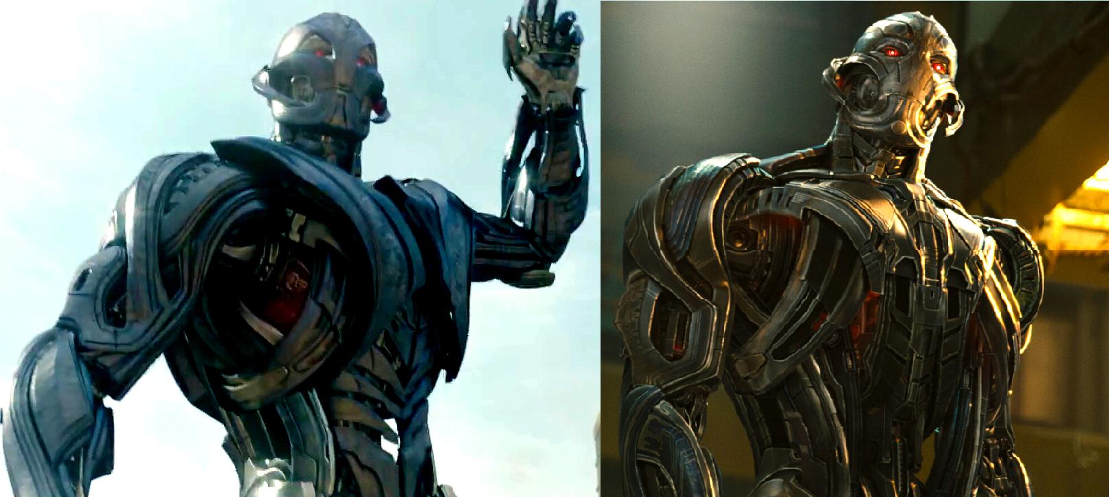
Just got the AOU art book. Love the amount of thought in the design process for Ultron Prime. Some really nice designs in here, some of which look like modernized versions of Ultron's classic jack o' lantern visage (which look really badass like ahhhhhhhhhhh *internal screaming*). There's even one with a four-armed Ultron, and some that look like they came straight out of
Dead Space (only Ultron-fied) including designs that had multiple slit eyes (similar to his
Annihilation: Conquest appearance). That said, it seems like Whedon really wanted the more expressive look for Ultron, as he wanted to really nail down the idea of Ultron possessing various emotions, and to communicate to the audience that he's not just one-note in his expressions.
There were even more human-looking designs which, while they looked great as a sort "final form" concept (maybe for Vision-Ultron?), I did feel that they veered a little too far from Ultron's facial template for my tastes especially for Ultron's default design. That said, even with the human-like expressions, they made it a point to still capture Ultron's classic visage, which I think really translated well on film. I'm glad with what we got for the film considering how it at least manages to maintain the bare essentials of his iconic design. As for the "Crimson Cowl" scene, it seemed like it was Whedon's idea to really introduce Ultron Prime in such a grand yet purposefully casual fashion like that. Hilariously the concept source of my avatar is also in this book as one of the heads for the later Ultron Prime designs.

Also Ultron's "magnetic" abilities are actually described as miniaturized anti-gravity tech from the Chitauri Leviathan. It's basically the stuff that keeps them afloat in the sky, and he re-purposed them as offensive weaponry as means of allowing him to create a push/pull magnetic force towards any solid object he directs it at.
Any comparison pics between this and his final form?
Here you go, left is Ultimate, Prime is on the right (second photo has been edited to hell to help emphasize the difference between the designs).
 looks more agresive
 looks more agresive


 They even post spoilers in the article titles ffs
  Hate them
 to each his own Canada clone


