- Joined
- May 31, 2011
- Messages
- 19,893
- Reaction score
- 300
Re: HOT TOYS : MMS DX 12 - The Dark Knight Rises - BATMAN / BRUCE WAYNE Full Specs &
simmer down.
simmer down.

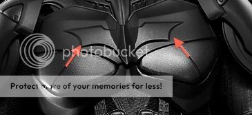
I think it'd be clearer still if those blue lines covered only half the length of the lines on the actual suit. Just to make clear that there are detail lines on the suit under the blue and these aren't just blue lines drawn on for a laugh.

The left line on the chest hits the symbol at the bottom tip. The right one is completely off.

Thx Maglor
I have a fair amount of OCD but I'm still not sure I would notice this once on display...
**** this ****. I'm going to come here for the pics, and that's it. Look, I wanted a lot out of this thing, but I really don't get why everybody's nitpicking here. I nitpicked the hell out of the prototype, because it was a prototype, and maybe they'd fix some things for the final figure (they did), but now, there's no point. How about, instead of *****ing about the figure that you're going to get, no matter what, you put your frustration to a more productive use and complain even harder about the other issues with the other figures.
We see that they do listen, so, if you have a Bane, or a DX 11, or a Quarter Scale Batman on order, now's your shot, take it. This figure is by no means perfect, but, you know what? I'm going to enjoy it. I'm not a customizer. I like to display my figures out of the box, and, with the exception of a few things , this is hands down the best TDK suit Batman you can get out of the box. I'm all for complaining if its going to make a difference, but this is the final product, it's what you're going to get, so how about enjoying all of the good things about it instead of tearing it to pieces? We'll get another, superior one someday, anyways.


After seeing page after page after page with illustrations of a "crooked" bat symbol, I sort of think the the design aspect of the suit is crappy in general.
Not the figure, the actual suit from the film.
I like it, it's cool and tactical, but it's like the team that worked on this design were afraid of incorporating the symbol onto the chest since it doesn't have a practical function (typical Nolan). It sort of just gets lost with all the unnecessary geometrical patterns and isn't quite noticeable. I'm surprised they included it all.
With the symbol being one of the most important aspects of the costume along with the cowl, cape and gauntlets, you think they would have made it "pop" more. I'm actually surprised they didn't do something ridiculous and have it be detachable as like a throwing star or some nonsense like the "PROJECTILE GAUNTLETS" action feature in the film.

After looking at all the pics of this, I've decided to buyBatman
DX09

It's crooked because he isn't Batman at all. He's Batzarro. That also accounts for the crazy face. All you have to do is break the PERS to have him look crosseyed, and you're golden.

I see the misaligned bat now. Cancelled! ****ing CANCELLED!!!!!!
I see the misaligned bat now. Cancelled! ****ing CANCELLED!!!!!!


 awesome last 3 posts.