Late to this thread. I know this is kind of a long rant, but remind you it's after reading 55 pages or so of this thread.
I saw the ht facebook pics up right when they came out and they only left me feeling blah about this figure. I wasn't blown away like I usually am with a HT release and it's such a disappointment considering how big of a Spider-Man fan I am.
Why Spidey 3? The WORST movie I think I have ever seen. Truly. It sucks on so many levels and has almost ruined Spider-Man movies for me. Spidey 1&2? Two of the best comic book movies ever. Love them!...So that is disappointment number one, but it's a small one at that and since the suit really doesn't change at all I'm fine with whatever Spidey fig we get as long as it's done right in 1/6 scale.
A couple gripes now that I can finally figure out what's bugging me about this figure:
1) The head was the first thing that jumped out at me that I didn't like and I suppose I really couldn't figure it out until...Diamond eyes. MUST lessen this effect and just make it more of a pearl look. I also think the eyes are too small and need to be enlarged ever so slightly.
2) I have yet to see a side profile shot that really gives the impression of features under the mask. It's like they chopped off his nose and chin and just put a round ball under there.
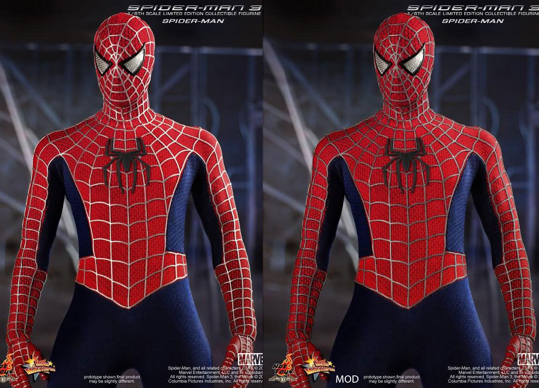
3) Darken the web on the suit. Bright silver and almost white in some pics is a no. It looks horrible.
4) Boots? Jeez. Cloth.
5) Hands. While not as bad as the boots I still feel like they could've pulled off cloth.
These ps look 10x better IMO. I would even go a tad more darker on the top one.
Did a little adjustment to the color of the web. I think this one looks better than the color white.

Outside of that, I must say the body looks great, the cloth mask is done well, and the pattern on the blue and red suit look fantastic.
But I'd still much rather have something more like this, maybe minus the "painted leg muscles"
This custom is better, IMO:
If only they could do a mix of both... we could reach perfection!
That's how it should look. That is f@ckin epic!!!! I need to get in touch with this guy!


