greygoose
Super Freak
128 pages of head sculpt bashing.


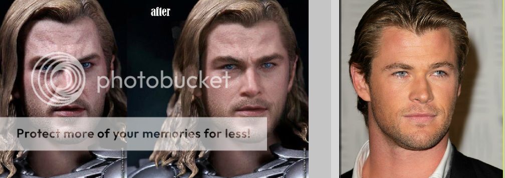
So I saw that Photoshop on Facebook, and while it's not perfect, it looks better than the headsculpt by Hot Toys


on.cc


And most of the problems with the sculpt I think could be attributed to the lighting in the photograph. I mean, you can see the figure has darker lighting and more of a blueish-red hue, while the real pic of Chris has a yellowish hue, therefore making the figure itself look better due to coloring when overlayed. Maybe Hot Toys should use better lighting when taking photographs?


This was the only set of pic with great lighting,and i just realise on.cc pics doesnt have the close up hs pic just like the other avengers fig, strange?
they both do look good displaying them together
i am picturing a bunch of ways to display them together in my head, this is not good news for my checkbook..............


In the last one he looks a little bit overweight, I dunno what to think about this figure anymore xD